Home › Forums › Sign Making Discussions › Gallery › signage: assortment
-
signage: assortment
Posted by valegraphics on 5 June 2006 at 21:40Havent posted for a while. So heres some recent stuff
Attachments:
 valegraphics replied 19 years, 6 months ago 4 Members · 5 Replies
 -
5 Replies
-

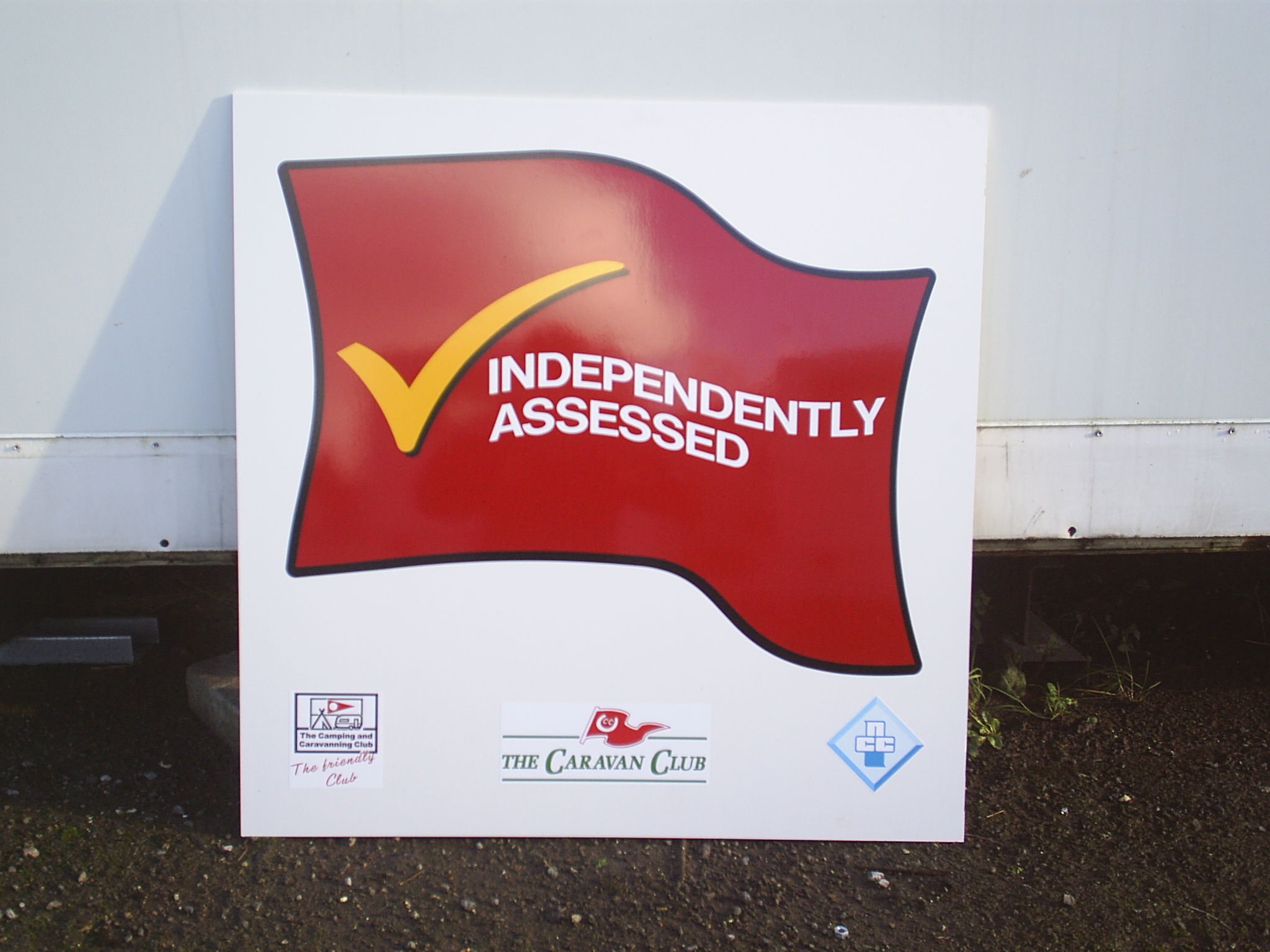
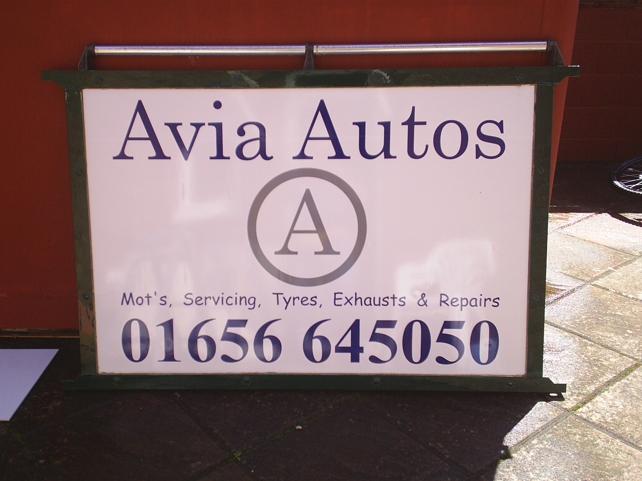
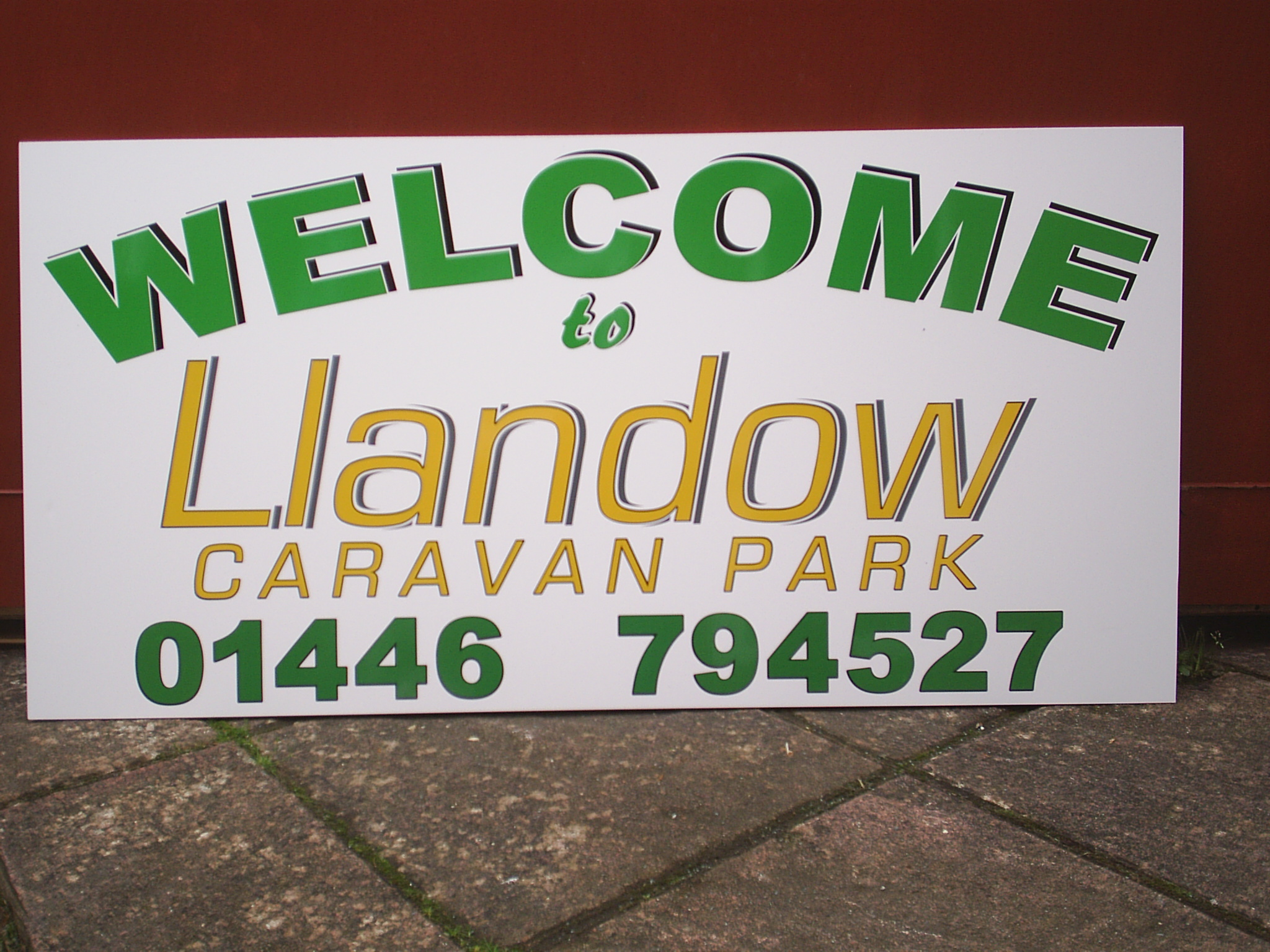
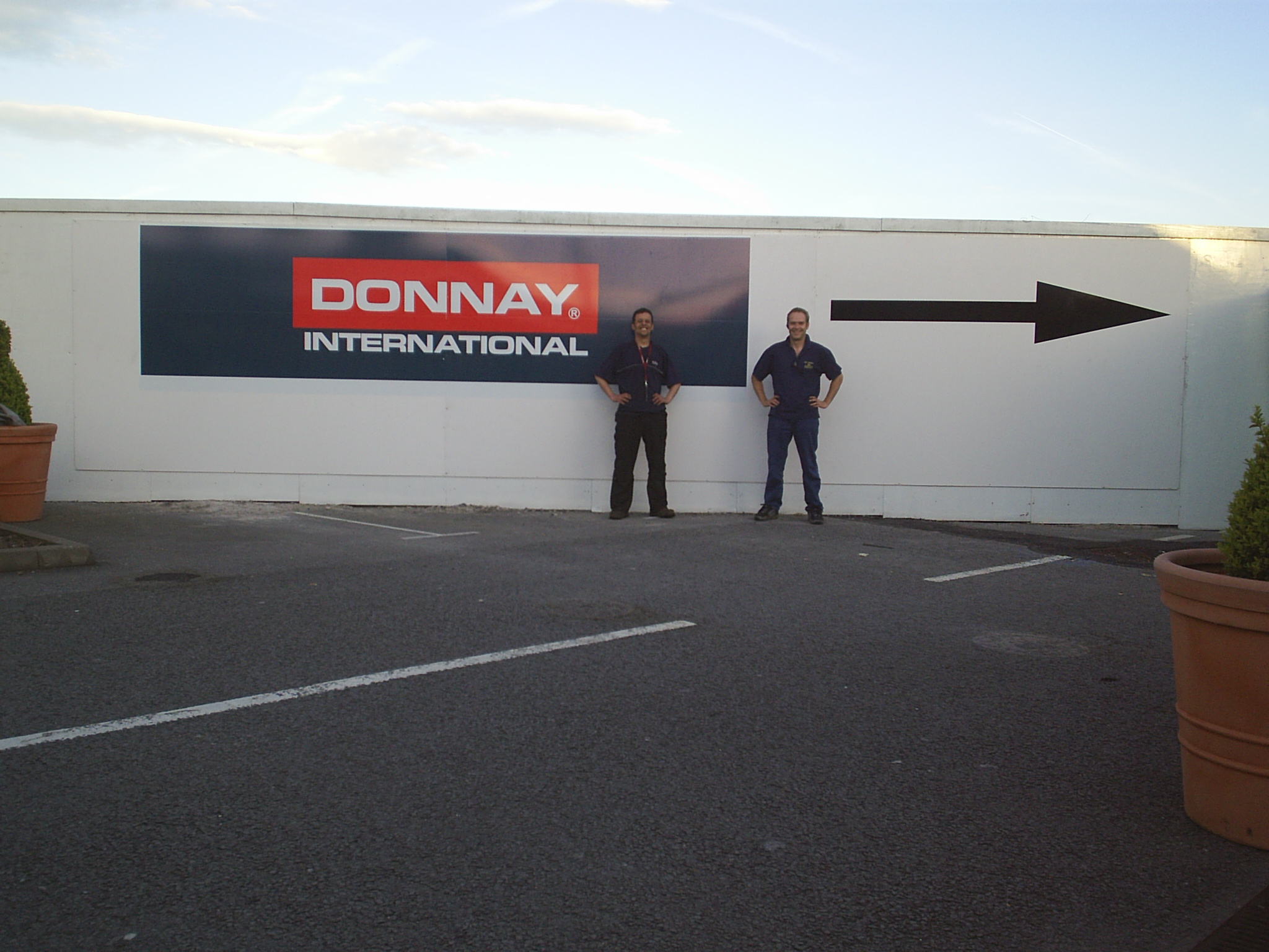
are these all on fomex or diabond or eqivillant ? all look good, on the garage one I think I would have wanted what they do to be more noticeable , is the last one an airport? and did you put the white up behind or just put your graphics on what was there ?? nice to see your work
Lynn
-

Good work, well done.
However, I think the Caravan park and Auto signs would have looked much better if you had allowed more margin space around the perimeter of each sign. 😀
-

Thanks for the comments. The large donnay was a re-fit for a shopping center. The boards were three seperate 3mtr x 2.5mtr 12mm forrex. They were already printed on the other side by another company.
Customer wanted them butted together and logo fitted.Took down. Took to workshop, turned over, signed. Took back to site and butt joined them to the original ply board they were fitted to. They wanted me to fit all of it on-site. Didnt want to take any chances, as the weather was all over the place at the time.
Phill. Good point. I have a nasty habit of making everything as big as poss. Thanks again.
The avia sign was actually a shelf unit from a phs washroom box. Eeerrrr
Matt
-

thanks for posting your work mate, looks good.
as way of constructive crit… ide echo what phill has said. my dad is a bit like you, guilty of oversizing his graphics. i know you will probably try this and think, nah… but please try this… finish designing your sign on screen as normal. then when your 100% complete. select all the design work and scale it down by 20%. once done, slect each line and open the gaps a bit. but not by much… then produce it. i bet the sign is much more pleasing on the eye. so many folk signmakers make this mistake when designing, we forget the actual size of these finished designs.
as a rule, i forbid our guys to stretch text, logos etc there should always be about 15% space at the sides of the longest line of text on the sign. same space at top as is bottom etc etcthanks for taking the time to post your work mate, look forward to seeing more.
-
Thanks Rob,
I’m all ears mate. Trust me i am 😀 Thanks for all the replies. At least i dint get fried eh!!
Matt

Log in to reply.