Home › Forums › Sign Making Discussions › Gallery › vehicle graphics: Balloons!
-
vehicle graphics: Balloons!
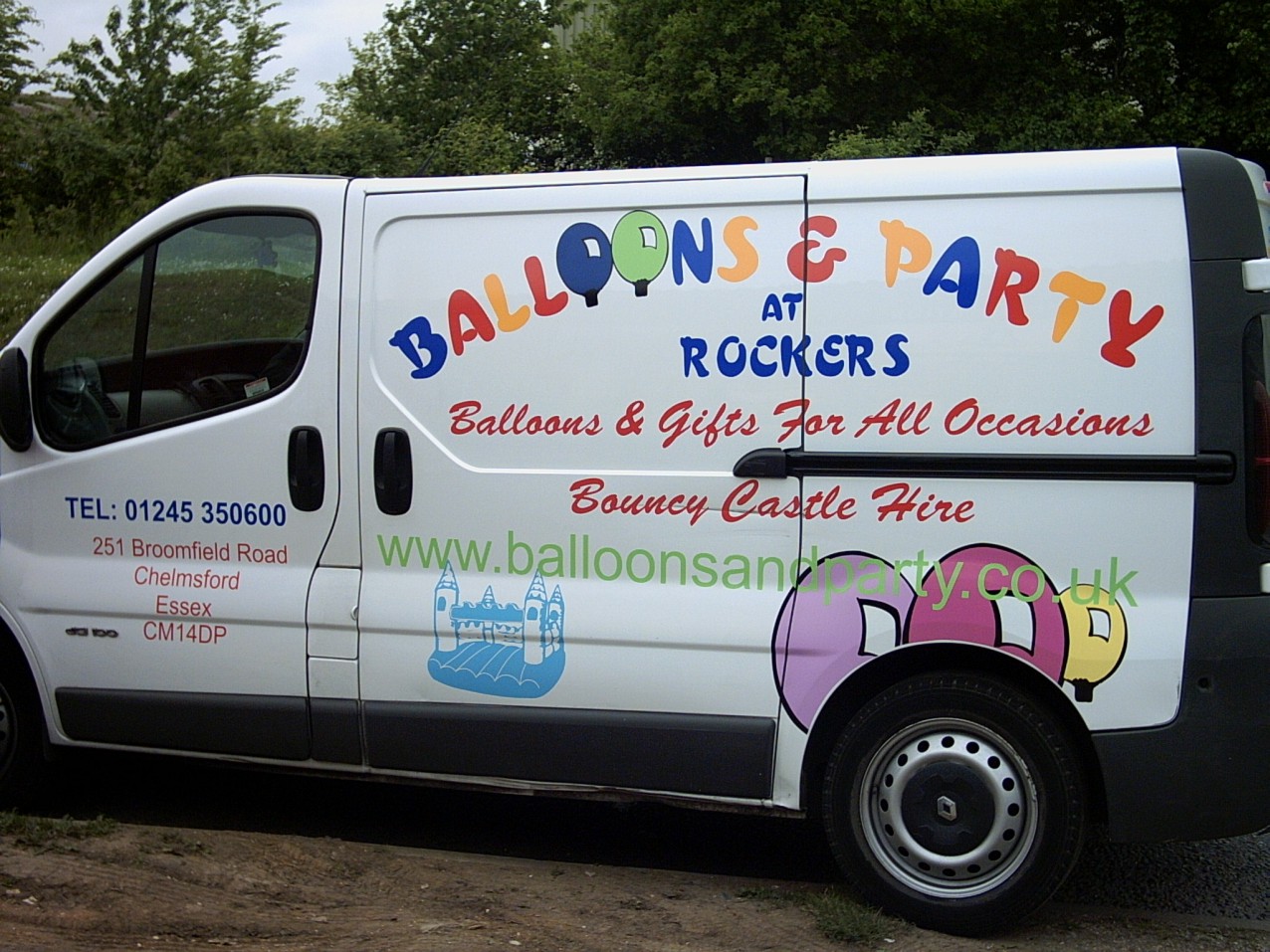
Posted by Ryan Fairweather on 19 May 2006 at 14:57Finished van for local party company finished on Weds.
Attachments:
 Shane Drew replied 19 years, 6 months ago 11 Members · 16 Replies
 -
16 Replies
-

As long as the customer was pleased, and you were paid, Ryan. that’s good.
In my opinion it is a bit busy.
You have a lot of fonts and colors and info.
While it is legible, I think you would have had better success with a simpler design.
Maybe a big bouncy castle in a pale blue in the background, the heading in black with just the balloons a cheery color,
the web addy smaller, and only one decorative alphabet.
….remember that there are other fonts than Brush Script as well.
I also dislike the mix of primary tones with the pinks and pale shades.
I’m not trying to be too critical, I am just trying to help you improve your design.
Love….Jill -
 quote Jill Marie Welsh:….remember that there are other fonts than Brush Script as well.
Oh come on Jill, tell us how you really feel about Brush Script. 😀
Like Jill says, if the customer was happy and you were paid, that’s great!
Jill also has some good points as well that should be considered on your next creation.
Thanks for posting.
-Marek -

I also think it’s a bit too busy and I would have used a lighter blue but it does the job spect customer loves it if I was a customer so would I 😎
Lynn
-

Address on the van Broomfield Rd, Chelmsford, I signed up a large hair salon there few weeks ago.
Where are you based Ryan?
I must admit I have an equal disslike for Brush Script, but at least it’s welded together and in upper and lower case.
Martin
-

I have to agree with Jill, the design is very busy, and bitty.
Better designs will come with practice. But there are one or two
glaring problems, the website is not even close to be level, and is unreadle over the top of the ballons.The tel number over the address is a little bit of a mess, the address is centred but the tel. number just does not belong. Not even in the middle of the door.
The ‘at rocker’ does not look to be centred in the side panel.
A few basic rules I use on any job…
I never use more than three fonts on any job, if possible. It is Ok to use different weights of the same font,i. Bold – Heavy, Medium etc
The brush script and the font used of the balloon wording are a little to similar to each other, try to use fonts that provide a contrast to each other. In my opinion brush script (hobo and arial) are the worst fonts in the world. Plenty of free fonts are availble to download, and they are quick to download even on a dial up.
The side panel is too full, the text needs space around it to make the text more legible. Smaller text with space around it can be more readable than larger letters with no space.
Sorry to be so critical, but if you want to learn and improve it can’t be sugar coated. Too much of that on here as it is.
-

thanks for posting your work ryan. very good of you mate.
constructive crtit?
i wont add to what has already been said, but i will say this…
i have seen many, most often Jill, mention a book that allot of sign makers, old or new should buy, its by Mike Stevens and is called "Mastering Layout" Mike Stevens, (on the eye of appeal)
i bout it at the letterheads meet i attended recently… just browsed a dozen pages or so. but…. already i see good, easy to follow logic in creating signs. something 9/10 of new signmaker s today forget or simply do not know.if you fancy having a look you might want to try HS Handovers, London.
-
You know that actors don’t like to say the name of the Scottish play?
Well I don’t like to mention the font that begins with B S
🙂
-

good points here Ryan, by all concerned. Tim brings out some very good observations too.
only comment I’ll make is 1) check out letterheadfonts.com for a script that is heaps more attractive than brush script (it is very dated now) and 2) I try and keep my fonts down to a maximum of two. Too many fonts will make it busy no matter what else you have there.
The main font plus a 2nd font is ample imo.
Keep up the good work tho, take advice as it is meant here and you’ll always be moving forward.
-

Thanks for the comments guys. It was the customers design and we did discuss the font/ location of web address etc but it was a no go discussion as she had set her heart on it.
Lots of comments to take on board though and we try to learn as we move forward.
Thats the benefit of a site like this, tapping into a large resource of knowledge.
Telling it like it is is refreshing, too much PC rubbish in this world 😀 -

Can I add a couple of points:
Always stand back and take a critical look at your work. are the dots all there over each i? Do any lines look off centre? Is everything level that is meant to be? If you had done this you would have seen the web line is very crooked and must be replaced.
The web line looks weak and does not show against the balloons. You could try have a white outline around the letter on top of the balloons to help them stand out, or better still a black outline on the whole line.
The good advice about reducing fonts helps designs look less cluttered, but remember that you can italicise lines to help give variety.
I will also make the point that although the customer paid up and is happy, there is an advert out there for your work that may cost you business. Why not get it back in and sort out the obvious problems such as the very crooked web, the un-centered door stuff and also check what the top of the castle is doing. Then take a look at the other side!!
Constructively yours,
Peter
-
quote ryan fairweather:Martin,
based in Braintree. How about you?
Ryan
I’m in Maldon Ryan.
-
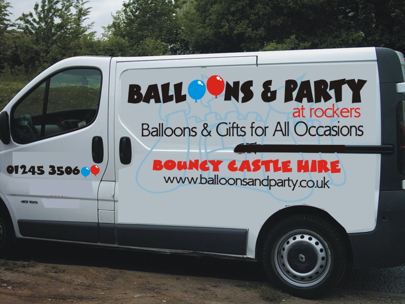
Here is a crappy mock-up.
Thanks for being such a sport, Ryan.
You are OK in my book.
love…jill
Attachments:
-

While many of the points raised are quite valid – I don’t have a problem with Brush Script which many others appear to dislike so much (even my dear wife Alison dislikes Brush script). I personaly like it and my experience of the general public is that many of them also like it, so if it helps to sell your work why not use it 🙄
-
I think Brush Script is out dated that’s all. I don’t actually hate it as such. I just think there are plenty of better scripts out there. It is unfortunate that most don’t want to pay for it. I think $US30 is not too much to pay for something a bit better…
I’ll still use BS in some designs, but if I give a few options, most clients will almost always take another font when compared to BS.

Log in to reply.