Home › Forums › Sign Making Discussions › Gallery › vehicle graphics: PM Building
-
vehicle graphics: PM Building
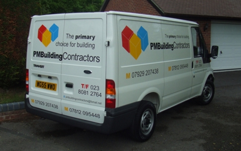
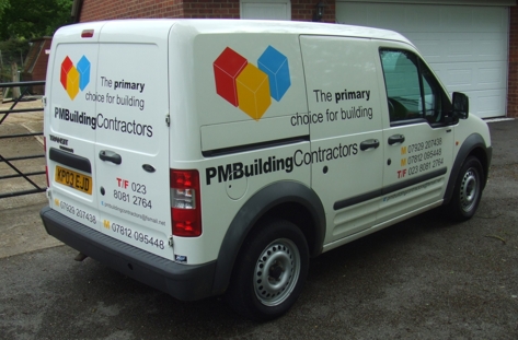
Posted by Neill Hague on 19 May 2006 at 13:242 vans fitted this morning between the rain showers & the gusts of wind!!
All done in Mactac 9800 series.Hugh Potter replied 19 years, 6 months ago 15 Members · 16 Replies -
16 Replies
-
Neill,
Looks good from here too.
How did you get the 3d effect on the blocks – was it fret cut or did you put white vinyl lines on it?
Martin
-
cheers
Martin, the logo was supplied as a JPEG by the customer which I imported in to Omega, then traced it so it was a vector image.
The cubes were then cut in the three colours & laid up on the bench before fitting to the van. The white of the van then comes through to make the lines. -
They look fantastic Neill, I like the layout alot, very professional look to them. Did you produce the layout yourself? I think black on white is crisp and clean.
Great work
Neil
-
Very nice and clean.
I prefer the way you have laid out the back of the van to the sides. I think that the logo works well with text running underneath and the "catchphrase" on two lines at the side. Maybe would have been better on the sides.
Criticism over, still a great job. Nice 1. 😉
-
Simple and straightforward, yet it manages to be punchy too.
Nice work.
Love…..Jill -
😀 I like that too. Simple but clever! …. if that makes sense!!! 😉
-
Hi Neill, Great work. May I ask what the Font is that you used for the main name?
Kev
-
Morning people, thanks for the comments much appreciated.
The layout was my choice, the customer left it to me, his brief was"I’m a builder, your the sign maker just make it look really good" – my sort of customer!!
Kev the font used is Arial Black for the name and Arial for the Contractors
I have pulled the letters in closer together as well.cheers
Neill
-
he does exactly what it says on his tin !
nice work, looks smart, most the builders i’ve ever been involved with, struggle to get past three lines of text, if i can work a curve into it i reckon i’m doing well, to get a logoon there is almost unimaginable !!
that alone deserves praise !
Log in to reply.


