Home › Forums › Sign Making Discussions › Gallery › vehicle graphics: Tark Racing
-
vehicle graphics: Tark Racing
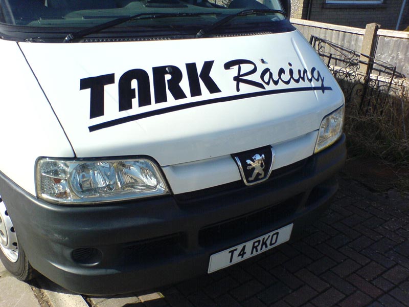
Posted by Tark Malbot on 5 May 2006 at 13:55Here is a picture of my van. I was very pleased with it for my first attempt. I found it a little tricky to do the sides as it was very windy, I was on my own and applied it dry. Its all level and no creases though which is nice!
Attachments:
 Jill Marie Welsh replied 19 years, 6 months ago 3 Members · 9 Replies
 -
9 Replies
-

well done Tark,
Check out http://www.letterheadfonts.com, and you may find some more creative fonts than the ones you have chosen
Brush script and pump? are pretty common these days, trying something a little more creative can really make it stand out.
Good job, especially for an early attempt. 😉
-

Problem I have with the Lettering is that I have been racing for 5 years and just used that font on my first letter head in 2000. Now the lettering is everywhere and is like the team logo. (:)
-
quote Tark Malbot:Problem I have with the Lettering is that I have been racing for 5 years and just used that font on my first letter head in 2000. Now the lettering is everywhere and is like the team logo. (:)
After 5 years Tark, you must be due for a new image by now, don’t you think?
I use to do a lot of race cars here, V8supercar’s down to stock cars, and just about everyone reinvented themselves every 3 or 4 years. Most argued that if they stayed the same, no one would notice them after a few years.
I come from a marketing/PR background, and it does not hurt to change your appearance after a few years, makes people take notice again.
One of the biggest bus companies in Oz had cream coloured buses with a 3 colour logo. A few years ago, they felt that they were blending in with the opposition, so they changed the colour of their buses to arctic white, and changed the font style, but retained the logo colours.
The bus industry was a buzz with the new look, and they started winning contracts again because eveyone was convinced the company had reinvented itself, and looked more professional. All they did was make what was really minor changes, and everyone took notice.
It was good for me too, kept me busy for the last 3 years doing the new ‘look’ on their buses in 3 states 😉
-
I have re-done my website about 4 times and changed the logo slightly but the lettering was always the same. I am not very good at Graphic designing so comming up with a decent original logo has always been difficult for me. If anyone wants to sponsor me by means of logo design I will be more than willing to advertise.
-

Shane is right.
If you want to be cutting edge, you shouldn’t be cutting Brush Script.
Racers around here have some really kick-ass logos.
Letterhead Fonts is a good place to buy some new alphabets, as well as some other font sites Like A&S and Sign DNA and The Fontry.And if you are making signs, you need to have some design talent,
or at least learn the bones of good layout.
Try to obtain a copy of Mike Steven’s "Mastering Layout".While your "hood" (bonnet?) is easy to read and has no bubbles, it lacks style.
I’m not saying to Photoshop the bejeezus out of it.
I feel that simplicity is always best.
But you may truly want to re-work that logo. After 5 years, it’s time.
Hopefully you have improved in that amount of time.
Would you continue to wear a suit after owning it 5 years?
Just think of how fashion changes…logos can change too.
Thank God or we’d still all be sporting a mullet.
Coke and Pepsi switch logos every few years.Another trick on applying graphics to the front of a vehicle is to distort them into a slight "smile".
This way they lay straighter.
Not to tear you a new one, I’m only trying to help.
I can’t apply vinyl dry to save my soul.
Love….Jill -
I know your all right. I just dont seem to have time or talent to do anything. I am not a sign maker by trade. I am an Electrical and Instrumentation engineer so I dont pretend for a minute that I can design or sign make. LOL.
I only got the Vinyl plotter for making website stickers and numbers for my bikes and to give away for advertising purposes.
I like the Logo though Shane. How long did it take to design? If it is no trouble would you design a few more for me so that I can use one?
Thanks,
Mark. -
quote Tark Malbot:I know your all right. I just dont seem to have time or talent to do anything. I am not a sign maker by trade. I am an Electrical and Instrumentation engineer so I dont pretend for a minute that I can design or sign make. LOL.
I only got the Vinyl plotter for making website stickers and numbers for my bikes and to give away for advertising purposes.
I like the Logo though Shane. How long did it take to design? If it is no trouble would you design a few more for me so that I can use one?
Thanks,
Mark.Mark that was just a 5 minute job with a font I purchased recently from letterheadfonts.com.
Got no problem having a play either, perhaps others here might give it a go too?
Take Jills comments as they are meant too mate. Jill has more talent than a lot of people I know. Her critical eye is always spot on, and although I have been in the game for over 12 years, Jill and others here have taught me heaps.
That is the good thing about this site. If you want a critical eye cast over your designs, to make them, and you, better at what you do, UKSB’s is the place.
Cheers Mark, I’ll have a play in the next day or so if that is OK.
My dad goes in for quadrupal heart surgery on thursday, so I’m flat out trying to get as much done before I lose my right hand man for a couple of months 🙁
-
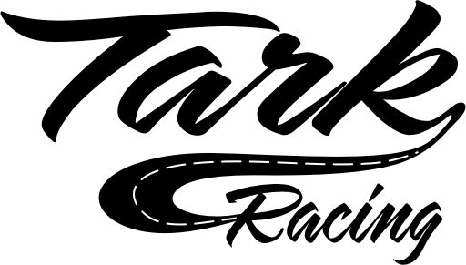
Here’s a quickie.
The Tark is LHF Mister Muster by my friend Dave Correll, that I modified. The script is from the 1930s by an American signwriter named Alf Becker. I got it from The Fontry.
It’s just a suggestion. If you are going to be selling signs you need to be able to design them yourself.
Love….Jill
Attachments:


Log in to reply.