-
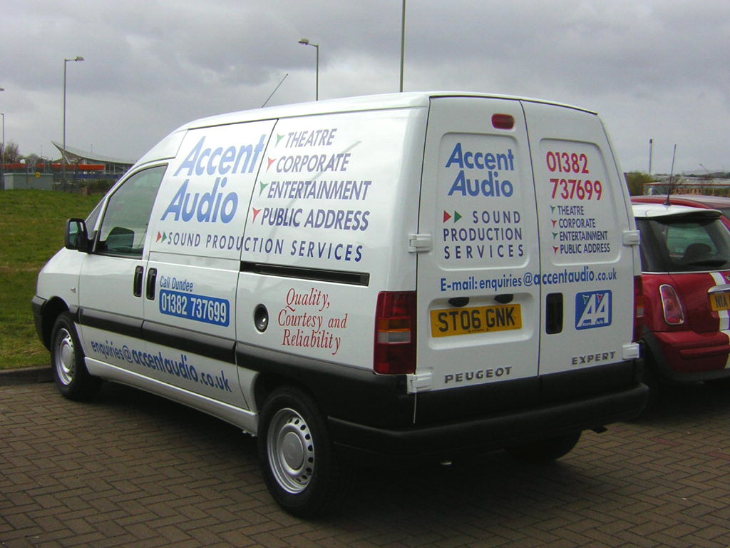
vehicle graphics: Accent Audio
Customer came to me with only: "I want the "A’s" to be vertical on one side and to stand out, and I want it blue." Well, he was happy with it.
I personally didn’t want the Email across the bottom, but hey – give ’em what they want.
Attachments:

Log in to reply.