Home › Forums › Sign Making Discussions › Gallery › vehicle graphics: My new van
-
vehicle graphics: My new van
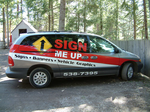
Posted by Adrian Page on 6 April 2006 at 12:47Here is a pic of my new work van. It was a lot harder to do the wide stripes than I thought. I thought they would go on in no time. I’m glad it was for me and not a customer. I’d have lost my shirt! Anyway, hope you guys like it….
BTW, it’s done in KPMF 2 mil…..all dry of course.Adrian
Attachments:
 Misko replied 19 years, 7 months ago 9 Members · 12 Replies
 -
12 Replies
-

lol ! what do the girls know eh ?
only kidding, looks good, nice, clean & simple design, but very effective 😀
-

yep adrian…i love it ….the lettering and choice of colours really lend themselves to the van shape mmm have i said that back to front ..well you know what i mean 😀 😀
-

not to keen on the design itself but i really like the gloss your vinyl has, it’s really shiny, did you laminate it?
-

I like it too Adrian. Those stripes would have been hard too. Been there done that 😕
My only comment would be to add a 6 or 12mm yellow or white line on the top edge of the red, just me opinion tho.
Cheers
-
 quote dennis:not to keen on the design itself but i really like the gloss your vinyl has, it’s really shiny, did you laminate it?
Just applied the KPMF as it comes off the roll.
Adrian
-
quote Shane Drew:I like it too Adrian. Those stripes would have been hard too. Been there done that 😕
My only comment would be to add a 6 or 12mm yellow or white line on the top edge of the red, just me opinion tho.
Cheers
Shane,
The van is one big, long compound curve and going on an angle seems to make it even more difficult to keep the stripes going the right way. It’s concave at the front and convex at the back with big bulges over the wheel wells.
I think it would stand out better with a white pinstripe as you say and also an outline on "SIGN’ but that’s the logo on my business card. I’m not sure if I should alter it on the van. Want to keep everything the same for brand recognition…I think. What do others here think? I’m here to learn.Adrian
-
Personally I believe that changing things is the key. People’s minds, even if they them selves don’t realise it, are capable of recognising a ‘brand’ even with fairly major changes. I think you just have to keep some key points the same or a background or something to let it register.
Don’t get too hung up on rigid formula.
A wee outline like has been suggested would be, in my opinion, no bother at all.
Cheers
Simon.

Log in to reply.