Home › Forums › Sign Making Discussions › Gallery › Van Graphics: BodyTorque
-
Van Graphics: BodyTorque
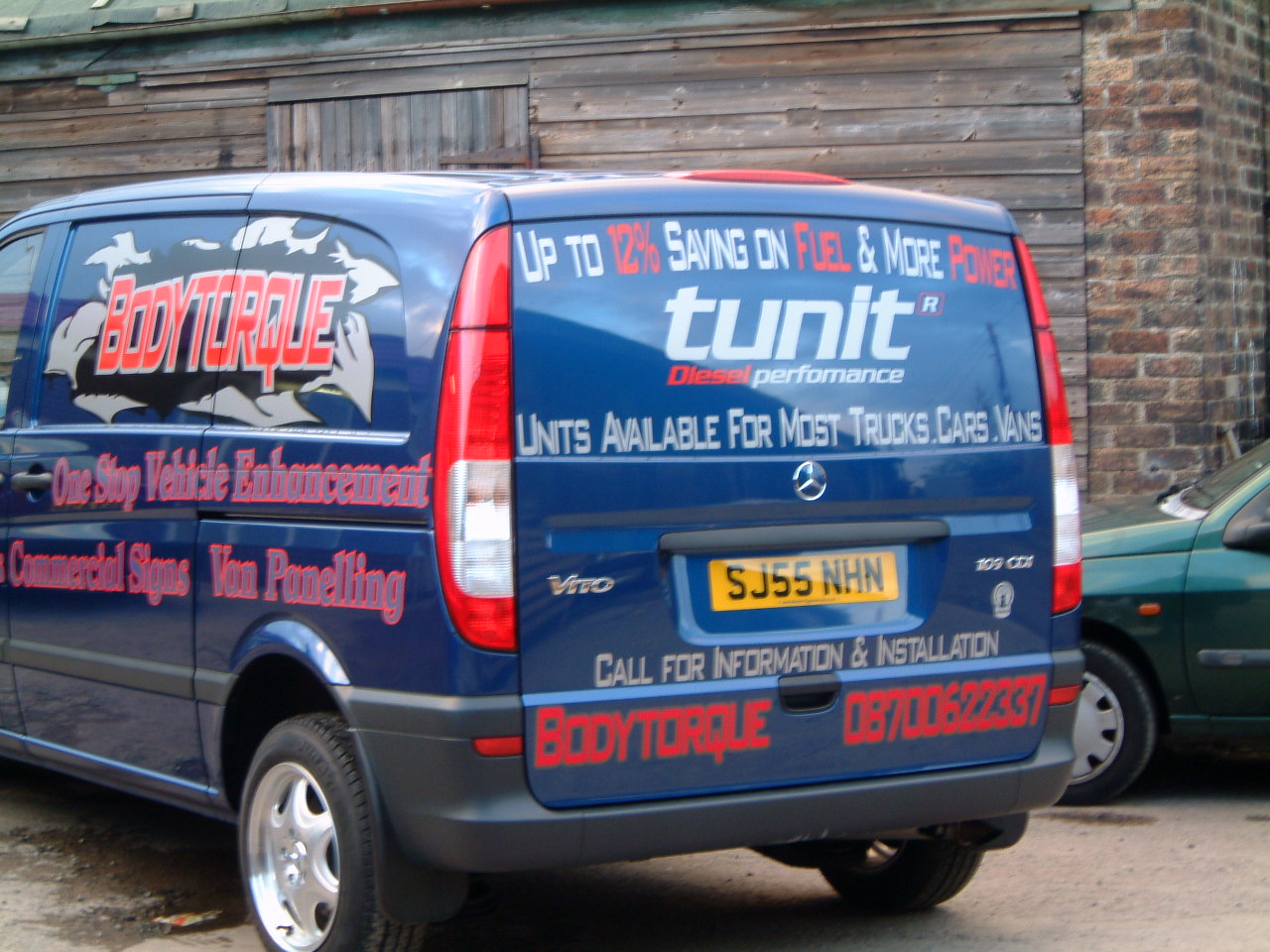
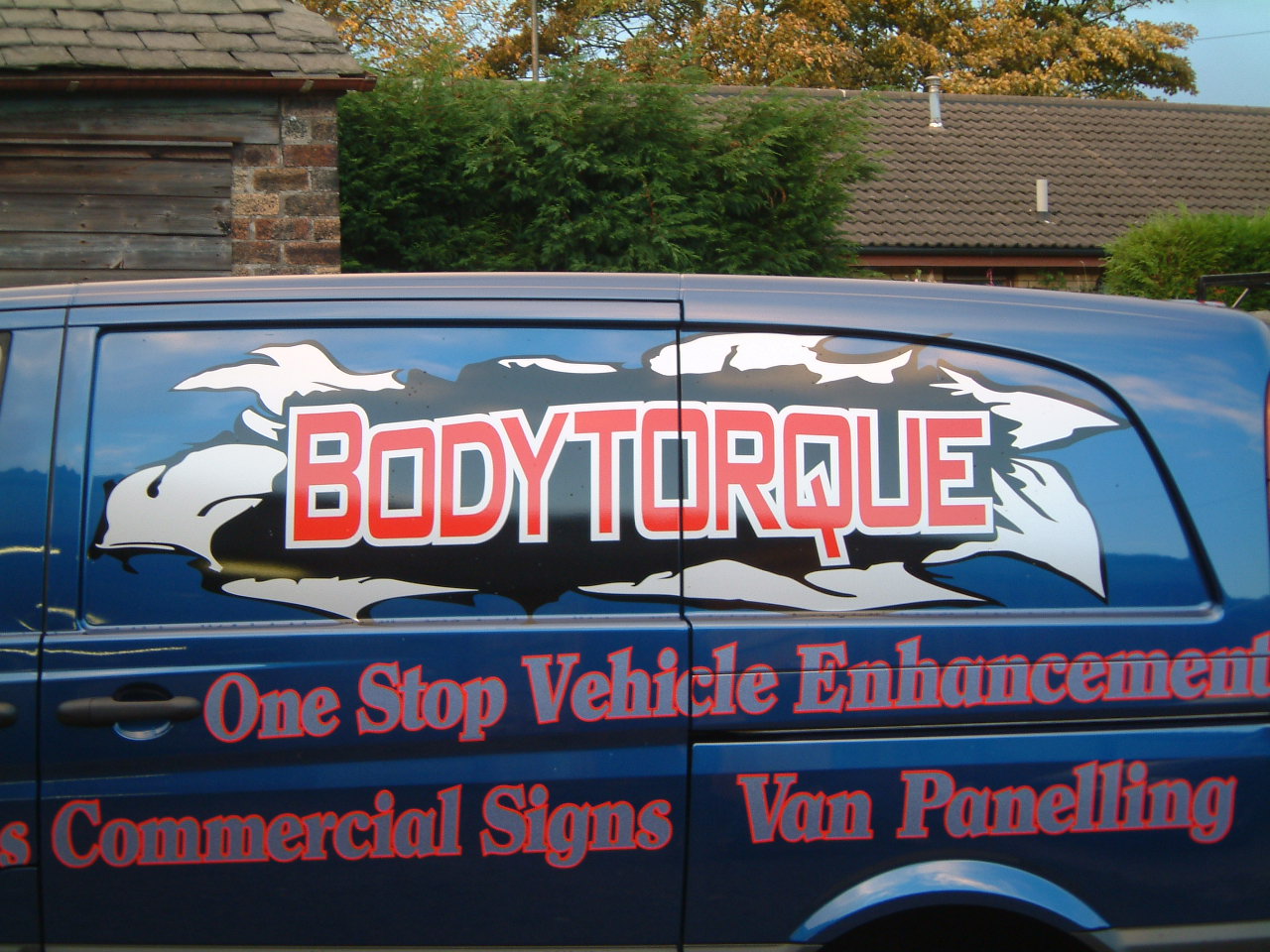
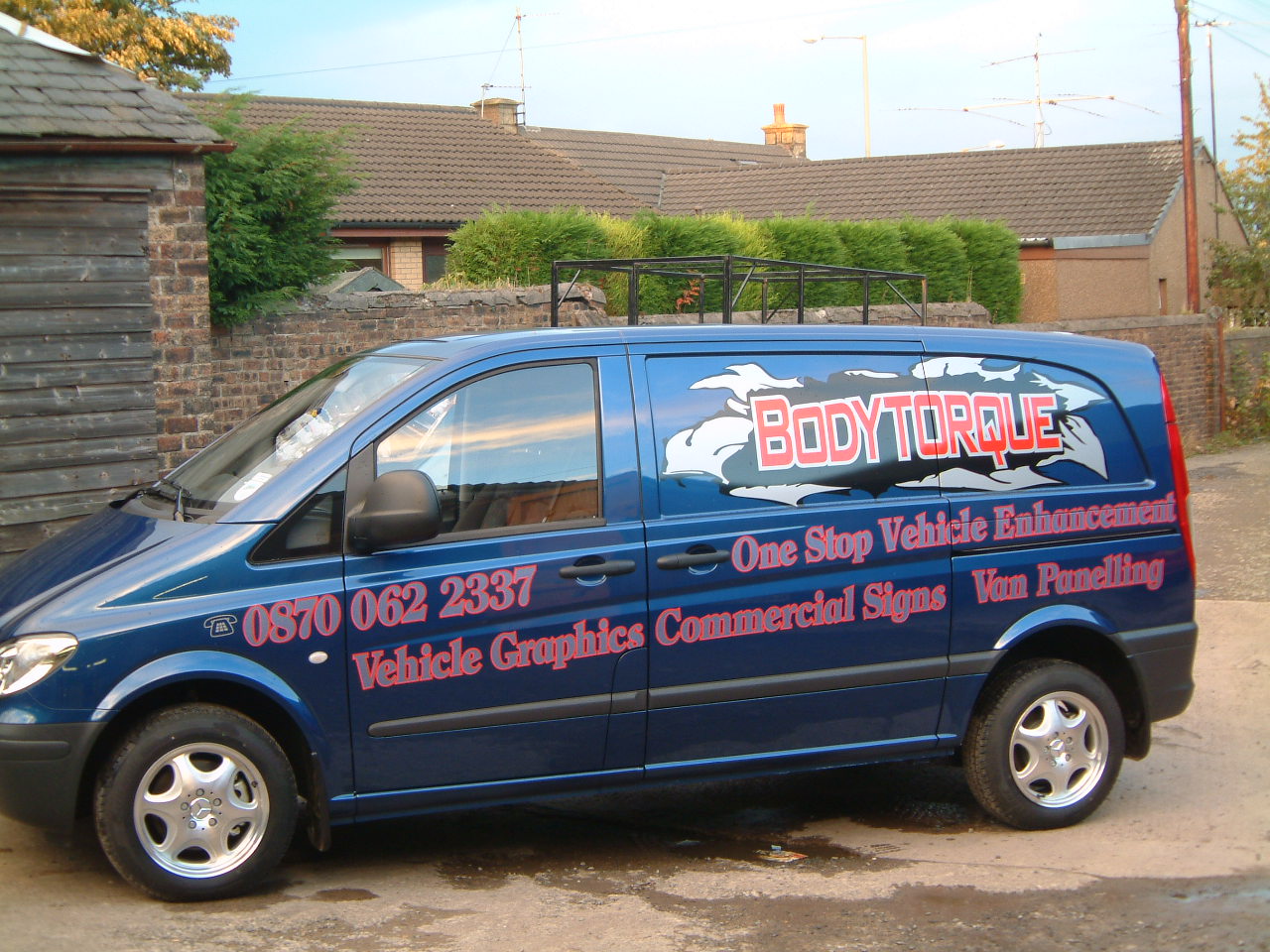
Posted by George Oberg on 15 March 2006 at 09:16Hi all
this was the first real job I done from design to app.
As you see its my own van.
Attachments:
 George Oberg replied 19 years, 8 months ago 4 Members · 5 Replies
 -
5 Replies
-

Certainly eye catching, as I said on the other job tho, I think you need to leave some space around the lines of text to allow them to be read. You dont have to fill the entire visual area right up to the edges to get a design to work. Overall the sides work better then the back, for me the back is a little busy. But a very ambitious job for a first one! Well done
-

Thanks Jayne
I can see your point there .
Can’t beat a bit of feedback to aid improvement.
Cheer Geo
-

well done for a early one the main panel i like a lot but your choice of the red on the blue NO see how the red silver and black work on the main bit because the red does not touch the blue.
just my 2p worth
chris
ps love the merc.
-

I really like the look of the name bursting through the panel.
But in other areas the red on black has virtually no contrast.
The red-outlined text would have been far more readable without an outline.
And you do not need to fill every little nook and cranny with text.
While it is certainly better than my first attempt at vinyl,
I would suggest you purchase a copy of Mike Steven’s MASTERING LAYOUT.
You have a lot of potential and enthusiasm,
but good layout will separate you from the newbies right away.
Reading that book will be an immense help to you.
It also teaches about which colors work together and why.
Keep learning and bettering yourself.
I try to every day!
Love….Jill

Log in to reply.