Home › Forums › Sign Making Discussions › Graphic Design Help › can anyone help please with different ideas for this logo?
-
can anyone help please with different ideas for this logo?
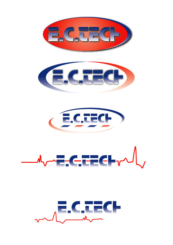
Posted by Nancy Wannous on 3 March 2006 at 12:05Hi Guys well this is a logo my client had the top one is more like original but i wanna show him other options. At the end he trusts my judgment but i wanted to run it with you guys the experts. so any ideas would help. Thank you Nancy
Attachments:
 Nancy Wannous replied 19 years, 10 months ago 11 Members · 16 Replies
 -
16 Replies
-

Hi Nancy.
I had a go with your logo.
I find that typestyle difficult to read, and the heartbeat idea
(at least here) is a very dated 80s motif reminding me of Chevrolet.
Just my 2¢. Remember my designs tend to be simple.
Love….Jill
Attachments:
-

I’m assuming the client wants to stay with the ‘stop’ font eh nancy? My preference is #2. Keeps the colours but is a new version easier to read.
The heartbeat makes it more cluttered. Especially as the font is hard to read in the 1st place.
just my thought
-
If forced to, I would go with the second one down.
Easier to read.
I would, however, completely eliminate the fade in the copy.
It makes E.C.TECH even less readable.
If you must, keep the fade on the ellipse.
But I feel that would look better in full color as well.
And please don’t put that horizontal barber pole in it! 😉
Love….Jill -

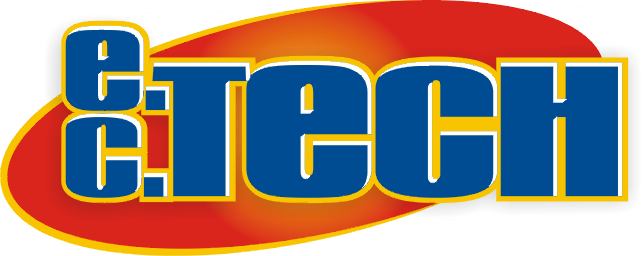
Hi Nancy,
I agree with Jill’s suggestions. It really is hard to read, and when designing a logo I always consider how it will be reproduced for all their letterheads, biz cards, website and any other promotional material.
I took a stab at it not knowing anything about this company. By the looks of your heartbeat graphic shall I assume that it’s something to do with the medical field?
I tried to keep it really clean with just a couple of effects for some flavor. A neat little graphic on it can kind of communicate some sort of idea what the company is.
Hope this helps.
Stevo
Attachments:

-

Hi Nancy
I do think they look a little dated and would go along with the comments made. You’ve had the 2 best designers on the boards give sound advice, oh and Shane. 🙂
Steve’s is very clean and would reproduce well on stationary etc as he
mentioned.Saying that I had a quick tinker, has no red though.
Martin 🙂
Attachments:

-

I would like to know what this firm is about before I can really do anything with their logo.
If they sell cars or do flower arrengements the logo has to differ.
But maybe you all know what this firm does…(and a few minutes later…)
…sorry, just read Steves input, he kind of covered this one…
-

ok, im over reading this, i must be, im confused….. i get the heart theme, but what does the company do/offer, do they have a website?
-

I was thinking they do electronics, and would agree that you need to know what they are doing before producing a logo.
cheers
Dave.com.com.com
-
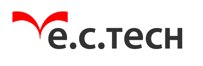
just basing this on the heart thing? not the most original but here you for…
http://www.uksignboards.com/images/general/ectech.jpg
.
-

Mr Andrew Boyle’s logo design shouts less is more, easy and very clean to the eye it gets my vote.
Russ
-

Well thank you for all the reply and the idea’s i will use them. he is and electronic guy . the reason i used the heart beat well i though electronic thing sometimes gets your heart going and i don’t know well i do like all what you guys came up with maybe now that you know that he is an electronic you can help me more i don’t like his logo. and i still want to give him something similar but more better lol . im not very fussy and i liked all the one you guys did. lets see thanks again .yes he wants that stop font . that font is stopping me lol (hot)
-
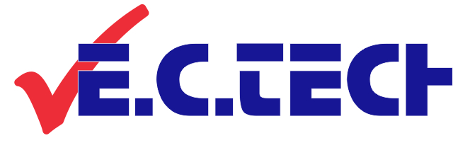
I’d go for something really simple like this. The tick gives the concept of approval without using words.
Just my 2c tho
Attachments:
-
Thank you Shane, Hope your feeling better. I will use all of them. redo in Illustrator and show my client. Thank you everybody Nancy

Log in to reply.