Home › Forums › Sign Making Discussions › Gallery › Window Graphics: Poppy Signs reception
-
Window Graphics: Poppy Signs reception
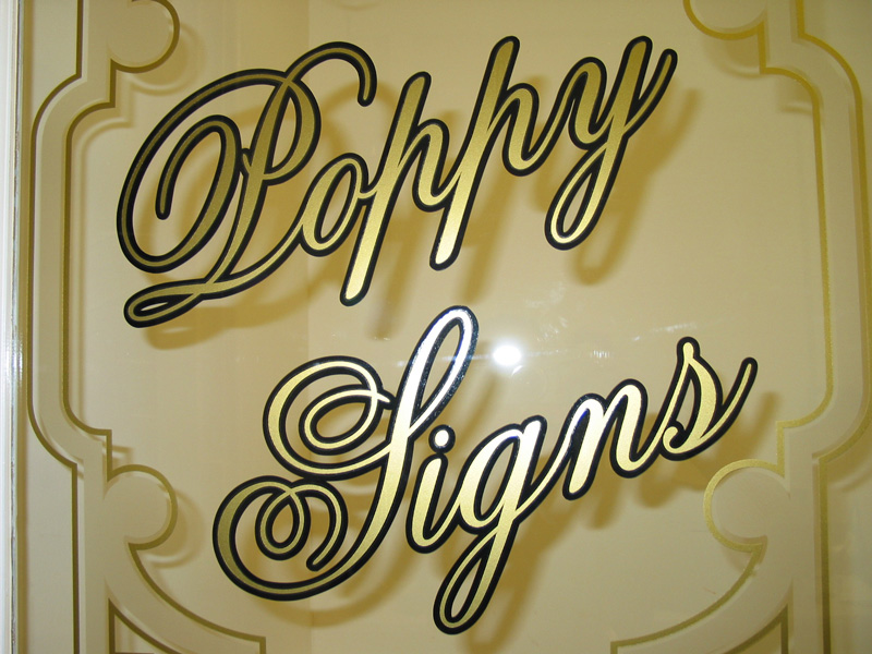
Posted by David McDonald on 22 January 2006 at 23:16I really like mixing gold, black and frosted vinyl on windows – I think it gives a really nice look?
Macky
Carrie Brown replied 19 years, 10 months ago 15 Members · 15 Replies -
15 Replies
-
That looks really effective Macky – tell us how you did it 😀
-
Ooooooh, very classy 😉
Looking good Dave, I must get down for a coffee some time soon!
Mark
-
love it
i didnt see the etch at first due to it being a photo
nice idea thats given me a few ideas never thought of mixing the 2 vinyls
class !!!!!! -
That is very nice! So are you going to let us know how you did it? I’m trying to work out how many layers there are…. Is this a double-glazed panel?
-
Hi All
It’s just basic vinyl – reverse cut and applied on the inside of a single pane of glass on the door. Gold down first then black outline (with backing) on next and a little etched effect to fill in the spaces. I’ve then fastened a white board behind this to obscure the view into the office and also this makes it really stand out.
As for the gold colour then its LG CHEM 7000 series 7790 Gold. I think this brand of gold is a really nice colour. ie. some colours are much of a muchness from each manufacturer – ie. Poppy Red looks the same from everyone, as does Ultramarine blue etc. etc. But I find ‘metallic’ golds do look quite different from each manufacturer – some are pretty poor but the LG one is a good one.
Macky
-
Cool! 🙂
By applying part of the design on the front/part on the back of the glass panel you could also add some depth.
Good Stuff!
-
Very Nice Job Macky,
It must just be me but, the only thing I’ll add is my first impression – the lower case “p’s” Don’t look like p’s to me.. kinda like a deformed h…
guess its the font, but looks weird to me.I think the whole design and colors are fantastic!
Log in to reply.


