Home › Forums › Sign Making Discussions › Gallery › A-board: Putney Tile Co.
-
A-board: Putney Tile Co.
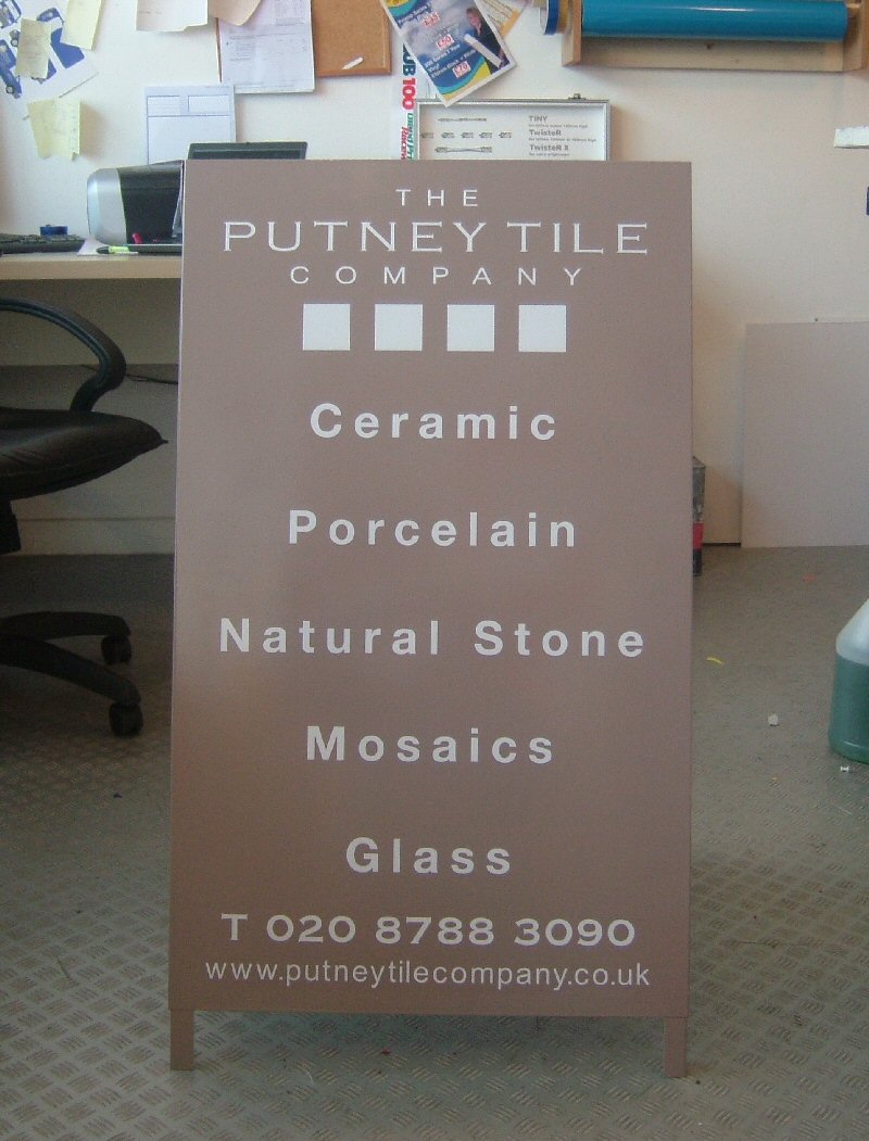
Posted by Richard Urquhart on 5 January 2006 at 10:02one of the first job’s of 2006
white a board painted pantone 409 to match customers colours
not sure on colour at first but im happy with the sign
rich
Attachments:
 Nicholas Hedges replied 19 years, 10 months ago 10 Members · 12 Replies
 -
12 Replies
-

very nice. i like it. the colour is matching the ‘natural’ type of business. well done. Danny
-

Really nice & clear. Did you increase the kerning? It looks good, and the colour matches the description (if you know what I mean!)
-

i started this design back in july after many layouts we have come up with this
just nice to get it finished and keep my hand in at sprayingi did play about with the kerning
thanks rich -

nice job done rich, colours are good 😀
i would have brought the middle in a bit though, brought the ceramic/glass etc…in together….it over- powers the company name, which is what you want to see first my const. crits remember 😉
nik
-

i saw this this morning but didnt post, i like it ! looks very ’tile’ like, good job mate !
i’ve seen these pantone colours mentioned alot, i’m guessing they’re some kind of british, or international standard ?
-
im not the best one to explain but i have pantone books along with ral colours etc etc
this way i can match customers colours to a pantone ref or ral
i can mix any paint to a pantone ref so its very handy
thanks for comments
rich -

Well done Richard
Is the board an AD1 from “A” Display”?
-
Looks great. Clean and modern. Putney? It’ll be soot black within 3 weeks! 😉 Good job Rich.

Log in to reply.