Home › Forums › Sign Making Discussions › Gallery › Van Graphics: part wrap
-
Van Graphics: part wrap
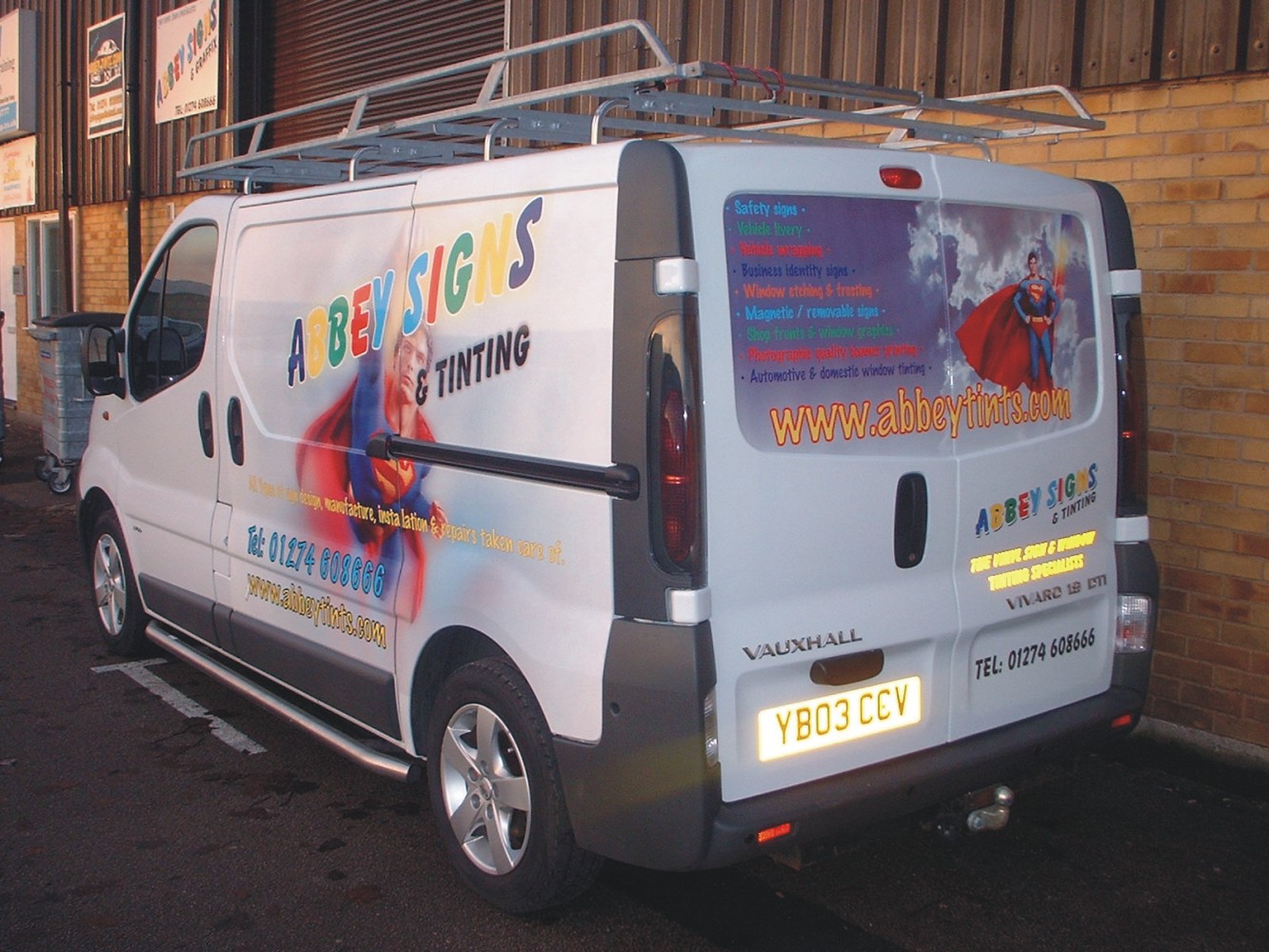
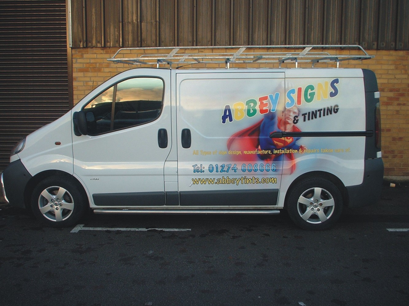
Posted by Stephen Ingham on 9 December 2005 at 22:50Hi all, at last we have spared some time to get our van stripped and re-wrapped.
The urge was pushed because we went to see a potential customer and they looked closely at the previous wrap using graffywrap, which had popped out of the recesses, and he wasn’t impressed.
so much so we haven’t heard from him since.
this time we used orajet 8571 (i think) printed on our brilliant versacamm and over laminated with oracal 290f. brilliant to use and very very shiny.
see what you think!!
cheers
stephen
Attachments:
 David Rowland replied 20 years ago 14 Members · 34 Replies
 -
34 Replies
-

looks really good stephen, i bet ya felt a right ‘nana stood their with yer skids on the outside while the pics were taken though 😉 😉 😉
ps, i wanna versacamm too !
-

skids??
they are stablisers; stops me falling offste
-

Hi Stephen I mostly like it apart from the yellow in abbey signs it seems a bit wishy washy a more vibrant colour may have worked better or maybe it’s just the picture
I love superman 🙄
Lynn
-
quote ste68blue:skids??
they are stablisers; stops me falling offste
skids………=………….underpants !! is it not you posing in fancy dress on the pic on the rear doors ? 😀 😀 😀 😀 😀
agree with lynn about the yellow, didnt think wishy washy or owt, but a brighter colour would be better seen, i ad to look a coupla times to read it,
H
-
hi lynn, i agree, we should maybe have put an outline around the letters to highlight them a bit better
ste
-

nice job Ste.
Not sure how the graphyrap failed though, there arn’t what you would call deep recess on the vivaro..Peter
-
sorry hugh,, skids!! you mean the undies over the tights thing!!
I thought you meant the bars on the side. Derrrrrrrrrr!
ste
-
hi peter, the recesses were bad enough that graffywrap kept popping out of them.
ste
-
dont worry steve, it was that peter putting you off, i know !!
-
Ste,
were does the wrap start and end? was it done on clear or white Vinyl?
It seems to blend in very well.
Me put people off Hugh.. Never.Peter
-
peter, printed on white, faded away.
the image starts from just behind the front door and ends at the far edge, back near lights.
the aim was to make it maintain the “white look”
ste
-

May be the angle, but it looks like you only have one “l” in “installation” on the side of the van?
Nice install though.
Cheers
Joe -

Steve, luvly jubbly! 😀 The back is great, but I do agree the yellow is a bit pale.
How do you get on with the copyright issue with Superman on the van?
(Yes, I know there was a debate about this last week 😕 )Joe, there are 2 ‘l’s in installation, just that one is caught on the side of the SLD.
-
well spotted, you had me worried for a minute; spell check not working!! but yes its very close to the opening of the slide door
ste
-

While I love the Superman graphic (it really looks great!)
I don’t care for the yellow, or the multi-color in your company name, it is virtually illegible.
A black outline would have helped considerably….see how well “tinting” stands out?
The Superman is really nice tho, and demonstrates what the Versacamm can do.
Love….Jill -

i love the super man but without sounding horrible i dont like the way abbey signs is done
it may be to late as you have now finished it
saying that it looks good mate i just think you could do so much more with that text with the machine you have
rich
ifeel bad now 😳 -

Sorry mate but I can’t say it’s very legible. In fact I cant read it at all. I don’t mean to harp on you but it’s very important to have your very best work projecting your image. My first impression was that it was for a comic book store. It does have potential though dont get me wrong. With a few tweeks and something alot more realted to your business (no superman). I think you can pull out a cool looking van.
As you can probably sense, there might be something wrong with your layout and design, especially if its coming from your fellow peers. Its allright though. If you need some advice, critiques, or more ideas on how to improve it, that’s what this resource is here for.Its’ nothing personal mate, I’d like to see you have a killer looking van!And unlike Autosign I like to try and explain why something doesn’t work.
The “I don’t like it” comments don’t sit right with me either. Why don’t you like it Autosign????? Just because????? Seems rather unprofessional if you ask me.
Stevo 😀
-

Hi Ste, Drop the Superman before you get a letter from Warner Bros. 😀
-

Ok, I’ll explain.
The logo at present gives the impression of an Old School sign company, i.e. someone who does traditional painted lettering, whereas the guys have a digital print machine and obviously are really offering a modern professional service.
If I was a big corporate customer that may put me off a bit. Infact all the fonts on the van give the impression of a small company that do cheap and cheerful signs. I would go for something modern and clean looking.
Also, if you are going to use a well known comic book character, try to tie it in with something, like adding a catchphrase. Otherwise it gets confusing. I did something earlier in the year featuring Mr Incredible and the phrase ‘Incredible full colour graphics’ (using the ‘incredibles logo) underneath. -
thanks for the comments and explanations;
if anyone has any suggestions for a slogan we could use relating to the super service etc etc.
much appreciated
ste
-

cool stuff ste, a little basic on the design on that though… also don’t over use Superman, a newspaper here says that they are coming back with another film soon so Superman will be popular in the next few years and if they did see you van, you would be in trouble.
-
hi, when you say trouble!!
what usually happens in this type of instance, could we face prosecution?
cheers
ste -
I know that Disney prosecutes for unauthorised use of their licensed characters.
I believe that Warner Brothers also does.
That’s why I am always leery of using things like Mickey or Taz or Calvin Peeing, etc.
Love….Jill -
 quote ste68blue:could we face prosecution?
ste
With a capital “P” mate. 👿 You may be OK until an opposition sign co wants to get rid of you and dob you in. They could bankrupt you, and insist on royalites for the image use for every day you have used the logo.
Don’t mean to scare you mate, but they do have legal dept for this very thing. (:)
I do work here for Warner Village, and I am not permitted to use any logo outside warners for any reason, or I will be in strife.
Have a nice day 🙄 😛
-
I remember when I was working with da Wool ich (delibrate spelling), I found a website promoting a certain thing, I informed my collegues, soon disapeared of the interenet.
-
quote Paul Hodges:Hi Ste,
Did you laminate the print on your van?
Paul, ste states “this time we used orajet 8571 (i think) printed on our brilliant versacamm and over laminated with oracal 290f. brilliant to use and very very shiny. ” in his original post mate 😉
-
yep!!
orajet 8751 and over laminated with oracal 290f, brilliant stuff!!
ste
-
quote Dave Rowland:I remember when I was working with da Wool ich (delibrate spelling), I found a website promoting a certain thing, I informed my collegues, soon disapeared of the interenet.
I am assuming you are talking about a copyright violation Dave?
-
 quote Shane Drew:quote Paul Hodges:Hi Ste,
Did you laminate the print on your van?
Paul, ste states “this time we used orajet 8571 (i think) printed on our brilliant versacamm and over laminated with oracal 290f. brilliant to use and very very shiny. ” in his original post mate 😉
Thanks for pointing that out, I’ve seen the oracal products mentioned a few times here, probably more often than the manufacturers you might expect, i’ve never used the oracal materials myself so i’m curious now…
-
quote Shane Drew:quote Dave Rowland:I remember when I was working with da Wool ich (delibrate spelling), I found a website promoting a certain thing, I informed my collegues, soon disapeared of the interenet.
I am assuming you are talking about a copyright violation Dave?
its was a picture of a ‘display’ that another company stole and put it on their website… the ‘display’ was supplied by another company

Log in to reply.