Home › Forums › Sign Making Discussions › Gallery › vehicle graphics: A1 Domesticare
-
vehicle graphics: A1 Domesticare
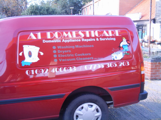
Posted by Lorraine Clinch on 18 November 2005 at 09:47One I did recently Sorry pic not great (the sun was shining!)
Attachments:
 Lorraine Clinch replied 20 years ago 4 Members · 6 Replies
 -
6 Replies
-

I think that looks good personally. Have never really like the font you have used for the heading, but it seems to work rather well here
well done.
-

Nice job!
As Shane said, this font for a header is nice and in this case it really is, but I find that it looses readability when you use this font smaller.
Are these cartoons also vinyl or did you print them?JJ
-

Hi Lorraine,
nice job one crit I really hate blue on red and visa versa, Don’t know if it’s true or not but peeps who are colour blind have problems with these colours I am not colour blind but they cause me probs they seem to bleed in to each other .LYnn
-

Hi Lynn,
the writing was in silver and charcoal, on a burgundy van. Looked the biz when done, and the customer was chuffed to bits!
I can see what you mean though, photo is particularly bad.
-
Hi Lynn, no, the writing looks cream to me, it’s a really bad photo (time for a new camera me thinks)
JJ, sorry, I missed your question earlier. Both pics were in cut vinyl. The ‘boxing’ man was off Beeline, the washing machine I vectorised off the customers business card.
I used the font because it was on cust. paperwork.

Log in to reply.