Home › Forums › Sign Making Discussions › Graphic Design Help › which way should i layout this directory sign?
-
which way should i layout this directory sign?
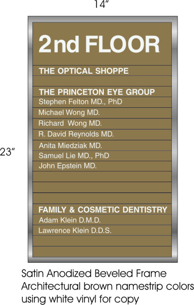
Posted by Leigh on 3 October 2005 at 18:31which way would you lay this copy out (vinyl lettering)
centered or justified left?can’t decide which works best….I know some of the copy might be too large (will adjust when directory is in my hands – am outsourcing)
and should I be using a
matte white?I think it would be a better alternative to a gloss because of glare
this is an interior directory going next to an elevator (lift??? 😀 )
thanks
Leigh
Attachments:
 Leigh replied 20 years, 3 months ago 7 Members · 10 Replies
 -
10 Replies
-

Leigh
my personnal choice is centred it is kinder on the eyeLynn 🙂
-

I would submit both to the client and let them choose.
My vote though would be left justy
Peter
Ps matt would be prefered -

Hi,
Personally, for the less informal sign I think centered is best. Perhaps if it were for a legal firm then left justified would be more appropriate.
I would also choose the matte finish, it allows the viewer to see the text without any reflections or glare.
Just my 2p’s worth (+VAT)
Mark
-

I’ve made an awful lot of directories (or is that a lot of awful directories?), and generally the text would be laid out left justified. If someone is looking for a particular name it is easier to find in a left justified layout. Have at least the height of 1 slat as the left margin.
-
And dont forget to check the spelling
Richard and Micheal are both wong 😀
Peter -

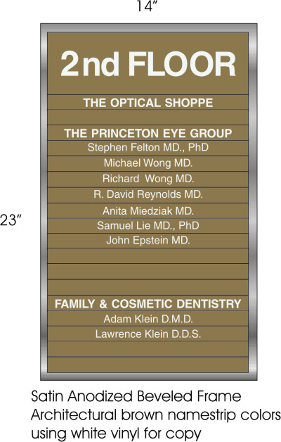
I vote for Left justified. I agree itis much easier to read this way.
-

damn names are all Wong! 😉
and it could vewy well be an awful diwectowy at that :lol1: :lol1:thanks for the help everyone
I posted this on another site I frequent and so far
the lefties have it.It does seem to be the way I’m used to seeing them as well.
just seems right doesn’t it?!I think I just need to make the “2nd floor” a bit smaller (and to the left)
for it to look correct. Thanks for the tip Andy on leaving one marker space—good tip.guess I have to buy some matte white vinyl now too
I figured as much.much appreciated
~Leigh
-

Hi Leigh
I would definitely do it left justified.
I would drop all text to about 85% of what you have here. The headings maybe even smaller, or perhaps same size but in bolder font… not bold bold, “im all chunky bold” :lol1: though… some slim font for the names etc and a regular font for the headers.
The words 2nd floor same font too (as headers but bigger) but I wouldn’t make it so big it could be centered. Ide have that running from left too with space to the right…Ok, my babbling is confusing me now; hope you can make some sense of that?
Oh and if doing this… I like the idea of the matt, looks better on this sort of thing. One thing to keep in mind. I am assuming you have other floors? If so, they will want you to come back regular to change bits here and there?
This being the case, use a difficult font to find. and maybe just use white gloss… reason?
If you have to keep coming back for name changes on each floor, it means you will have to keep matt white or get it in every time. The difficult font to match is just to stop the local shop pinching your business. People get away with using “similar” fonts but when multiple lines of test together like this they won’t…. -
😮 huh what huh 😮
😛 only kidding – I got ya Rob
Actually, this is the only interior for them.
I got the job directly through the owner of the mall – have many more things to do for them…..9 small AL entrance/exit signs coming up and they are redoing the medical building so we will be redoing their exterior directory eventually as well.Have already put up 13 exterior scroll bracket signs with hangin AL
I’m not worried about other sign shops stealing the work, cause’ that’s what I did :lol1: :lol1:
They used to use someone else, but weren’t happy with the service.
We did some work for the contractors that were putting in a new foodstore (stop n shop) and they got our name through them.They also own some rental properties – we repainted a sandblasted sign for them as well.
Good/loyal customers (well so far,,,,we’ll see 😉 )Thanks for all the info on the sign
You are def. right…..I couldn’t figure out what was throwing me off
it’s the font and the size. I’m actually going with a condensed version
(Helvetica….it’s what they already have throughout the building)
gives it more height but less weight so to speak.
Will go with a bold for the “2nd floor” copy and Heading names then regular weight for the Doctors names …… yah good???🙂

Log in to reply.