Home › Forums › Sign Making Discussions › Graphic Design Help › can anyone help please with this new business logo?
-
can anyone help please with this new business logo?
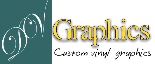
Posted by Derek Hunter on 22 September 2005 at 20:09Hi guys n gals
Just put a logo together for the new business what do you think?
Any advice and alterations would be most welcome 😉
Attachments:
 CLAIRELOWTHER replied 19 years, 9 months ago 19 Members · 34 Replies
 -
34 Replies
-

Not sure what the swirly script type thing is trying to say.
Iain
-

Yeah sorry i should of explained a bit more its called DV Graphics 😀
-
Must get my eyes seen to.
Well, although i normally like script fonts i dont think it fits in well with the rest of the design. I think there is far too much contrast within the 2 separate elements of the logo
I would prefer to see the script in a staight forward block type font with a similar photoshop effect but still using a diff coloured background.
I think the colours you have used work well together.
This is of course just my opinion but i’m sure others will add theirs.
Thanks for sharingIain
-

quick reply… will reply again later…
as has been said, the DV is hard to distinguish. at a glance i thought it said DOV. the DV does tie in with the graphics. not keen on the black text font…
thoughts: needs pulled together….thank you for making use of this forum mate, it takes allot to post this sorta thing to let us all pull it to bits in a constructive critisism way.
personally i think its a good way to learn, as many others have good/better suggestions to what we think when we design our own stuff. -

Hi Derek,
I think the combination of the 3 different fonts from different families is giving kind of mixed messages…… maybe a sans serif font with a script logo type thing might work…….
I’m sh*t at explaining things…..
Aye! needs pulled together… Rob’s right [how’s that]
Good Luck
Cheers
Andrew
-
 quote andrewkerrb:I’m sh*t at explaining things…..
no your not 😀 a bit smooth round the edges at explaining things but never rough :lol1:
nik
-
Hi Nik,
that was almost a swoosh on the Subaru…..looked good 😉
-
quote andrewkerrb:Hi Nik,
that was almost a swoosh on the Subaru…..looked good 😉flip……..never noticed that 🙄 cheers andrew…hytorcs logo im afraid, i just made it a bit different for the cars… 😉 :peek:
nik
-

doesn’t do it for me sorry too cluttered, brain has to work to read your Dv bit and you use graphics again in the strap line.
Two fonts is all you need, do like the script font and wording. why not just DV SIGNS with same strap line, two ways of saying what you do. Some people equate graphics with comics, computers etc and not with signage.
IMHO of course
-

As has been said, the DV is illegible, gives me a headache looking at it. 😎
You have the word ‘graphics’ twice in 5 words, and the bottom line really does not go with either the DV or ‘Graphics’
One other point-why limit yourself to vinyl only-do you not think you may be asked for digital/garment printing, or any of the other million things we can produce as signmakers?
Sorry, I’m sounding a bit harsh, just don’t know how else to explain what I mean….. 🙄 I think the word Graphics (yellow) is very nice, clean & clear.
Lorraine
-

also, be careful using a shadow that you can not reproduce in vinyl, unless you are using a printer of course.
If you are only doing computer cut, then do a solid shadow not a fade, as someone will look at your card and say that they ‘want that sort of shadow’ on their car. Then you are left to explain that you don’t do that with vinyl, bit difficult when it is on your promotional material.
As has been said, try to keep your fonts down to 2. Anymore and it sends the wrong message (ie you lack experience) The average jo blow will look at this and may form a negative opinion, just because they don’t like the style. Youve lost the client before you even open your mouth.
Sorry to be so ‘to the point’. Keep trying tho, I’m sure something will come to you once you digest these posts 🙂
-

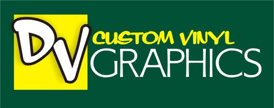
It’s a good start, the colors go well together…but….
The use of the word “graphics” twice is redundant.
The script seems too formal to go with the word “graphics”
The use of three fonts is a bit much.
You need to tighten up and prioritize your copy.
Just my 2-minute take, using your colors but reversed.
Love….Jill
Attachments:
-

Nice
What do most people use to design the graphics?? I’m messing about with FlashMX for design the now so that I can import straight to the web
-
quote John Wilson:Nice
What do most people use to design the graphics?? I’m messing about with FlashMX for design the now so that I can import straight to the web
I use Corel v12. Been using corel for years. I also use my Sign Wizard program because I am much quicker, then I export to corel for ‘polishing’
Nice job (as usual) Jill
-
Thanks Jill i dont suppose you have that ion a cut file do you? (if you dont mind)
-

Excellent, you incorporate my companies name (Custom Vinyl) in your logo 😀
-
:lol1: Now you will have to give me some of your jobs :lol1:
-
AH i aint got correl. can anyone put this into .ai for me pllleease 😳
-

Pushing your luck now, next you will want someone to make the sign 😉
-
had a mess about with this one… probably not everyones cuppa-tea but thought ide post it anyway…
ive taken out the word custom and replaced with designs, ive dropped vinyl because very few know what vinyl is and confuse it with other things.
added signs as it gives the veiwer more scope into what you can do/offer.hope it helps some.
[c]
 [/c]
[/c].
-

very trendy did you have your leather pants and frilly shirt on for that one.
i like it all the same
-

Looks like Rob’s after Andrew’s Job! :lol1: nice brand design
-
chris…. ok hot pants yeh…. but frilly shirt. hmmm it’s just sooooo yesterday! 😳
-

I have to say I like both designs but for a small company I think I would be inclined to go with Jills Logo, it would be easier to do in solid vinyl and I know signmakers should offer digital these days but feel that when you are starting out its best to stick to what you can do inhouse as much as possible.
I think as Dave has said Roberts Logo would be more suited to a larger company as it gives the impression of a particular brand or the logo of a large corperation. -
Nothing wrong in thinking big Martin! 😮
Robert, if you were to do this in cut vinyl, would you do the faded ‘grapics’ and circles in translucent?
I really like it, by the way. :thumbup2: from me!!Lorraine


Log in to reply.