Home › Forums › Sign Making Discussions › Graphic Design Help › what way can i layout this ‘a’board for it to be seen?
-
what way can i layout this ‘a’board for it to be seen?
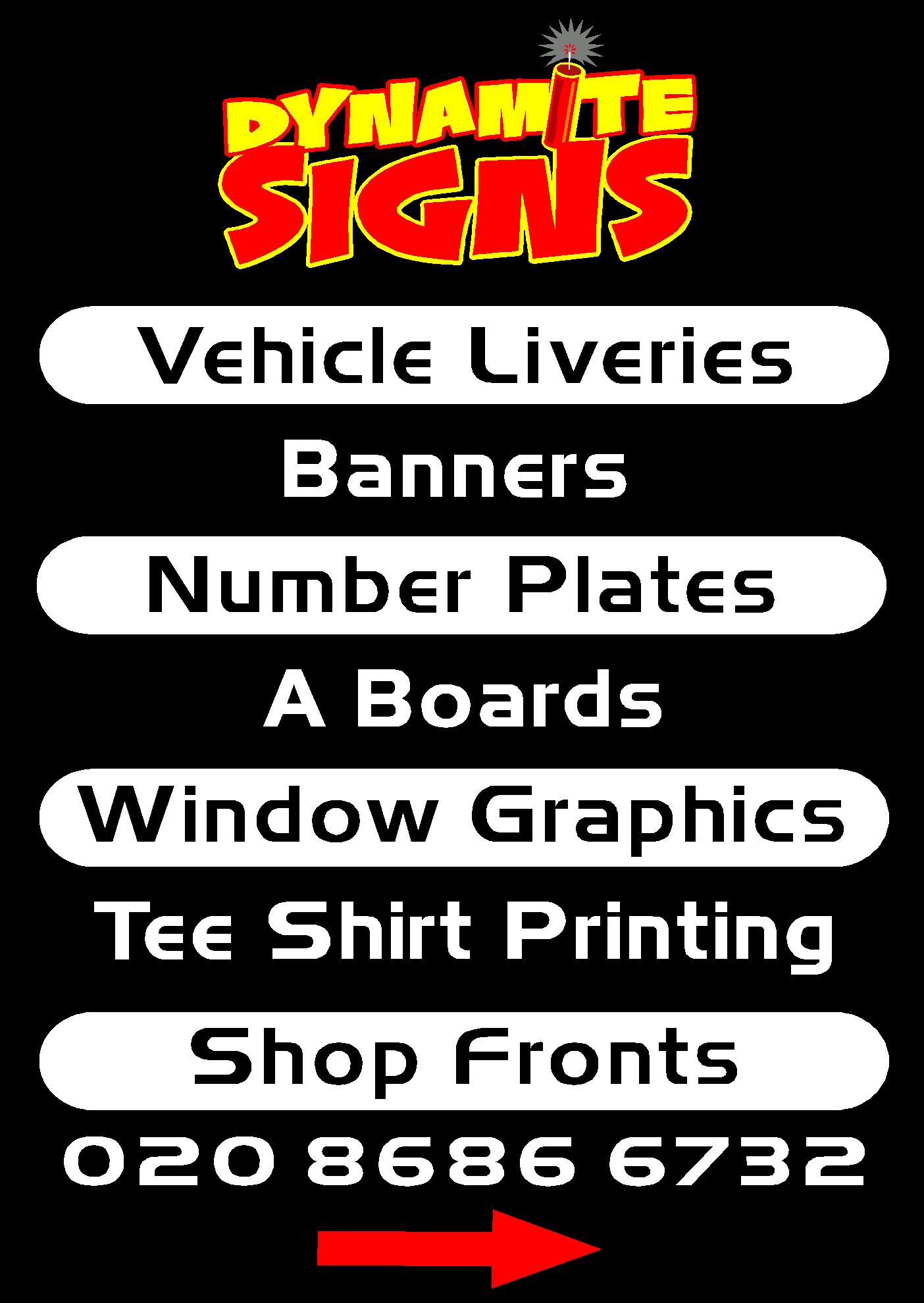
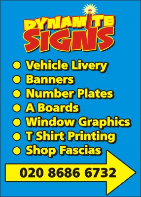
Posted by Richard Urquhart on 19 September 2005 at 18:16i would like to use a sign for the outside of my workshop i have come up with a design like my business cards i dont want any thing flash just to the point
what do you think of this ???
Attachments:
 Richard Urquhart replied 20 years, 1 month ago 10 Members · 21 Replies
 -
21 Replies
-

still have you on my mind will sort you a panel out mate 😳
-

No problems mate, Just give us a shout when you find one,
cheers
Simon
-

Richard,
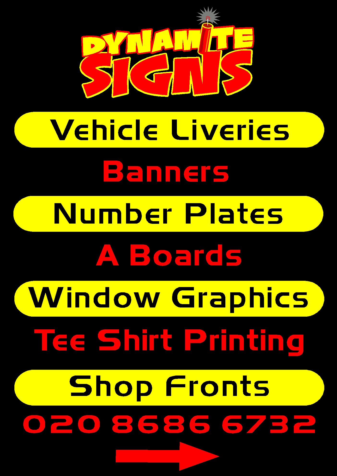
hope you don’t mind but i would rather see “shop fascia’s” instead of fronts. always makes me think that joe public will think you only paint the shop front woodwork.
Just my opinion, otherwise top one is good.L J
just a suggestion, why not put a white outline around the red text!!
-
good point never thought of the wording but your right
i will go with that and try an outline may look to busy with the outline as well ?? -

Lose the apostrophe from “Fascia’s”. Also, what does it look like with the list of services all in the same style? I think it may make the list easier to follow.
-

if this is going outside, then drop the phone number for another word?
I don’t get the point of phone numbers on signs too much, kinda “Walk in for a quote” type thing
-

Looks good mate, I would keep the phone number. If you nip out for a bag of chips at dinner at least someone can leave a message on your phone! What point is a sign without a number in this day of mobiles? Many a time i’ve taken note of a number by typing it into the phone and calling later, it is’nt always practical to pop in for a quote, just imho.
cheers, Mark.
-

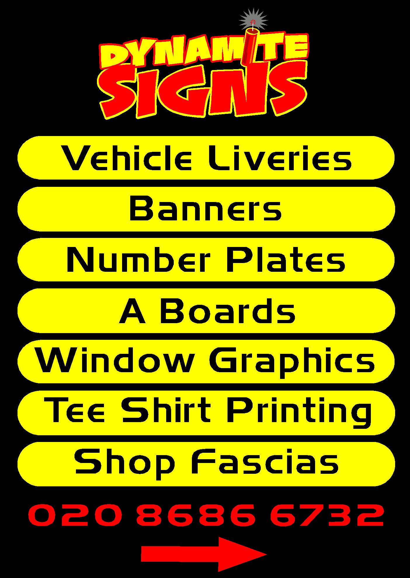
Rich, I think that the items in the yellow border are over powering the red text like andy has said, the may be better all done the same,
Peter -
thanks all i did a first have the same text for all listed however it looked had to read
i will have another look
thanks -
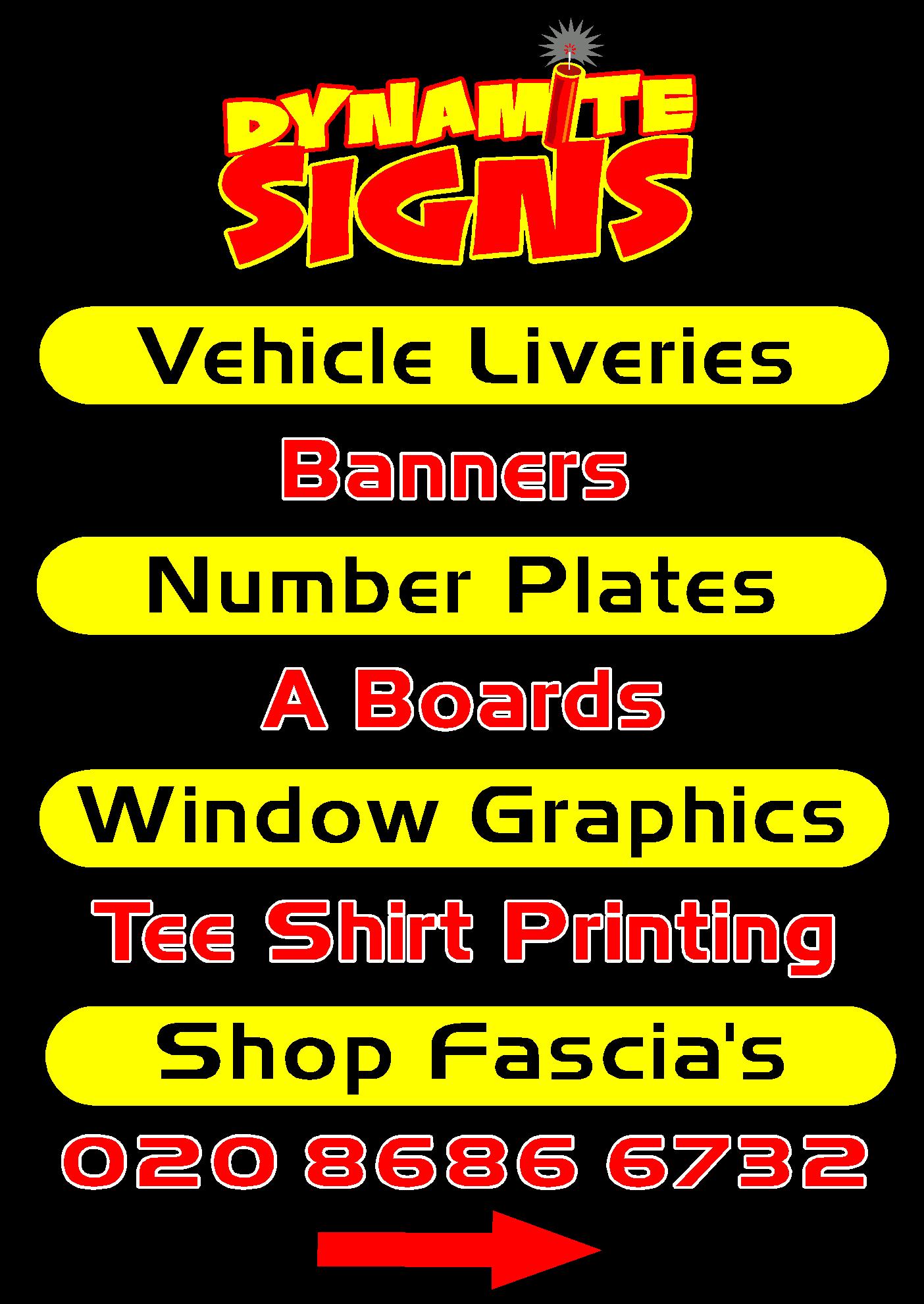
do you like this ???
i like the edit yellow red
Attachments:
-
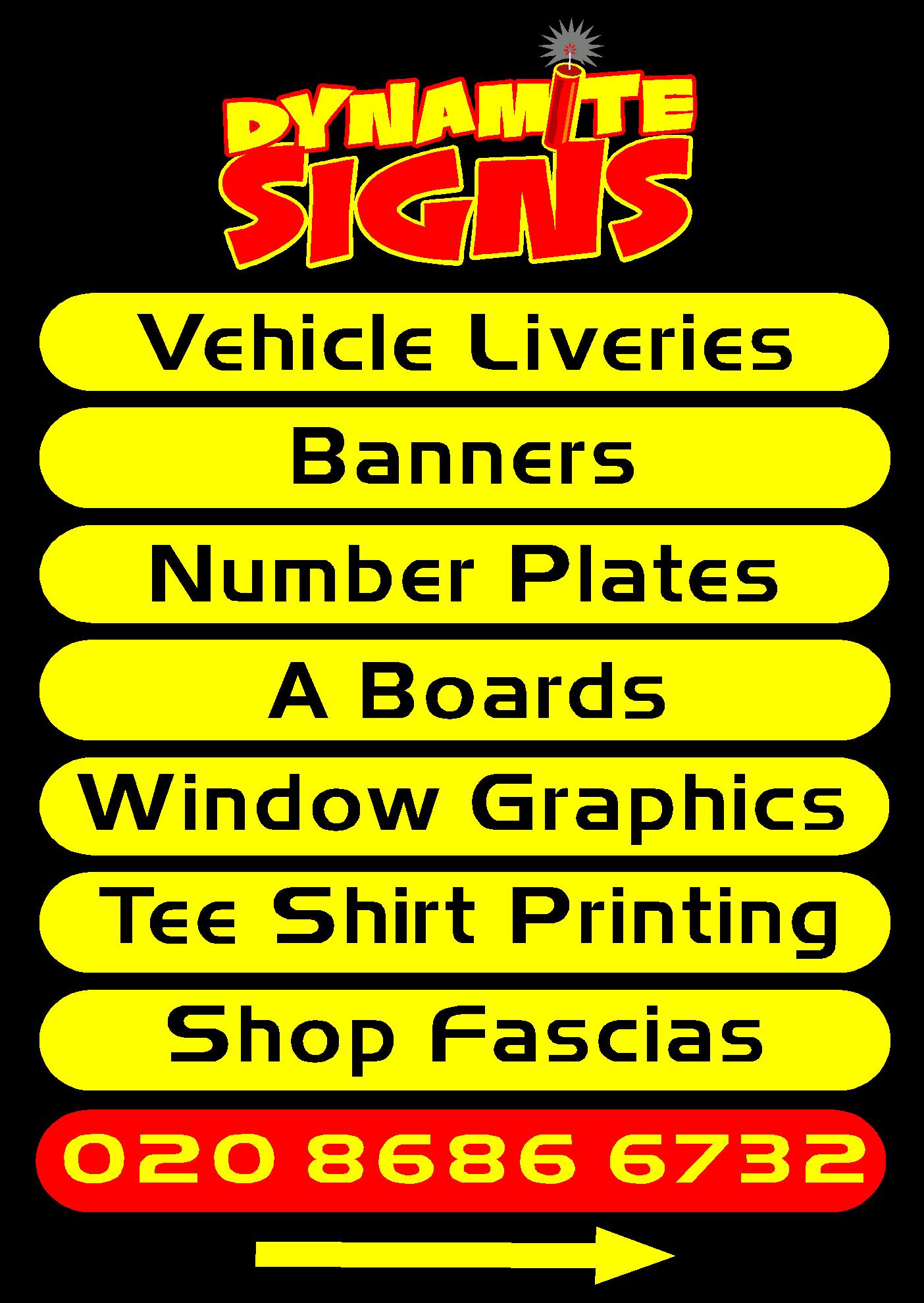
I hope you don’t mind Rich, but I’ve done this just because I wanted to see how it looked with some slightly brighter colours.
Attachments:
-

nice one andy i like the bullet points and colour… its the arrow looks too big 😀
nik
-
I know it’s a bit old hat, but I always think that bullets help to make a list a bit easier on the eye. If the premises are easily identifiable, then I wouldn’t bother with the arrow.
-
quote Andy Gorman:but I always think that bullets help to make a list a bit easier on the eye. If the premises are easily identifiable, then I wouldn’t bother with the arrow.
coudnt agree more….but i would change the arrow…ditch the horizontal yellow bit…and just leave the pointy yellow bit a tad smaller though 😕 so your left with the phone number :lol1: customers i get INSIST on the arrow being somewhere on the a-board 😀
nik
-
nice one andy thanks for that will have a think on that colour is a prob as all my company stuff is black yellow and red which i could change in your design
thanks all
rich 😀 -

Rich
just an idea – >>>> would maybe use instead of arrows?
Cheers
Andrew
[no fonts at home!] -

I was going to suggest moving the arrow under your name, but he!! since Andrew’s post…well it doesn’t much matter!
:lol1:Nice job Andrew
gives it a nice touch of creativity -
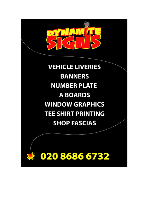
another fine design !!!!
thanks mate thanks or your input another one for top marks
thanks all rich

Log in to reply.