Home › Forums › Sign Making Discussions › Graphic Design Help › can anyone help with my new logo please?
-
can anyone help with my new logo please?
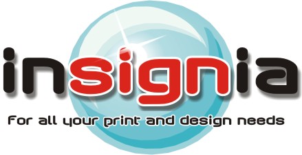
Posted by David Walker on 28 April 2005 at 23:56any input or ideas would be greatly received….
Attachments:
 Andrew Boyle replied 20 years, 6 months ago 14 Members · 33 Replies
 -
33 Replies
-

I don’t mind it a bit…but…
as a traditional signpainter,
sometimes I have a problem with the over-use of drop shadow effects.
This design is strong enough not to need them.
Did you know that the human eye has a hard time looking at red and light blue together?
Did you also know that red has about the same contrast as black?
I would like to see this simplified into a red oval with “sign” in white,
and the rest of the text in black.
It would look very upbeat and clean.
Love….Jill
PS
what’s cool about this approach is that if you tire of red, almost any other color (but yellow) would look just as nice.
Here’s a quickie:
Attachments:

-

I quite like it but I prefer dropped shadows a touch closer to the text so it dosn’t look as blurred.
The shading on your elipse is fighting against the placement of the dropped shadow – because you have put the dropped shadow bottom, right of your text it means the light source is top left, therefore the darker shading on your elipse should also be bottom right – the same as your dropped shadow 😮
hope you can follow that – my descriptive powers have deserted me
-

Im not keen on the drop shadow or the red text on blue at all …….. thinking about it, I agree with everything Jill has said & I like the design she produced aswell!!
Not being overly helpful :lol1: sorry just think Jill has very good points to take note of when designing.
😀 …… Jill’s no.1 Fan 😮
Its the sun I think …. been stood outside too long!!!! 😛
-

sorry but I think it’s too nice a word with the evenly spaced i’s
would look at it from a different angle…….will have a fouter
Cheers
Andrew
-

thanks for everyones views and ideas please keep them coming.
my equipment comes on thursday need to settle on a logo for i plan to
wrap my van (when i decide which van i’m getting?) soon as to try and
drum up some trade so need it to be eye catching.thanks everyone
Dave…
-

Some valuable tips you got there already, i use to agree with Jill’s ideas but sorry Jill i’m not with you this time, specially about the drop shadows as evrything in life they just have to be used in a moderate way.
In this case just to be going against her i did something i don’t use to that is: i abused drop shadows 😀 .
Anyway just a diferent view.
Cheers Britchenko
Attachments:

-
i’ve used most of the advise in the replies i think
i.e less shadow, and light source matching through out image.
well here it is anyway??
keep it coming
Dave…
added corel image
-

Hi Dave
I like most of it but I am not keen on the font on for all your print etc. i think you need something more easily readable and may be a bit bigger
am I also not keen on red on blue (just a personal thing) I like the blue better now you have lightened it and also your hint of shadowsLynn
-
Dave,
keep it simple……..this is 80’s red and and black duvet stuff with filters…need a brand logo | logotype that will work cross section…..no rounded type…clarity needed
sorry I’ve had a bad day, plumbing not back on ’til Monday
Andrew 😀
going to dig 2 holes 8am tomorrow for post fitted sign to get rid of my office head
-
Hi again Dave
just a thought you said your logo is going on a van eventually think carefully about the van because if you are going to wrap that design you need some nice flat panels because I think that design will disort going round curves
Lynn
-

dave
my 2p.
not about the design but about the name, how do yo pronounce it?
I first thought it said insignia oops so it did , but pronounced in-cig-nia.
but should it be in-sign-ia? bit confusing ?
Peter -

I’m easy to please Dave
I like it very much
Looks coolJohn 😀
-
I like the name Insignia, and the definition of the word ………
Andrew
I reckon if we work together we will have a great logo, ….got ’till Thursday [he may take work from us in a years time with the InSIGNia franchise UK Ltd.]
😀 -
I like it a lot better…but….still not keen on the light blue with red.
Red is hot, blue is cool, perhaps this is intentional, but they just don’t “match”!
….Martha Stewart
(AKA Jill)
PS
It won’t let me open it. Here’s what I’d suggest:
Try a circle in shades of purple with “sign” in a bold yellow or slime green. -

I really like what you have done Dave but completely agree with Jill about blue and red. If you put a very small white outline around the word “sign” (thereby seperating the red from the blue) I think it would look even better. 😀
-
wow,,,
wasn’t expecting this much input i really appreciate all the effort every one has put in to this…
i feel like im learning something new every time i read this post…
i am taking it all in and will try colour changes to text, and i never even thought of how this would look on my van…
the van ive got is a vw transporter i havent recieved my outlines cd yet so cant test any graphics out as yet…
thanks again..
Dave..
added white lines and thicker shadow (can really see the word “sign” stand out know)
Attachments:
-

i like the last one too mate, looks good. but not keen on the text below. not the text just how it looks. will add to this later.
what vehicle CD are you getting? sorry im a nosey begger 😉
-
Hi Dave if it’s a newish transporter you may be ok the older ones have very deep recesses my choice of images is impact (sorry if thats not allowed) I have looked at others but always stay with them
I think you may have got a clue now about what most sign makers/writers think about red and blue togetherLynn
-
not to sure what outline cd,,
im getting it out of grafytip catalog..
i ordered it with the rest of my equipment thats coming..
Dave..
-
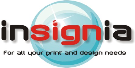
That’s it – that’s the one – go with it 😀

but maybe lighten the shadow just a bit -
i think the outline of white should be less/thinner. im with phil also on making the shadow lighter. maybe about 50% what it is now…
still not fussed on the line of text below name, seems to seperate/push the ball image back when i look at it. needs to all link together i think…
im not helping with this poor comment, i know.. i know what i m,ean but hopeless at putting it into words. sorry…ball reminds me of taw bools/marbles 😉 (thats not anything constructive, just a blast from the past) 😀
go on go on… say… well so does the uksb logo rob 😮
ok, game over… ive spat my dummy 😕
-
 quote rightsigns:That’s it – that’s the one – go with it 😀
but maybe lighten the shadow just a bitThis is my choice too, I’d go with this one for sure, unless someone has a better suggestion of course, then I’ll probably change my mind 😳
I like it tho Dave. Don’t forget to post a piccy of the finished product. :lol1:
Shane
-
I’m still not happy with your under bit I would maybe go for a euro or impact or arial blk
Lynn -
i think this may be the one know, thanks to everyones help..
when i look at the first design i posted and then this final one im glad i posted here for all your advise..
thanks to everyone im off to print my first corp t-shirt with my logo on
so ill take a picture and post me wearing it as my avatar(when i work out how to do it)..
thanks again everyone for your help..
i really appreciate it and hope in the future with a bit of experience under my belt will be able to help someone else in return..
thanks..
Dave..
Attachments:
-

I like how designs “grow” here. It’s cool to see everyone trying to help out when they can.
-Marek -
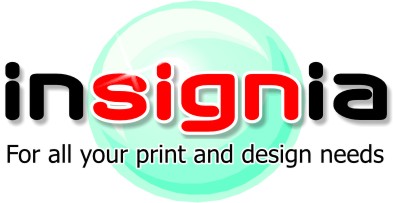
….I liked the blue better….
I’m a woman and it’s how we are.
That green looks like a breath mint…tee hee.
I’d add a pink tone to the red if you’re going with this one,
it just plain clashes!
“For minty fresh signs that don’t leave a bad taste in your mouth”
Love….Jill -
i prefer the blue too, not fussed on the mint. 😕 still not sure on the lower text 😉
-
Sorry if this is going backwards, but I missed out……still liked the 3 i dots would change to represent CMYK
borrowed Rob’s ball..would then look at the text colour!
Cheers
Andrew
Attachments:


Log in to reply.