Home › Forums › Sign Making Discussions › Gallery › vehicle graphics: spring clean
-
vehicle graphics: spring clean
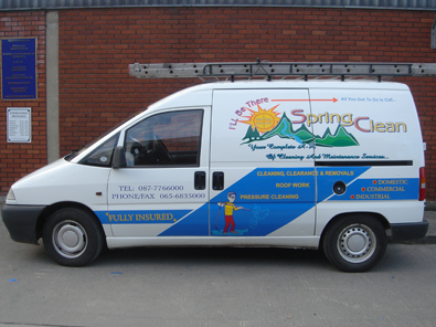
Posted by James Smyth on 9 April 2005 at 03:25This job we completed last week, was happy with result,
Any feedback welcome…?
Attachments:
 Jill Marie Welsh replied 20 years, 7 months ago 12 Members · 13 Replies
 -
13 Replies
-

Very eyecatching but not for me.
In my humble opion it is too busy, looks like two vans. Top half from one bottom half from another. Yellow text on blu is hard to read.
But it will be seen
Regards Adrian
-

Sorry James like the others theres something about it that doesnt quite look right, I suspect the customer wanted all the detail on it which is always awkward to do and make the van look really good. I like the logo and name but personally feel it is a little close to the bottom of the panel, I would have lifted it a bit and reduced the gap at the top.
The bottom of the van to me looks like an after thought or something done on a couple of latter dates if you know what I mean, customer comes back says I need this put on and you have to find a space to put it. As has also been mentioned not sure about either the yellow or red on the blue.
Sorry to be so negative, I really liked the car you posted but not so keen on this.
Mind you don’t listen to much to what I have to say, I’m not a great designer I don’t mind admitting that but I am trying to learn and improve myself. At the end of the day it comes down to opinion so if you and the customer are happy with it then its a job well done. -

I agree that the yellow doesn’t stand out too brilliantly on the blue, but I think this is one of those where the photo doesn’t do the job justice. It’d catch my attention if it passed me, and although there is alot of information on there, the main thing is that people will look at it.
Bet that took some time to apply as well! 😮 Is the top section a print or vinyl?
Cheers, Dewi
-

It is a little busy,
but I’ll bet the customer liked it.
As long as you charged accordingly, that’s all that matters.
Lately I find my high design ideals slipping by the wayside
as my quest for cold hard cash takes over.
“What? All-caps red brush script with a black drop shadow? SURE!”
Well, I wouldn’t go that far, but lately I’ve gotten sick
of trying to educate the client, and I just shut up and take their money.
Sad, ain’t it?
Constructive crits would have been to add a punchy black outline on top,
and made the blue parts on the bottom in black to tie it all together.
Love….Jill -

I think it is a bit busy too, but has lots of colour which no doubt draws the attention. A darker blue would have probably worked better with yellow text in my opinion.
End of the day, if the client likes it, that is all that matters.
Like Jill says, as long as you charged accordingly everything is sweet.
I tend to think like Jill too, it is a fine line between only doing jobs with design merit, and being able to afford to eat!
Sometimes you just have to take the money and run…. so to speak..
-

Hey James,
You’re happy…Customers Happy…Bank Managers Happy….its just one job out of thousands that you’ll get to do.
I agree with Dewi, that the picture possibly doesn’t do it justice. But it’s bright and breazy and will certainly get noticed.
I’ve found in the past that the most rubbishy jobs I get to do, where the customer has insisted on his design, pulls the most referals.
People are so pleased with themselves, and the fact that you’ve gone along with them that they tell everyone how great you are ! 🙄
Mission – pay the bills, sleep well at night !
Thanks for posting your pic
love from
Cheryl -

I pretty much agree with everyone because I cannot form my own opinions yet. 😀 j/k
I like the top graphic, it would look great by itself I think. What does the back look like?
-Marek -

I agree with the others on this – I tend to go for more of a “less is more” design as sometimes there is just too much to look at.
No doubt the customer would have been really pleased with it though, and that’s important.
On the positive side, it looks like it must have been quite time consuming in both design and application, and that’s an acheivement in itself! -

I’m sure the picture doesn’t do this job the justice it deserved.
Altought i tend to agree with everyone about it being too busy, i’ve to recognize this: it catched my attention, and thinking that 95% of the potential customers will only see the van for a few seconds than it as done it’s job, only thing it’s that they’ll have to run after the van just to catch the details. As we all know this was probably one of those jobs where customer wants that only that, nothing less, we can see that from all the lettering around the logo.
I recognize i’m the first to dislike any of my jobs, when looking after finishing them, i always think that i could have improved something, but what the h**l, i need to eat also, and i can’t eat designs.
I think Cheryl’s words said it all: Mission – pay the bills, sleep well at night ! , in the end that’s all the counts.
Great fitting job!!!
Keep up the good work!!Cheers
Britchenko -
Indeed the customer was very intent on getting all this onto the van and personally i would have calmed things down, but the customer was more interested in having all the info as he has a number of inner city contracts and the van in his eyes would be viewed parked more than when coming and going.
But as the ol saying goes “the customer is always right”
All said, its nice to get professional feedback
Thanx guys
-

i know the feeling james, any way if thr customer was happy, then thats the main thing! i did a van recently for a block layer, when i started to explain the best way to go about it, he started to walk away & shouted, your the sign man, i am a brickie! call me when its ready 😉
came back for van & was well impressed if only all customers wer like that!! -
Just 10 days ago I lettered 2 trucks for a man whom I had sold a new logo to last year.
He LOVED the logo, but his wife did not.
I lettered his old, hideous all-caps Times Roman logos on those trucks.
Why fight it? His money was just as good as someone’s who appreciates me.
My favorite customer is the kind who comes in, with a deposit, and says
“just make it look good”.
(and who doesn’t listen to his wife)
Love…..Jill

Log in to reply.