Home › Forums › Sign Making Discussions › Gallery › vehicle graphics: norrie brothers
-
vehicle graphics: norrie brothers
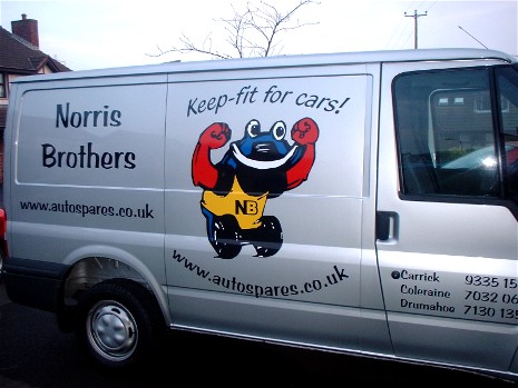
Posted by wmcauley on 1 April 2005 at 15:55Hi all this is my first post in show us your stuff
any feedback welcome
Wilbert
Attachments:
 wmcauley replied 20 years, 7 months ago 8 Members · 9 Replies
 -
9 Replies
-

The image is an attention grabber that quickly tells folk what the company is about, so it does the trick for me
Why did the client want the web address twice though (?)
John 😀
-

Hi John
Thanks for the reply, thats what the customer asked for to fill the spaceWilbert
-

haha!
I really like cartoony images on vehicles – it def. gets attention.nice 😀
-

I like the toon,
but I woulda liked to see tighter copy in a different font.
Nice use of space tho & thanks for sharing!
Love….Jill -

Looks good. I am a great fan of toon type graphics.
My only critical comment would have been that I would have dropped the second web address under the toon, and made the toon larger to fill that space.
Apart from that, well done in my opinion.
Thanks for sharing
-

Norris Bros looks a bit lost, I would have used all caps for a bit more impact!

Log in to reply.