Home › Forums › Sign Making Discussions › Graphic Design Help › can anyone help with layout for my company advert please?
-
can anyone help with layout for my company advert please?
Posted by Ian Higgins on 29 March 2005 at 10:33Hi Folks,
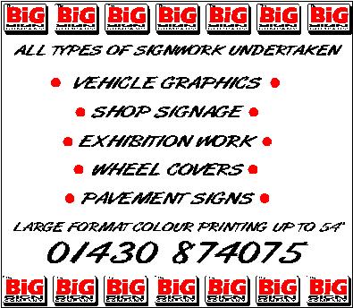
I am trying to put together an add for myself… As usual drawn a complete blank.The logo I have used for the past 6 years is not easy to work with.. any help appreciated.
Cheers
IanIan Higgins replied 20 years, 7 months ago 9 Members · 13 Replies -
13 Replies
-

hi higgi
would it be possible to edit your post and also add a .jpg picture along with the other file mate, lets folk see at a glance what your working with.cheers mate 😀
-

Hi Higgi,
Sorry I haven’t got time to have a dabble with your idea, but maybe my comments may be of help to you or maybe not 😕 😕
Firstly I noticed you are using a small logo with the word BIG on it, i reckon I’d be more inclined to blast this logo and make it stand out, you do BIG stuff so have a BIG ad to say so!!
I like the idea of bullet points, but there is a lot of white space on the ad, don’t get me wrong space is good, just not too much of it if ya know what I mean.
At first glance the advert looks slightly dated with the use of the font that you have chosen. Maybe something more bold and up to date might be needed.
I may be way off here mate, but these are just my first impressions. Please don’t be offended.
Hope this helps, sorry I can’t do more. 😉
Aaron
-

Ian it might help people to know what you want this advert for as well, I mean is it to go in a paper or magazine or on a sign board as it can make a big difference to design and choice of colours.
I have to agree with arch digital about the logo as well, looks a bit odd to me a tiny little box with the word big in it!! -

Cheers For the replys…
The advert is to go in the local trades magazine. It can be full colour or spot it does not matter.
Cheers for the comments Arch… I agree 100%
Ian
-

…the over-use of a casual font may cause blindness…..
also red and black, altho commonly used,
have the same optic color value so they actually lack contrast.
I’ll see if I can mock up something, not that I am the Goddess of Signs.
Love….Jill
PS
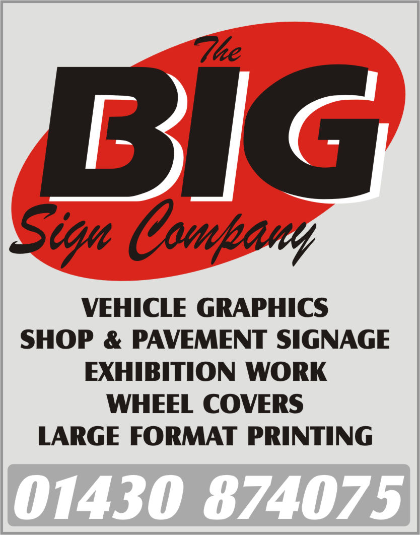
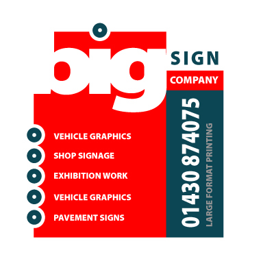
Here ya go, just a quickie. I simplified your text too. 😉 -
Jill is on the right tracks there, nice work Jill.
😎 😎
Aaron
-
Thanks Jill,
I like very much.. gives me something to work with
Cheers
Ian -

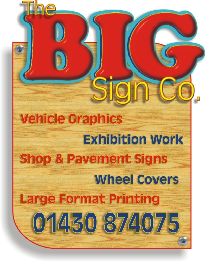
Here you go Ian,
Needed something to do, lack of motivation today!! 😀
Attachments:
-
 quote :not that I am the Goddess of Signs
You mean……..Not a goddess?
I’m disappointed Jill, you have had me under an illusion for so long now… -
Cheers
Nobby.. I will post my final design once I have made a decision..
Cheers
Ian -

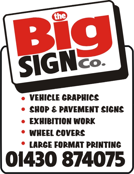
I needed something not as stressfull as i was doing soo i decided to give your ad a go, i really didn’t understood if you do all that and don’t have any artwork barriers why should you stick to 2 plain and simple colors?
Took 10 minutes and i already had too much coffee today anyway 😮
Cya
Britchenko
Attachments:
-
Thank you all for the input…
It is quite amazing the amount of talent on these boards. Everyone has their own style which all adds to the confusion..
Why is it that when it comes to our own logo and design we seem to draw a blank?Plenty of ideas now though..
ThanksIan

Log in to reply.