Home › Forums › Sign Making Discussions › Graphic Design Help › can anyone suggest improvements to this logo please?
-
can anyone suggest improvements to this logo please?
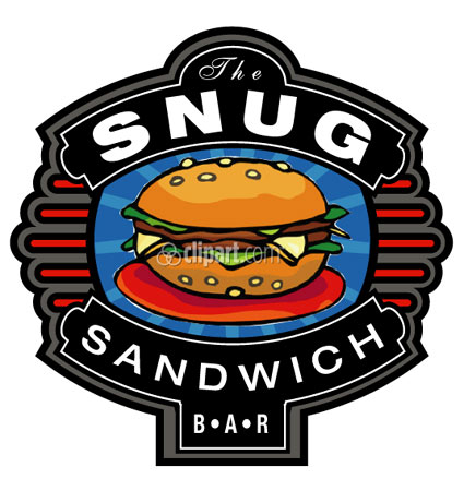
Posted by magpie on 26 March 2005 at 11:06Hi,
I’m working on this design at the moment, this is a first draft from an initial sketch.
I thought I’d throw it open at this early stage to get some input and perhaps some guidance to some better clip art and or fonts to try etc.
Basically I’m just eager to learn and improve, so any help welcome.Thanks, Peter
Attachments:
 magpie replied 20 years, 6 months ago 13 Members · 18 Replies
 -
18 Replies
-

Hi.
The first thing that jumps out at me are the mis-matched fonts.
“the” is so formal, like for a lady’s tea room.
I guess you are temporarily using Hellvetica
until you find something better.
You need something “fun” yet readable.Sign DNA has some cool fonts, like stuff from CrazyJack.
http://www.signdna.com/v2/cart/category.php?id=63&gp=46I also think that the red linear elements on the sides need to be changed
to the golden yellowish color of the sandwich bun.
Red touching black without a white pinline to separate have the same value.It is a nice design with lots of potential. I like it!
Thanks for “exposing yourself” to the criticism of folks like me!
Love…..Jilledited to add a cool free fonts site that lets you type in text:
http://www.dafont.com/en/theme.php?cat= … asst=alpha -

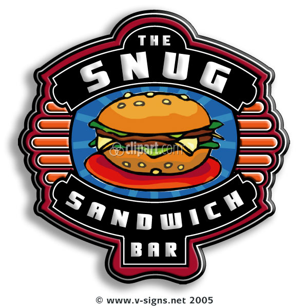
Hi Jill,
thanks for joining in. Yep you’re right the fonts are mismatched, I was looking for contrast
but as yet can’t afford to splash out on the fonts you and others integrate so well.
As for the helvetica, well quietly I am a fan of it, but yes your right I was looking for something
a little more informal.Had a play with the linear elements as well as some other things and went a little emboss
crazy in photoshop, lol.So here’s the second installment.
Cheers, Peter
PS the link are great
Attachments:
-
It looks nice!
I would still change the color of the side thingies.
And maybe make that outer outline part orange?
Meant to say earlier that the area where “BAR” is
could be just a little bit wider, horizontally.
Figure in the cost of a font as part of the job.
You can use it again forever.
I only buy a few a year.
Love….Jill -
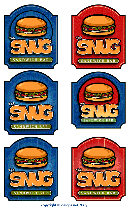
OK so I’, not the fastest turnaround in the world, but I’ve been trying to refine
my technique; looking at stuff by Leslie Carbaga, Illustrator WoW and Stevo’s
stuff.
Please let me know what you think.Cheers, Peter
Attachments:
-
Niiice.
I like the one on the bottom left the best.
Darn it, now I’m hungry!
Love….Jill -

Peter,
I`m pretty impressed by them all to be honest.
The simplicity of the later ones is great but i also like to originals.
Sorry to be of no use to you from a choice point of view. 🙂
-

nice work peter…they are all good attempts 😀
but i will go for the bottom left too as it all blends in together, but i also like the one above too 😛 the burger gets lost with the swirly thing round it on the other ones, i like the layout for snug..but i would have made the ‘the’ a bit bigger 😛 😉
Nik
-

Bottom right for me Peter 🙂
have a problem with blue and food
would like to see a nice SNUG deeper Rioja RedCheers
Andrew
-

bottom right… Red works well with Food, look at McDonalds, Wimpy, Burger King and all the rest of the them. Bright Red 32C
-
You do have a point about the blue-n-food.
I love the “glow” of that blue one tho.
And if you choose the red, I’d change the green panel
to…..BLUE!
love…jill -

bottom right for me but your original had a nicer burger
Lynn
-

Blimey Pete! 😮 All the designs look great to me, you’re coming up with some cracking stuff! Is it going to be a sign or are you working round ideas at the moment? Either way, really does have a style to it, top class style as well! 😀
Cheers, Dewi
-
I’d go for the bottom right one, only because as it has been said red and food go together, the left one looks like a cold burger, but they are all cracking designs…
-

Botton right for me too 😀 They all look good Pete, you’re doing a good job there … 😉
-

Bottom right for me too mate. As has already been said, blue ‘n’ food are not a good combination in a marketing view. Blue would suggest cold in a subliminal sense, red/orange suggest hot. If you selling hot food, don’t make it a blue sign and visa versa.
All of them are good tho.
Cheers, and well done
-

Like them all but prefer the top left design but done in red 😮
-
Thanks for the feedback, I’m going to try and incorporate your suggestions into the panels. Personally I prefer the bottom two and as many of you suggest I’ll push the red one forward for this job and the blue one I can adapt for his fish n chips shop which I’ve just found out about 😀
Thanks everyone, its been a great help.Cheers, Peter

Log in to reply.