Home › Forums › Sign Making Discussions › File Swapping › font id needed!!!!
-
font id needed!!!!
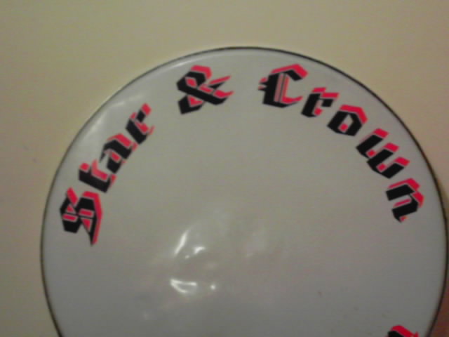
Posted by Craig Gibson on 8 March 2005 at 19:28😕 can anyone help need this font urgent
Attachments:
 Tim Painter replied 20 years, 9 months ago 6 Members · 8 Replies
 -
8 Replies
-

Looks like some nasty form of old english font but it might even have been altered by the looks to simplify it 😕
If I had a font like that to match I’d spend the time convincing the customer to try a new one rather than matching it !!Sorry, not much help really 😉
Nigel
-

you are right nigel it is old english I don’t think it’s been changed though it’s only the upper case that is elaborate
Lynn
-
 quote Peter Normington:you are right nigel it is old english I don’t think it’s been changed though it’s only the upper case that is elaborate
Lynn
peter is right… as is nigel… old english but caps & case… 😉
-

found it!!!! American text bt!! 😀
Next question, using Coral Draw how do i get the visable detachment from the red and blue?
-

Convert text to curves.
Create another copy of the text overlay it in the correct possition then use trim function.
Then shift the text slightly to create the gap between the two.Hope that helps.
Tim.
-

sorry tim but that would make the gaps un-equal.
place red and black where required – contour the black by the amount of gap required – seperate the contour line from the black – trim the new contour from the red.sorry to nit pick
chris
-
True Chris I do it your way also.
I didn’t look close at the pic thought it was like a drop shadow with a gap between.Tim.

Log in to reply.