Home Forums Sign Making Discussions Graphic Design Help Looking for Guidance/feedback on logo design?

  • Looking for Guidance/feedback on logo design?

    Posted by Moonsmurf on 19 February 2005 at 01:59

    Hi Guys
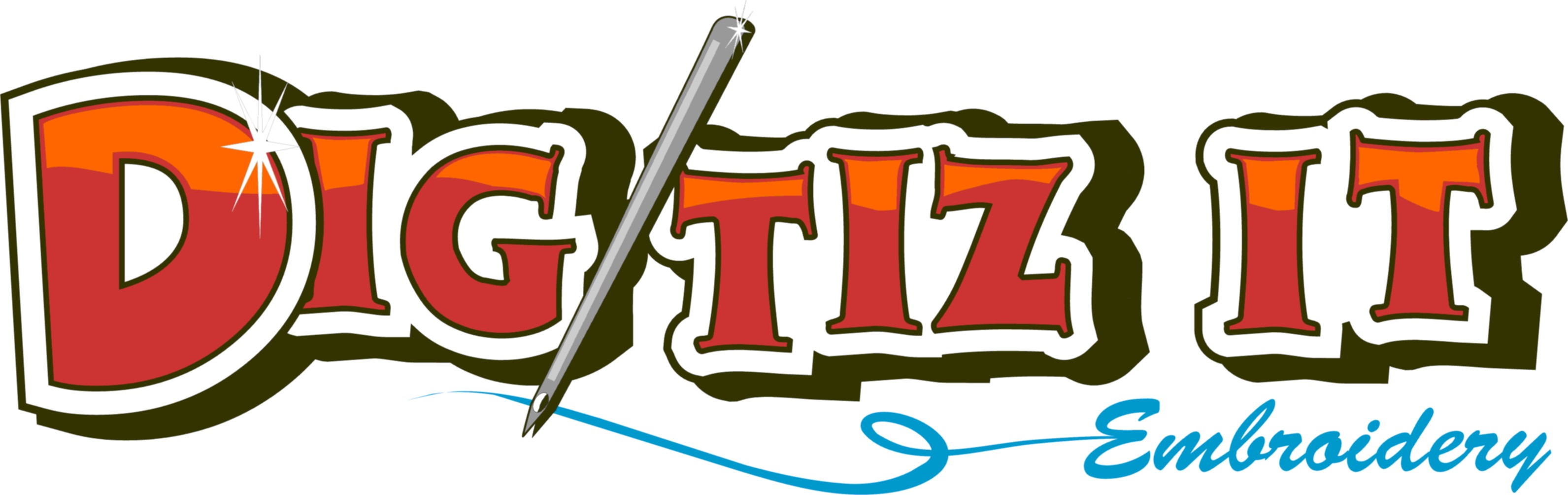
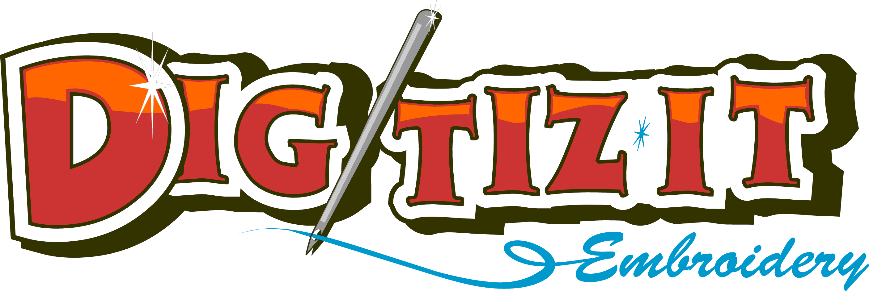
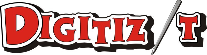
    This is a logo for an embroidery company, I think trying to make the needle into an I, might not have been the best choice in the world.

    This is going to be used on stationary, signage and eventually shirts.

    I ‘borrowed’ an idea from Dewi (Thanks Dewi! 😉 ) I am still kinda finding my way a little in Corel.

    I would appreciate any feedback

    Thanks

    Lanie 🙂


    Attachments:

    Bill Dewison replied 20 years, 8 months ago 3 Members · 3 Replies
  • 3 Replies
  • Moonsmurf

    Member
    19 February 2005 at 02:00

    oops forgot to post the very first one I came up with 😳 😳 😳


    Attachments:

  • Shane Drew

    Member
    19 February 2005 at 04:32

    Lanie, I like the concept very much, not the first attempt tho (picture #3), but I do have concerns that the needle does not add an ‘i’ to the name. The first picture reads dig tiz it because your shadow/outline is grouping the text, and as the needle has no outline ot shadow, it is actually looking like an afterthought 😕

    To make the ‘i’ out of the needle, I think it needs to be closer to the height of the lettering too. just my opinion. I think you are nearly there tho.

    Cheers
    Shane

  • Bill Dewison

    Member
    19 February 2005 at 17:54

    While the logo mainly about embroidery, could you not use a bold font, then apply what looks to be a weave to it in photoshop? Maybe with a bit of thread hanging off the .com bit. Just an idea and as its not necessaryily in cut vinyl, you can make use of some of those fancy filter tricks 😀

    Cheers, Dewi

Log in to reply.