Home › Forums › Sign Making Discussions › File Swapping › can anyone help deciding which font i can use for design?
-
can anyone help deciding which font i can use for design?
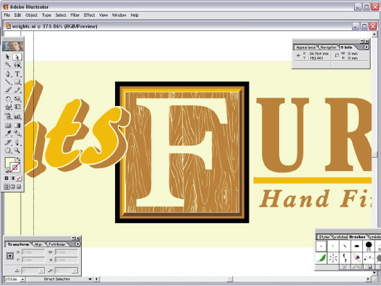
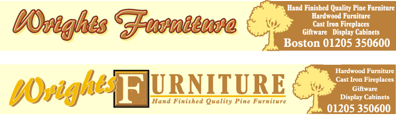
Posted by Steve Broughton on 16 December 2004 at 13:32Stuck with the script style for "Wrights" 🙁 but pretty flexible for everything else, size is 16′ x 2′ what do you think then ??
Attachments:
 John Singh replied 21 years ago 8 Members · 13 Replies
 -
13 Replies
-

Nice Steve.. i prefer the top wright but the rest as the bottom one…if that makes sense
And maybe add highlights to the furniture bit???
-

You’ll probably get pulled up on not using a pine tree outline, as their stated preference is pine furniture 🙁
-
Pete to which I’ll reply “Its a f***in tree! who am I David Bellamy!!” :lol1:
-

im with Simon on this one.
Use the words “wrights” from the top design and put it in the bottom, keeping the design for furniture, from the bottom.
I’d drop the shadow on wrights, as it’s too much. maybe even thin down the black outline too.. as its closing up the text.
I’de also make the word “Wright” in the gold colour.
The section at the right hand side breaks it up nicely, but all the text is screaming for air. Needs a different font, sanserif, and scaled down slightly. It’s far too close to edges.
If you try and look at both designs at the same time, you will see the bottom one stands out far better and is easier read. Although “wrights” is merging into background. At the same time all the text on the panel to the right becomes one.Not knowing the substrate or if its going into a trim? If not it would maybe be an idea to make a thin border around the cream background, same colour as panel on right.
-

Steve as everyone else Wrights from the top and Furniture from the bottom. the only other change would be to reduce the letter height of urniture slightly, not a lot. Might be my eyes as I get older but it looks a little tall. 😮
-

Here’s my take on it.
Please bear in mind I have only been using Corel for 10 days.
I know I suck at it! Of course I had to substitute a different script.
And I’m no Stevo!
Love….Jill
Attachments:
-
Steve, that’s a cop out, it’s like saying a I’ll use any 4×4 outline for a Range Rover dealer. Perhaps I’m inclined to being anally retentive, but it’s attitudes of it’ll do that I thought your approach to signmaking was trying to rise above.
Cheers, Pete
-
LOL in keeping with my original post that should read something like:
“some people are inclined to being anally retentive”.
Guess I’m some people then 😳 -

Personally i would go with simon and rob, use the top part (wrights), then use furniture from the bottom. Then lose the tree but still have the brown coloured box on the right hand side. I take it this is for their main building sign, so it is important the guys name stands out. The top wrights looks a little wishy washy, just the colours used mind. The tree takes abit of your attention away from what the sign is there for.
Hope this helps you steve.
Stephen
-
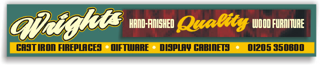
Well just look at how that one little change has completely transformed the sign 😉
I think I like that, one question tho’ is that a Scots Pine or a Douglas Fir?Seriously though, while that is much better, I think its a little heavy on the left hand side due to the black and red. It needs something to balance it over on the far right, just not sure what needs changing?
-
quote magpie:I think I like that, one question tho’ is that a Scots Pine or a Douglas Fir?
:headbang2: :tongue:
-

Great to see your stuff
I know we’re all offering constructive observations…… but I’m certainly inspired by your workJust love what you’ve done with that red outline and highlight
John


Log in to reply.