Home › Forums › Sign Making Discussions › File Swapping › Limo Vector and What do you think of this.
-
Limo Vector and What do you think of this.
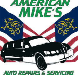
Posted by storeinet on 11 November 2004 at 12:47Hi All
Just knocked this up for a client, it’s a bit basic but you get what you pay for. So would appriciate your views…..
Also the customer would like to change the car to a stretched limo, but i can’t find one with a 2d prospective, can anyone help?????
All the best.
Dan
Attachments:
 Jill Marie Welsh replied 21 years, 1 month ago 6 Members · 23 Replies
 -
23 Replies
-

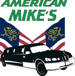
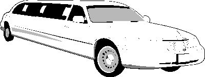
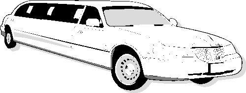
dan try this one i drew from a photo
-

Yup I think you need to change the limo,
as mostly what we have here are stretches.
(and a few Hummers!)
I also think that you need a “ballsier” Yank-looking font
like Crillee or Chaney (Chainlink)
Or even a “gangster” Bonnie & Clyde style Art Deco font.
But I do like the design.
Love….Jill -
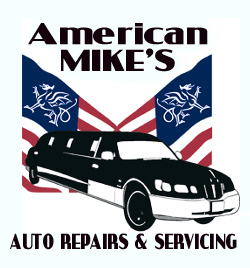
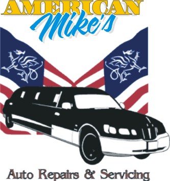
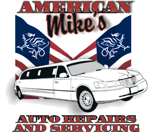
Thanks to Steve for the limo.
Also thanks Jill for your imput.
With Jill’s coments I’ve played around a bit, moving the limo around more than anything.
So here’s the competition, which one is the client going to run with?
There are still tel numbers to be added, but his waiting for the phone to be installed.
Dan
Attachments:
-
I like #3 the best, but watch your kerning & distortion.
And keep the red! Ditch the green.
Love…Jill -
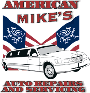
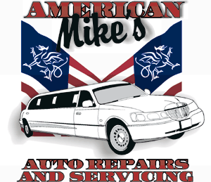
Back again, I don’t mean to be a pain.
Here is my take.
I went to http://www.letterheadfonts.com
and downloaded the free font Bell Boy.
It has an Art Deco feel.
Changed the copy to black to balance out the limo.
One thing, dunno if it matters, but it is considered
bad etiquette to “mirror image” the flag.
Love….Jill
Attachments:
-
errrr that liomo is supposed to look like this mate
Attachments:
-
I like Jill’s version with the bolder font. Love the flags! 😀
If there’s room to nudge the price up a little bit (as this would mean extra work) an idea maybe to infill the word ‘American’ with the American flag, then outline it in black. Just an idea 😀
Cheers, Dewi
-

Here’s a nice Americany font. It’s the one off the dollar bills.
Attachments:
-
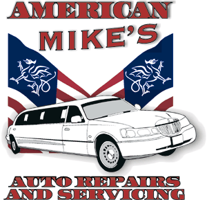
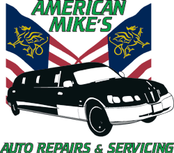
Thanks all for your comments they have been taken on board.
Would like to give a big thanks to Steve, who telephoned me this morning of his own back, got to say never in a million years expected that – thanks again.
Thanks to Jill & Big G not forgetting Dewi. all the best guys’n’gals.
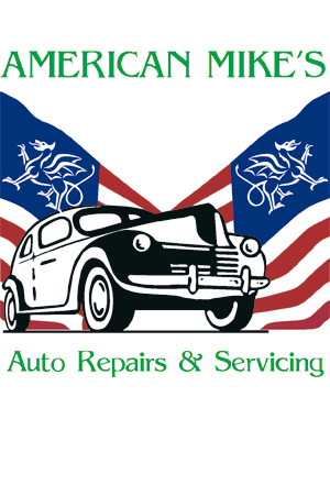
With all of your comments this is what I’ve come up with.
Attachments:
-

it sure has come a long way from first post ,i really like the finished art work it all fits together very nicely
-
It looks MUCH better….
But OH PLEASE lose that distorted
Copperplate Gothic….it is too severe a font.
Do like Big G and use a nice script,
NOT Brush Script, maybe Brody (Brophie)
I know I sound bossy but I’m a woman.
You’ll be glad that you listened.
I do like the secondary copy in 2 lines,
I almost did that myself.
Love….Jill -
Steve, here it is with a drop shadow, not to sure if it compliments it or not????
Attachments:
-
Like this mate, yours is like a halo all the way round, drop shadow down to the right.
Attachments:
-
Here ya go the shadow is not perfect, and the MIKES text has been changed to Brophy (Brophie)?
Thanks everyone this has been an enlighten experience.
Attachments:

-
Make the Mike’s in black and ya got yerself a winner.
Thanks for listening.
Love….Jill -
Here ya go Jill – you people are worst than customers – just joking cheers.
Dan
Attachments:
-
:nagnag:
…no need for an outline Dan.
On the Mike’s I mean.
I do like the shading around it.
I’d maybe even make it just a tad bigger.
Stevo hollers at me whenever I use red and black together.
He says that they have the same color value.
Love….Jill 😉 -
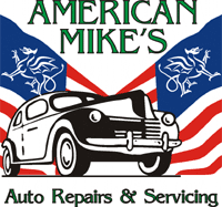
Jill I’ve done what you have mentioned, and a little more. I just could not get on with the M so i chopped it’s nose of.
Dan
Attachments:
-
I like it.
Make sure your shadows are all going the same way tho!
Looks good Dan.
Love…Jill

Log in to reply.