Home › Forums › Sign Making Discussions › Graphic Design Help › can anyone help with my first design please?
-
can anyone help with my first design please?
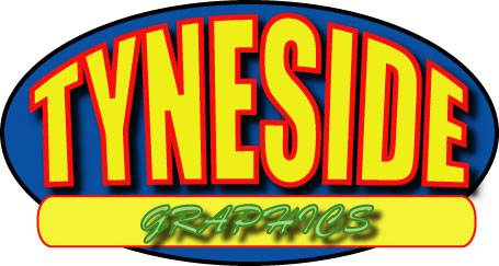
Posted by PhilB on 6 November 2004 at 10:18I thought I’d show you my very first graphic ever, I don’t know if I will use it but it was fun experimenting. I used Illustrator which is also new to me.
Don’t be too hard it’s my first time lol
All i have to do is add a phone no.
Phil
Attachments:
 John Singh replied 20 years, 11 months ago 8 Members · 10 Replies
 -
10 Replies
-

Nothing wrong with that! 😀 The only thing I would have done differently, but its just personal preference, would be to make the graphics into a bolder font (or maybe lose the drop shadow) but again, just personal preference.
How are you producing it? Digital or cut? Only reason I ask is the drop shadows would only work if you were using digital unless you made them into a solid colour. I know, I know, its an obvious one, its just I tend to design now so I have the option to use the design for both, so I stick to solids.
Like the envelope effect and the outlining though, class!
Cheers, Dewi
-
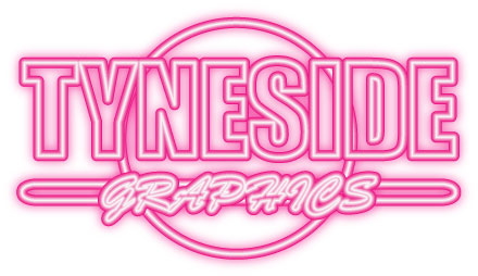
It would be cut so i’d drop the shadows or make the solid like you say.
I don’t even know if thats going to be the name of business, Im just playing with ilustrator atm. Im totally amazed at the features in it.
I especially like the drag’n’drop. I was amazed when i turned the above to neon.
Attachments:
-

Not bad at all for your first ever graphic Phil. 😀
I agree with Dewi, I would prefer the “Graphics” in another font, at present with the shadow aswell its not easily read …….. or it could just be my eyes 😮
Good and all we need now is your avatar 😉 … sorry!! :lol1:
Carrie 😛
-
Never use Brush Script! especially in caps, got to be the most cheesy font ever invented always makes me cringe when I see it anywhere.
But thats just me.
Good first effort!
-

Bout to say the same as cookster myself. never use all caps for a script font anyway there are very few that look good or legable, other than that nice first try. The shadow under the GRAPHICS would have worked if it was a lot lighter as it is it’s too strong and comes “forward”.
-

Agree with everyone here. An excellent first attempt. But…. using a script font in all uppercase is generally considered one of those design sins that should never be ignored.
Good job tho, well done. :thumbsup:
Shane
-

It’s not bad for a first attempt!
And you are brave to post it.
But you will get paddled on your rosy bottom
by Jill’s Mahl Stick of Doom
For using all-caps brush script!
A true Sign Sin. 😮 (you too, PhilB!)
You don’t need the shadow on it either,
the words need to speak for themselves
before you tart them up.
Nice job of prioritizing your copy.
Nice use of panelization.
Nice primary colors.
Nice size, so we could all actually see it.
Now back to the drawing board.
Love….Jill -
Cheers Guys, thanks for all your comments and advice 😀
Im putting a business plan together and hope to be up and running with a vinyl cutter soon.
I will keep reading and perhaps buy a few graphic books to get me used to the do’s and don’ts.
If any has and advice for a new starter setting up shop in his spare room i’d be happy to hear it :lol1:
Phil
-
Hi Phil!
Oops, I thought the second design was by somebody else!
I like it better, except for the unfortunate Brush Script.
While I do use it on a race car, that’s about it.
Try this site for books and tips:It’s a magazine you might wish to subscribe to.
You can purchase Mike Steven’s Mastering Layouts thru them,
as well as several killer fonts including Mike’s own lovely script.If you are using just a regular vynull cutter (like me)
You’ll have to forego the blurry shadows.
There is a product our there in Hi-Performance vynull
called Tru-Shadow, which can be used by itself or layered to
give the effect of natural shadowing. I’ve seen it used,
but not yet tried it myself. Samples below:http://www.speedgraphics.net/new-colors-main.htm
(us paint snobs refer to Vinyl as Vynull)
Love….Jill 😉 -

Apart from the obvious sin ………………
(Try putting up a script font like commercial script in all caps and you’ll see what the guys ‘n’ gals are talking about)
……………I’d say you’ve got the idea and you have the eye for layoutWell done and thanks for sharing
John

Log in to reply.