Home › Forums › Sign Making Discussions › Graphic Design Help › can anyone help with my van layout please?
-
can anyone help with my van layout please?
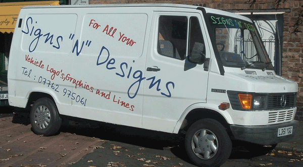
Posted by widget on 4 November 2004 at 10:04I am just trying to design my new escort van but keep drawing blancs.
If anyone has any spare time on their hands and would like to offer some ideas it would be appreciated.
I am looking for something to really stand out,
its a white van so colours should be no problem.
I just got a roland pc-600 and i am wanting to see what it can do.
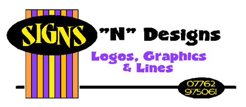
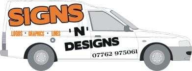
my name is Signs "N" Designs
thanks
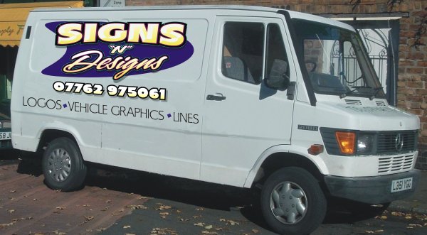
I have attached my old van which i was not to keen on after i fitted them
Attachments:
 Robert Lambie replied 20 years, 11 months ago 16 Members · 132 Replies
 -
132 Replies
-

I think you need to get a company logo or the like sorted, maybe if you have a go at a logo then show us what you have done and then anyone who can and wants to can throw their ideas or designs at you ….. just make sure you duck ….. :lol1: Its hard to just offer ideas when you dont really have a design brief …. do you want modern, traditional, etc etc.
Carrie …. being her ever so unhelpful self .. sorry 😀
-

Stevo did a great demo a couple of weeks back on spicing up text with some pretty simple techniques. Might be worth a gander!
Cheers, Dewi
-

A bit too casual, Widget. looks a bit ‘untidy’ to my mind.
Casual is OK, but has to be done really well not to look cheap and nasty.
For my money, I’d concentrate on getting a really catchy logo. Then you have one of the most difficult parts done. Your logo will then dictate the rest of your style.
I am a great believer in having a graphic in a logo. Having said that, designing a logo for anyone else is heaps easier than designing your own
graphics can say more than words sometimes
Attachments:


-
or these
hope these ideas give you food for thought
cheers
Shane
Attachments:


-

I would do the “widows” as Faux windows with the pc , IE full colour printed graphics looking as tho they are REAL windows and you can see inside (perhaps some singnage tools etc etc – whatever)
I would then use the mid panel for the Co name and tel nos etc on the bottom. Rmeber , wehn you driving , you have about 5-10 secs to get attention and NO ONE reads the tel no etc – while driving the tel no is only useful to see where the co is located , when parked , ppl have time to read and write down.
Essentially the brief is to show ppl what you do , how well you do it and help them remember your name , all in the space of a few seconds- and that aint an easy task – however if you DO pull it off – you gonna get a LOT of customers -
love them they are brill
dont think i can come up with something that good though.
will have a try at something a little more basic and post it up here
thanks everyone
-

Widget, darlin’,
You have a few innapropriate apostrophes in there.
One thing I like to do is PANELIZATION.
Make a fancy-shaped box and put your logo inside it,
then the by-line or phone number underneath.
Red on white, altho it appears to be eye-catching,
is difficult to read.
I’m not a huge fan of slanted scripts or the over-use of
a casual font, either.
I have seen vans where the name is a big, punchy block style,
on a slant, which I like.
If I have time, I might have a go.
Love….Jill -
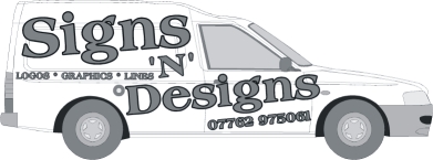
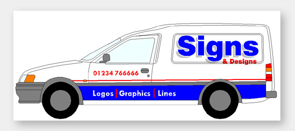
Its a tad crude, but this would be pretty simple to make out of vinyl. It may give you some ideas anyway.
Cheers, Dewi
Attachments:
-
Thanks dewi
love the design,what programme did you use for it?
how would i use it if i wanted to?
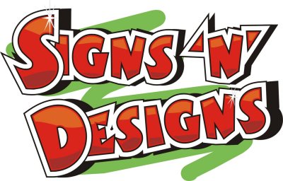
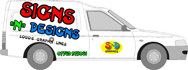
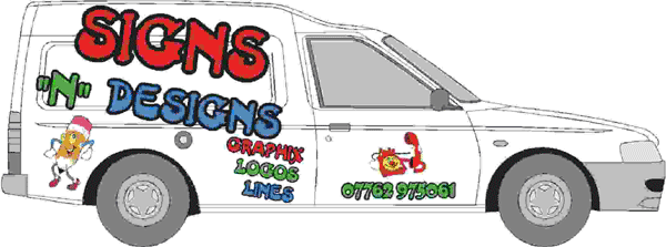
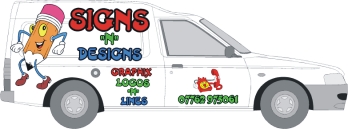
anyway here is my attempt of a logo
what you think ?
Attachments:

-
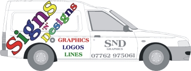
sorry about that big pic,forgot to downsample it
anyway of taking it back out ?
Attachments:
-
It’s um, big 😀 I’m not being an old fuddy duddy here, but I doubt that would look too great in vinyl. There may be a way of sprucing it up a little and popping it through a digital printer, but when you’re designing for vinyl, its better steering clear of the filters and gadgets used to produce shadow effects and the like.
I can upload the file in CorelDRAW format if you want to use it, but it may need a little tweaking before you cut it.
Cheers, Dewi
-
wouldn’t mind mate,just to have a bit play with it.
i do have a print and cut machine so the shadows etc are not a problem
thanks
-
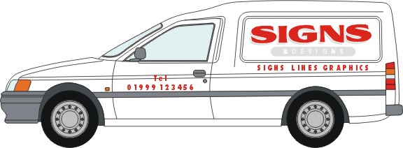
Here’s my take, based on Mike Steven’s alphabets and layouts.
See how I have prioritized the word SIGNS.
Soory about the non-UK van!Also, try this guy’s book, his name is Bob Behounek.
http://signcatalog.hostasaurus.com/Merc … rchant.mvc?
Also, you don’t need “tel” in front of a phone number.
Attachments:
-
Love the effect on the ‘Signs’ bit Jill, really smart! 😀 It’ll certainly get noticed around the town, thats for sure.
Cheers, Dewi
-
Nice one Dewi, I like it.
Jill yours looks good it certainly gets the message across as soon as you look.
Widget …. whoooaaaaa you know how to post um big!! :lol1:
-
love it 🙂
not sure how it would look on my small escort van though
-
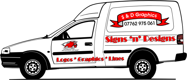
Here then try this one.
I used my Brian “The Brush” Briskie CD
that comes with a SignGold Starter Kit.
Attachments:
-
Thanks for all the replies 🙂
Another question for you.
in corel photopaint is it possible to create a design then export it to make it into sign ?
when i have been trying to load it into corel or my sign software it is very low quality and jagged around the edges -
I usually export in corel as a tif (cmyk) or jpg (rgb) or eps.
Tif or jpg I usually export to size at 300dpi.
They are large files but the quality is always good.
cheers
-

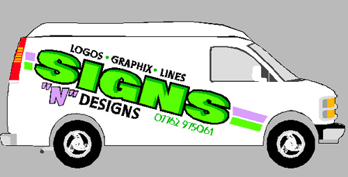
Hey we got some really cool designs happening here!
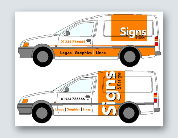
Widget, When I design vehicle graphics I like to keep it fairly simple but try to be as loud as I can with the lettering. People may have only a second or two to actually read it on the road. Text priority is crucial! Your original design has no priority at all.
Here I have prioritized it like this
1. name of your company and what you do is in your name. “SIGNS “n” DESIGNS”2. How do get ahold of you? Your phone #. I have a huge pet peeve when it comes to the word “phone”, Tel.”, or “call” in front of phone numbers. We all know what those numbers are for and it doesnt need to be there.
3. What else do you do? I feel this text of of lesser impotance because I think your name shouts out what you do already. I mixed them up a bit saying “LOGOS VEHILCLE GRAPHICS LINES” The first two have pretty much summed up what you do.
Hope this helps abit for you. Dont be afraid to GO BIG impact on your vehicle graphics. It is the best form of advertising you have.
Stevo
Attachments:
-
Stevo, thats superb!! Was that all done in CorelDRAW? If so, is it really rude to ask how the bevelled edge was achieved on the text?
Widget, at this rate you’ll have the best designed van in the sign industry! 😉
Cheers, Dewi
-
i love it 🙂
cant thank everyone enough for these designs.
but can someone tell me if they are all done in corel draw or in the sign software ?
thanks again
-
stevo
any change you could send me the file in eps so i can impose it up against an image of my ford escort van to see what it will look like,i dont have that mercedes van anymore i am wanting to do my new escort van
thanks
-
Sureeeeeee Widget I could send you the file but I think my efforts are worth something.
Stevo
-
Fifty pence and a kiss? 😉 😉 Not a kiss from me though, um, er, just thought I better straighten that out! 😳 😳
I’ve been playing on and off this afternoon trying to figure out that bevelling technique. Still no joy 😕 I tried following your demo on the bevelling as well, but I must be hard of thinking 🙁
Where did you learn how to use CorelDRAW Stevo? Are you self-taught?
Cheers, Dewi
-
Stevo IS self-taught. Man you should see how fast he does that Corel Stuff too.
Dewi, the alphabet is a prismatic font, they come already beveled.http://www.beacongraphics.com/prismatic-print.html
or
http://www.letterheadfonts.com
Widget, surely you can combine all these ideas into a killer layout.
Love….Jill -
Thanks Jill 😀 It kind of explains why I was having so much trouble recreating that in CorelDRAW 😳 😳 Those fonts are cool though, I especially like the street art one on the LetterHeadsFonts.
One thing for sure, you’re good at self-teaching Stevo! 😀 They say practise makes perfect, personally it just makes me smoke more 😉
Cheers, Dewi
-
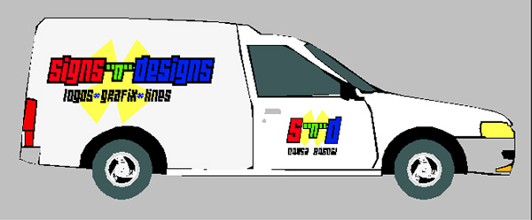
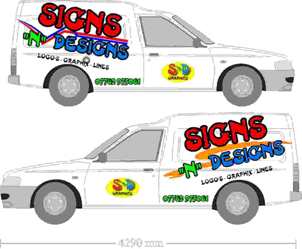
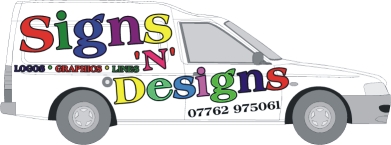
Heres my pathetic effort, i am starting to pull my hair out now.
Thanks for all the help everyone
looks like i really need to get stuck into corel and wait on my book arriving from usa
Attachments:
-
Well it looks better than your first attempt.
Now if we can only teach you how to resize your pix….
My biggest critique would be APOSTROPHES….
It’s just LOGOS, not LOGO’S!
Yeesh!
I applaud you for trying.
You ARE learning.
Love….Jill -
Thank jill
i love your honesty
do you not think its a bit over the top with the colours?
i was expecting to get pulled to bits
-

Hi Widget
If you can resize your pictures so that those without broadband can load quickly, it will help – cheers!
Obviously there’s a lot that can be done here Widget but what I can tell you is that just fooling around a bit with your programme has made you turn out something quite different from your earlier efforts.
In this case it could be a matter of your selection of font
I agree this is a matter of preference but some fonts………well……Try a number of fonts to see if it makes a difference
You should be able to copy or duplicate the original then adjust the copy/duplicateGive it a whirl
John
-
OK, Widget.
Here is another go at it, sized at 600 pixels wide.
I went to this font site (free downloads as a ZIP file)
http://www.dafont.com/en/alpha.php?lettre=w&page=4
I selected an edgier font called Wide Awake,
I wanted to use “widgets” but it was all dingbats.
The background shape is simply the font’s asterisk.
I kept your colors but refrained from outlining everything.
Please excuse my shoddy tracing, but I wanted to get the right type of van.
Love….Jill
Attachments:
-
thanks jill
i like it 🙂have to hand it to you,you come out with some good ideas and quickly.
i can send you the van outline if you want it
anyway does my attempt look better this time ?
Attachments:
-
damn
someones got to learn me how to load these images right and how to resize them
-
Please lose the apostrophe!
You have “graphix” on the side, and “graphics” on the door….
In your sign program or whatever
(i use a cheape Adobe Photo thing)
Go to “size”, re-set at 600 pixels.
I’m not keen on the lines, they look like an afterthought,
and i especially don’t care for the orange.
love….jill -
thanks jill
well spotted
thats because i used your graphix on the design u done.
-
Jill what do you mean by the font’s asterisk?
do all fonts have this and how do i use them ?
sorry for all the questions
-
this *is an asterisk.
I meant to say, too, that if you are advertising that you do lines,
it is good to incorporate them into the design somewhere,
but not like they just got stuck in.
Love….Jill -
for my money I’d lose the “ and just have ‘ instead
shane
-
this is my effort
I’d use red reflective to get extra impact at night 😛
Attachments:
-
thanks for that dsi 🙂
i cant believe how many people have come up with ideas,
still undecided though 🙁been looking for a nice picture for the back of my van to advertise i can do colour prints or small logos as well.
any ideas?
-
There was another thread going a couple of days ago where Chris mentioned a link posted by Rodney Gold. There are some great images on there that you could use 😀
How are you coming along with the van’s side designs? Any closer?
Cheers, Dewi
-
thanks for asking dewi
not really any further forward at the moment,its so hard when its your own van you want done,
i want something super special and eye catching but dont know what 🙁
-
Designing for yourself is always the hardest. I can knock out designs for anyone else all day long, but when it comes to doing my own stuff, I’m just stumped.
There’s plenty of ideas here though, maybe a combination of them may be the answer. Stevo’s ideas are top class, as are Jills, maybe worth trying to combine them to make that killer design 😀
Cheers, Dewi
-
dont suppose you have the link dewi ?
tried a search through forums for rodney gold but he has posted loads of stuff i will be on all night looking
thanks
-
-
i agree stevos and jills designs are absolutely fantastic.
dont get me wrong i have been playing with them for days now but still cannot come up with nothing that makes me 100% happy,
i had the day off today because i had square eyes with sitting trying designs for so long,
i am even dreaming of them now LOL
-
thanks for that dewi 🙂
i liked your design also,was wanting to play with it but for some reason could not download the file you uploaded ?
-
🙁 that link was for special members only 🙁
how do i become one of these ?
-
Theres a link on the main page, I think you need a minimum of Gold access for that section 😕
To download the file I uploaded, I think you have to right click on it and save it to location. If you PM me your email address though I’ll email it to you when I get to the shop tomorrow 😀
Cheers, Dewi
-

sorry mate, ide say no!
at least to the clipart images.ill try give a more creative reply a little later. sorry, got a hangover today 😥 :lol1: :lol1: :lol1:
-
stop drinking that will fix your hangover 🙂
why no to clipart? does it make it look too cartoony
they are vector images
-
i think its a combination of the font used, various colours and of course the clipart.
look at the van as you have it. forget it is yours, honestly ask yourself if you caught it passing you in the street, does it spell sign maker or a proffessional looking company?i dont mean that in anyway bad, i just mean it doesnt have a focal point, its a mass of colour/activity.
for now, forget the van…
design a nice logo for yourself. something that looks sharp. once this is established we can move it onto a van and alter for best impact. -
Thanks for the honesty 🙂
i think its the name “signs n designs” thats the problem,i just cant come up with nothing good.
i want something to draw attention and for them to say i like that.not doing much advertising with a plain white van atm 🙁
-
i would change the font, don’t use as many colours & for now. loose the clip-art.
look back at the past offerings of designs. take on the ideas used & develop something from there.
a plain white van wont do you any good, i agree, but nor will an over the top design. i honestly don’t know how some sign companies get business based on what their own van looks like. your image is very important…a different approach here…
the software you use. is it a decent package, do you feel you are restricted in getting what you are looking for based on how well you can work it?
some softwares are hard to use, this can become a problem in itself.
its a bit like a right handed artist trying to paint with his left hand. he knows what he wants, but getting it on canvas the way he wants it is another thing. so tends to give in & use what he has. -
yep i am limited
only got corel (just learning how to use it)
and basic artcut signmaking software
-
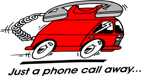
There are 2 reasons that I don’t care for the pencil:
He looks like he draws with his #2 hard lead point,
and…you don’t make signs with a pencil!What about changing your name to
“Widget Grafix”
Then you could have the by-line
SIGNS*LINES*LOGOS
….just my two cents.At least you have figured out how to resize your pix, which is great.
Red on white is usually difficult to read.
Perhaps make a shaped colored background panel
and put your info inside it in a contrasting color.
The phone number could go beneath the panel.
The font IS difficult to read and cartoonical.
Love….Jill 😉 -
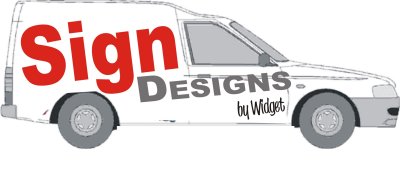
I’d agree with Robert and Jill, the clipart doesn’t do much for the design. 😕
Maybe you’re trying to over complicate things Widget, some of the best designs in the world are very simple. I’m not saying the graphic below is ideal, but its certainly simple and to the point.
Another avenue could be to look at a variety of names you think may work. Choosing a name is again, a toughy, but getting the right name can often lead to some ideas for your designs.
Cheers, Dewi
Attachments:
-
the following designs are not using a logo as such. its just a plain text design, using only black and orange.
the overall look isnt exactly atractive, but at a glance you can see what they doi and its also pretty distinctive if sitting at traffic lights across as street.
im basicaly just trying to make a point that even the most basic of designs van be used on a vechicle to create some sort of impact, without going over the top or by using fancy clipart.
hope it helps a little. im usless at trying to explain stuff like this. :lol1:
Attachments:
-
I have been trying to put all your ides together and came up with this.
is it any better ?
not sure what colours though.
only trouble is i was wanting to put some prints on somewhere to advertise that i do it
Attachments:
-
its better, but still needs a bit more work. colours?
try something new, something tasteful. really only you can decide what best suits.
“designs” are as prominant on your design as “signs” do you think both should equally be promoted?
do you see you earning more from designs or signs? try promte the one thing that will cover all aspects of what you do. then break it down and list it. like window graphics, vehicle graphics etc etc
if you are talking about prints from the pc600-60 then leave that for the back of the van were people get more chance to read and take in what you do.
remember, dont push large graphics from this machine. alsthough it is more than capable of doing them. it is costly to do so. -
Widget, I have to say that this last one is by far the best you have come up with yet, no offence 😉
Carrie 😀
-
🙂 its nice to get told something is better 🙂
i tried replacing the i’s with scalpels but it looked worse.
the grey in the picture was meant to be silver with a black outline not too sure though,i dont think anything too colourful will look good
-
IT IS GETTING BETTER MATE, BUT ONE THING I NOTICE IN ALL YOUR DESIGNS. YOU ARE ATTEMPTING TO MAYBE COVER TOO MUCH OF THE VAN. ALSO WATCH WERE THE DESIGN LANDS ON RECESSED AREAS. YOU WONT BE DOING YOURSELF ANY FAVOURS WHEN IT COMES TO FITTING THE VINYLS, BY CROSSING RECESSES.
sorry about caps 😮
-
Staring to get better. But your choice of Typestyles are Weak. Take a look at Jill’s and my own designs and try to emulate those. The three most importabt rules to designing vehicle lettering, Impact, Impact, Impact!! How about a sans-serif typestyle with a beefy outline, all caps, and drop shadow.
Stevo
-
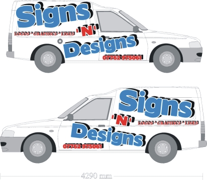
Is this layout any better ?
ignore the colours i am just trying to get a good layout first
and thanks to everyone for their help really appreciated.
you will be wishing i hadn’t joined the forums before long LOL
Attachments:
-
widget, im gonna through away your rotate button mate… 😉 :lol1: :lol1: :lol1: :lol1:
try reducing the size here and there.. 🙄
-
stevo,
sounds good to me.
i been looking for them fonts but cannot find them,
you make it sound easy but i am just a beginner and have not got your qualities or style and i am in just a basic program and corel draw which i hardly know how to work yet.
-
Widget, I think you’ve come a long way.
I like Rob’s color choices and was in fact going to recommend them.
I like the design that you did that was posted just after Robert’s.
But reduce the copy a bit.
Make SIGNS orange with a black outline,
‘N’ DESIGNS plain black,
logos lines graphics (or whatever) orange,
maybe with black bullets dividing them,
and the phone number plain black.
I do think a bolder sans serif font would be the way to go,
like maybe Antique Olive Nord for signs ‘n’ designs,
and Impact for the secondary copy and phone #.
Like Rob sez your best place for a digi print is the back,
where thousands of bored housewives and businessmen
will see you in traffic when they’re behind you.
Love….Jill -
thanks Jill
will have a play with your ideas and see what it looks like
orange is not my fav colour but i will try it i might get a surprise 🙂
-

Widget, you are probably really confused by now, Try Try Try to do your own thing, Whatever you put on your van reflects what you can do. Dont try to run before you walk, no disrespect, most of the designs that have been offered would cause you problems with cutting and fitting. stay simple, Robs stuff is fairly simple, stay on the same lines, you have had loads of ideas, now is the time to commit, Grab the bull by the ball.. horns and do it.
stop faffing about mate you’ll be ok
Peter -
Thanks Peter
straight to the point 🙂
been looking for fonts did not realise they were that expensive 🙁
dont fancy paying $20+ for a font to find out it dont look right
-
Widet
there probably enough fonts on your system without buying any,
Use what yer got. its the way to go. if you need fonts go to pc world and buy a disc for a tenner One mans good idea is another mans yuk..
do it, and do it tomorrow! Always bear in mind that it can be simple and good.
Peter -
http://www.dafont.com/en/theme.php?cat=501&page=2
Free fonts site.
Sans serif.
Main copy Boris on this page.
secondary copy/phone number Headlines page 4.
FREE FREE FREE
Just download em and try.
Love….Jill -
Widge
Have you ever seen a hairdresser with a good hairstyle? or a Tailor with a good suit, or even a cobbler with a decent pair of shoes?
Your van dont need to be acceptable to a sigmaker, only the public, Just advertise what you do, get the customers and then the experience follows.
Customers can inspire you , They quite often have an idea that you can translate for them, Even plain text on your van will be better than none.
Get something on there, you can always change it later.
Peter & Lynn -

Widget, I agree with these posts.
Basically take all the comments on board and sleep on it. Then take another look fresh look at everything that has been suggested. Bear in mind the advice given, and more importantly WHY that advice was given and then create your own new design, based on YOUR skills and YOUR understanding of right from wrong.
That then should be YOUR final design.
We could all keep suggesting a million differing ideas, all valid and all worthwhile, but ultimately you are the person who is now plunging into this business, and it is you who will need to create ideas and designs for your customers.
Naturally we are all here to help, encourage and advise you on your new venture, but your own confidence can only grow as your skills do, and your skills can only grow when developed in your own way.
It is natural to be nervous and uncertain, but through trial and error (and this forum!) good layout and good manufacture will become second nature and soon enough you may, in turn, be dispensing guidance on these boards!
As a last comment, my overall final quality check is a simple one – would I be happy, as a client, to receive any work I had created? If you can truly answer “Yes” then you are doing the best you can and no-one can ask for more than that!
Good luck in the industry, I am sure we will all do our best to help you succeed.
-
Yep you are all right i will sleep on it
Its great to have some ideas though they have really helped me along quite a bit and i really do appreciate everyones help and hope someday i can repay them for their efforts.
heres the design from jills help i done.
next one you see will be the finished result good or bad.
thanks again everyone
Attachments:
-
quote widget:been looking for fonts did not realise they were that expensive 🙁
dont fancy paying $20+ for a font to find out it dont look right
But you have CorelDRAW 😮 It has over 500 fonts (probably more) in virtually every conceivable style, at this stage you shouldn’t have to buy any fonts. In fact, I can count the number of times I’ve bought fonts on, well, two hands 😀
As others have said, the final design choice is all yours Widget, we can all only offer our advice on what we think.
Humble opinion, for the moment at least, keep it simple. Its takes more than a few minutes to master CorelDRAW, I’ve been on it for some years and I can’t even come close to doing the types of graphics that Stevo can do (probably more to do with artistic talent, but lets just go with the number of years, it sounds better 😳 ) Simple designs do work. As Robert has demonstrated, all you have to do is think Orange. A multi-million pound telecommunications company that are known by an Orange box with orange in a very simple font slapped in one corner. 😀
Cheers, Dewi
-

That’s a good layout you have arivved at. The only other thing you need to think about is how that layout will translate when fitted to the other side of the van.
-
Widget,
dont buy fonts unless your desparate
this is how it goes (sometimes)
Me: What font do you prefer Sir/madam?
Customer: Blue or red please.
Me: Ok sir/madam, What style of writing?
Customer: Slanting.
Me: Do you mean Italics?
Customer: No in English please.
Peter & Lynn -

Isn’t it always more difficult to design for yourself than for a customer?
I think you should put all your effort into doing something simple, but doing it well. Keep it tidy and simple. As your confidence grows and you learn a few more tricks you could always redo it. I guarantee that in six months you will look at whatever you do now and realise how much better you have got and want to change it. -
Widget,
not going to advise you on the design, think you will have a problem fitting it round double corners though. -
Get rid of the shadow on the telephone number and sub text, too much.
Main text is ok though, I’ll tell you what always looks nice: text with a very light grey drop shadow. Also, keep in mind the features on the van, like recesses. It appears the text is disappearing onto the roof slightly, maybe it needs reducing slightly.
-
this is just a rough design playing around,when i come to actually cut it i will alter it all right.
about the double corners is there any good advise to get round them ?
maybe warm the vinyl a little with heatgun ?
or will i just have to redesign the layout ?
-
It is possible to heat the vinyl into recesses, but you MUST use the correct vinyl. If you don’t, the vinyl will just pop back out again in a few days. I try to avoid working across recesses because it can distort the look of an image, but if the recess isn’t too deep it shouldn’t be a problem.
-
Widget, design wise, spot on mate! 😀 Your designs are really progressing with this, I really like that one. Only my opinion mind 😳
Fair play though, its not going to be overly easy to fit, but I think thats half the challenge when you start out on your own. Attempt to fit stuff that look or are difficult and leave the worries next to the computer.
Good on you though Widget, you’ve stuck with it. Complete honesty, I gave up on my vehicle after I’d gone through 5 different designs. Its took me 9 months to get back to it and rethink, imagine all the advertising I’ve lost! 😮
Cheers, Dewi
-
quote widget:ONE SIDE LOOKS OK I THINK
Hi Widget. Wow this post has moved on since I last visited…
The important part you need to consider in any design is what it looks like on both sides. Glad you have decided to do the second side.
The key is simplicity.
It is generally recognised that people will form an opinion about a sign in seconds. First impressions count.
I get 1 or 2 jobs a week from people pulling me over in the street, and my van is not overly ‘flash’. But people comment on how good my van looks. Instead of heaps of text, I used reflective material so at night, it stands out in a crowd.
Just my view.
Attachments:
-
again, much better mate but i see you having bother fitting that one. the panels near the door windows scoop away and will leave you open to creases appearing.
also, i dont think it reads/looks right on the left hand side.i have done another knock up based on what you have just done there.
again, im dropping the design part as i dont think it should dominate your van as it is.
my design is again very plain, ive just based it on your font etc.
it will be far easier on you to apply and maybe a little less in your face.
Attachments:
-
I agree with Rob’s theory of keeping it simple. It is an easy trap to fall into that you have to do something flashy on your own van just because you are a sign bloke. Aint true. Neither is it true that you have to fill every inch of space in order for it to stand out. Just do a neat job. A plain simple design, done properly will work. Oversized graphics always look a bit amateurish to me. Maybe you could try a more subtle approach. The last image you posted was OK (with the exception of the overused shadows) but would benefit from being a little smaller.
-
OK, I don’t claim this as an award winning design, but as an example of simplicity. It isn’t trying to be too clever, but is just putting across the information you wish to put across. Literally 2 minutes work….
Attachments:
-
yep, i would say widget would go far wrong using that one mate. very easy to fit, cut etc. maybe red text on the silver panel though…
nice one 😉


Log in to reply.