Home › Forums › Sign Making Discussions › Graphic Design Help › can anyone please help with this kite layout?
-
can anyone please help with this kite layout?
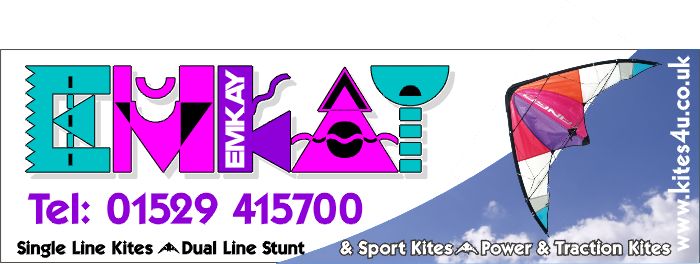
Posted by Steve Broughton on 1 July 2004 at 16:26Right before we start NO I didn’t pick that font the owner did and he’s "been using it on my website and stationary for years" so don’t blame me, gonna be dibond and digi print though I did mention using a real kite, any glaring awful mistakes?
Attachments:
 Steve Thurlow replied 21 years, 3 months ago 6 Members · 18 Replies
 -
18 Replies
-

I like it Steve… looks very different… even if the fonts a bit nutty… 😉
I like the sky being cut away like that with the kite poking out of it… very smart.constructive critisism:
Take the phone number and make 2/3 the size
The bottom line of text (black) I think would be better closer to the (white)
Letting the (&) cut through the blue sky into the white. The kites between the words ide maybe make simple vertical lines slightly larger than text and in the pink above.
I just feel the kites in between makes the text flow into each other, making it a little harder to read from a distance…
The main word I would drop the height slightly too… I think the left hand side of the sign needs some more white to breath… looks a little tight-knit.Great work as ever though mate… Thanks for taking the time to post. 😉
-

Hi
I’d align the lettering on the left to a vertical line, make the black lettering flow into the outlined black without a gap, align telephone number to possibly the end of the word ‘stunt’, make margins top and bottom, left and right the same and outline the web URL in black as it gets lost in the clouds, just some thoughts Steve 😉 -

As mentioned the gap between ‘stunt’ and ‘&’ needs addressing, perhaps a rounded
corner box for that line of info so that it pops out.
Also as mentioned the web address is lost as it is. I’d suggest as this will be a digi print
to give it a drop shadow effect it photoshop, just enough to make it pop but not so much
that it competes with the other elements in your layout.Hope this complements the other feedback you’ve had.
Cheers Pete
-

Yo Steve, How’s it hanging 😎
Looks great…… but, (HA…. payback time 😉 )
How about making the sky a brighter blue? looks a bit dull, maybe a typical Brit Summer’s day. 😕
Also a subtle drop shad on the web address,
Apart from that it’s lovely mate 😆
Cheers, Steve
-
……. Also, at the rear of the kite image, should you have cut out the white background between the kite & ‘string’ to show the sky?
Steve
-
Hope you don’t mind, i had a bit of a play, bit difficult working on a jpeg
Simon,
Attachments:
-
Cool, but doesn’t flow as well as the original, everything is still unaligned and the impact of www is not solved, the sweep of the sky and kite on the original is perfect, just wants aligning and outlining properly, the chosen font (customer choice, not Steves) is horrendous, if the customer doesn’t want anyone to actually know his business name then he’s a fool, modern, but a fool 😉
-
don’t think i agree on the web address outline…
it is there for reference and doesn’t need to be in your face. the www. is lost a little in the clouds granted, but that part is not a necessity to have anyway. the actual address and end code is important and thats very clear white against blue.
web addresses are all to often a string of letters, they should be broken down for easier legibility.
e.g.www.uksignboards.com
subtle but gets the info across… if you give it an outline like the rest the whole things looks like a constant string of text around the aprimetre of the sign blank 🙄
-
quote Robert Lambie:don’t think i agree on the web address outline…
it is there for reference and doesn’t need to be in your face. the www. is lost a little in the clouds granted, but that part is not a necessity to have anyway. the actual address and end code is important and thats very clear white against blue.…Agreed, well, sort of ! some of our customers drop the www. anyway ( just as they dropped http:// ) I still think if its actually going to part of the design then it should there for a reason, no point in wasting space on something no-one can read, just save on the time and trouble of Steve designing and working this into the sign. 😕
-
It hard working with just a jpeg as it has to be crop and stuff…
If an ai file was posted it would be far easier to change text and layout.There needs to be more balance, more space around the text move the web address in from the edge.
I can’t see a way of the text crossing the sky without the sky being cropped, or just have it as two separate sections of text.
The web address needs to be a different colour, possibly render the sky onto the text but reverse it so that the dark part of the sky ends up on the light part of the sky, (if that makes sense).
I think the font and colours are great, its bright and colourful, which helps it stick in the mind, that’s why companies like BT have changed there logos to bright colours and unusual shapes, it all to do with the way we remember things with association (remembering a colourful or unusual shape rather than a company name)
Simon
-
quote Simon C:I think the font and colours are great, its bright and colourful, which helps it stick in the mind, that’s why companies like BT have changed there logos to bright colours and unusual shapes, it all to do with the way we remember things with association (remembering a colourful or unusual shape rather than a company name)
Simon
True, but Emkay sell kites and not global communications. Large established, household names like BT can get away with bad and ridiculous design( not this one of Steves design by the way 😉 ) Emkay unfortunately, cannot.
-
What’s that got to do with it?? How many vehicles or signs do you past every day, how many stick in your mind? The ones that stand out from the crowd, were not talking global companies, a local firm brightly coloured van, different and unusual that’s what stands out, this is why so many signmakers are moving over to digital print, full wraps, etc.
What is good or bad design? Bad design is not being noticed or remembered, or putting down vinyl across a van door, cutting the letter in two.
I bet if you put a two or three leaflets side by side, one with that design on it, most people would look at it first.Years ago, i replaced a sign because the owner was fed up with people coming into his shop, telling him it was spelt wrong, I changed it, and six months down the line was asked to change it back… the reason being, he had loads of people coming in, telling him it was wrong, but while in the shop, they would browse and most bought something (the shop front was very narrow but went back a very long way)….is that good or bad design?
It’s all to do with being noticed,
Why is it children’s toys are brightly coloured, it’s nature way, our brains are developed to notice brightly coloured objects and most times we want to explore them. -
Easy recognition of a company is by logo. Not a word.
A word made into a logo, has much the same sort of impact, so there for must appear simple yet different/unique. i.e. coca-cola.The problem with this word logo is it is hard to distinguish as a word or a logo because it is far from simple. BUT… is recognisable if seen for the second time due to the burst of colours etc. so does work to an extent.
From childhood we are taught how to speak/read from recognising pictures, shapes, colours etc. this is were the logo thing comes to play.
A logo such as PEPSI is recognised worldwide because it has only one language.
It is easier to remember a picture/image/logo than it is a word/name.
How many times have you bumped into someone in the street and thought I don’t know who you are but I recognise your face?Logos work as the face for the company but only work twhen the logo is promoted properly. It has to be seen associated many times all over with the name before the usage of the name is dropped.
More and more large companies are opting for the logo only, these days..
BT has brought in the coloured balls.
Pepsi has the Pepsi ball logo
Nike has now the tick
The list goes on…
I spotted coca-cola has come up with a new, very simply bottle top design in white on red. I bet my bottom dollar this is the final one that will represent them eventually as Nike has done with the tick. 😉example of a word logo not working right..

example of graphic logo working right if seen in any country.

-
Very well put Rob.. that’s what i was trying to get across
Simon
-
Have you 3 finished? can I get on and do this sign now?? 😆 😆 😆 😉
-
I KNOW!!! ……TIZER!….. NO…. IronBrew?
….. Newcastle Brown? 😥 Doh!
(drink1)
Cheers, Steve

Log in to reply.