Home › Forums › Sign Making Discussions › Graphic Design Help › how can i make this key look more 3d looking?
-
how can i make this key look more 3d looking?
Posted by Kev on 27 May 2004 at 18:25Hope someone can give me a few pointers
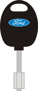
Knocked this up in Corel 11 and wondered how I could possibly make it look a little more 3D looking. It is going to be all vinyl not printedThanks/Cheers
Kev
Attachments:
 Robert Lambie replied 21 years, 5 months ago 4 Members · 11 Replies
 -
11 Replies
-

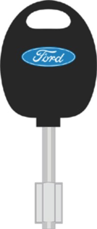
hi there, I have added a couple of colours of lighter grey on the cylinder part which makes it look more 3D, also you could add some shades on the black part (either side) this should give you the effect your after.
Stephen
C&S Designs
Attachments:
-

Thanks Stephen
I did not thinkof putting a thin stripe down the shank 😳
Now the top of the key is what I am really stuck on 😕
Thanks for the help
kev -

upload the vector file here and ill see if i can help also 😀
-
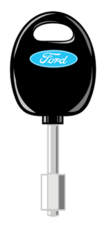
done a quickie on this mate and needs a bit of a tidy-up but gives the general idea. you can keep adding shadows here and there but your only giving yourself work work cutting and applying.
anyway.. hope this helps 😉
-
Rob
“Thank You, Thank You,Thank You” 😀 😀 😀
Its a total transformation, just adding a few bits here and there (well sort of) makes all the difference. Now I’ve seen how its done all our signs around the shop is getting the 3D treatment 😆Thanks again
Kev
-
Once you get the hang of shadows and where to put them they create some really good effects.
Nice one Rob …………. 😀 Looks good …… !!! ours looks really feeble now 😆 😆 We didnt have time to go the whole hog on the shadows earlier on our image 😛 But then again perhaps ours probably wouldnt have looked as good as yours ……. 😉 …. flattery will get us everywhere?????? 😆
Carrie & Stephen 😀
-
quote :flattery will get us everywhere??????
certainly will! 😀
cheques in the post 😉 😆 -

You beat me to the punch, Rob!
All it needed was some white highlights.
That’s why you’re the administrator.
You’re obviously wearing your thinking cap!
Love…Jill -
thanks jil but…
BEER cap actualy 😉 😆 😆
ok whos gonna say it first? BREEZER CAP 😳 😳 😉

Log in to reply.