Home › Forums › Sign Making Discussions › Graphic Design Help › will this window splash stand out enough?
-
will this window splash stand out enough?
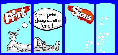
Posted by Bill Dewison on 20 February 2004 at 22:11After being inspired by Terry Bull’s excellent ‘Window Splash’ I’ve decided to do one on my shop window, get my shop noticed from day one. And why not, I’ve stuck vinyl to everything else in the shop, I may as well start on the glass 😉
Anyone who’s seen my special offer A board will know I kind of like the Fido character that boy racer’s have on their cars. So I thought, cool, I’ll stick Fido in my window. That was about 2 hours ago! Since then I’ve been playing with shapes, sizes, different images of Fido until I settled on whats below. It isn’t finished yet, but I thought I’d post it and open it up for a bit of creative bashing about.
I’m not precious about this design, although I like the large Fido chappie, but I added in the bubbles on one side as thats where the window angles towards the door and I thought it’d be smart to overlay my opening times in standard black arial text.
Cheers, Dewi
Attachments:
 Bill Dewison replied 21 years, 9 months ago 8 Members · 15 Replies
 -
15 Replies
-

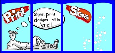
I like it. Just a couple of things: The word print looked like ‘Frint’ when I first looked. I’d try a couple of sample colours on the glass before you decide on final colours; black can be virtually invisible on glass.
-

I’ve altered the ‘Print’ bit, I hadn’t noticed that 😳 Do you think maybe a thin white outline around the black will make it stand out more?
One of the hardest things I’ve found with this is scale. The shop window seems to be a huge space, but when you start spacing things out in it, it seems to get smaller 😮
Cheers, Dewi
Attachments:
-
I don’t really know to what you’re referring. The fido character with a white fill should be fine. I always check colour combinations together by way of a small sample when working on glass as it can do strange things. Colours tend to lighten and dark colours can disappear completely. I assume you will be applying to the inside of the window, which calls for some careful positioning when overlaying, and meticulous squeegeeing around any overlaid parts to remove any possible air outlines.
-

Hey mate, I like that design 😀
As bigG says, I’d definately steer clear of using any plain black (or other dark colour) text/graphics without a lighter outline. Are you going to put all the shaded parts on the fido figure ? I think this would look great but could be a bit tricky to fit, epsecially on glass ? Same for the colour splashes at the top, quite a few layers of vinyl there by the looks…. but don’t let me take any of the wind out of your sails, if you feel confident then go for it, I’m sure you will end up with a great looking display 😉
One thing I try and do when designing window graphics is to photograph the shop (or whatever) and overlay the graphics on the photo so you get a better idea of how the “actual” colours will look when applied in relation to the interior colour and lighting etc.You could always simplify the figure into just a plain white outline and lose the shading to make it easier ? Maybe I’m being a bit defeatist, obviously you layout will look better, so it would perhaps be worth the effort/practice !
Looking forward to seeing the result though 😀
Nigel
-

like your idea dewi!
but i would try and make the wording larger, no one is going to read that from a distance! it could work the opposite too, they will be so intriged at what it says and cross the road!! just to read it!! you can win both ways i suppose!!Nik
-
Catch 22 Nik 😉 On one hand I want ppl to see the words when they’re sat at the traffic lights near the shop, but still have enough interest to come and take a closer look 😕
Did a little research on window splashes and 100% right, everything done in black on a window is outline in white to make it stand out. The Americans seem to be mad on window splashes, they’re everywhere. Even when the shop owner goes to the toilet, he gets an artist in to whip up a quick bit of window art to explain he’ll be back in five! 😉
Interesting stuff this window sign art, I’ll have to read more.
Cheers, Dewi
-

Hi Dewi
Glad to see ive got you fired up on the windowThe fido youve got fits the general shape leaving room for people to peek in but if i could suggest a couple of points , extend some color along the bottom of the window so as to link all the glass panes as one -makes the window bigger.perhaps run more along the top the idea is to make it
big n bold and tie all the messages together.Big letters are not lost when they are cut at window frames
Also think of using stars bombs squares dots stripes anything as a panel to back up smaller text
Treat all smaller windows as just one and forget the frames
My splashes are usually painted but if your using vinyl and want to apply a quick cartoon then cut and apply in black then get some white off the roll straight over the cartoon and use stanley to trim round leaving about 12 mm of white showing beyond the black -really makes it pop out and you dont need to use the plotter
If it was possible to post here id like to play with a layout
GOOD LUCK
Terry
-

Hey Dewi….
You need something in the last window!
Black outlines will be lost on glass.
White outlines will be far better.
Tighten up your copy. I like the guy…looks kinda like you!
Think “SPLASH”. Splashes are bright & wild here.
They are SO easy to paint!
*draw on yer window with a blue Stabilo pencil
*paint over everything with white latex house paint…
the stabilo bleeds thru for a good guideline. Use a 3′ foam roller.
*paint with DAY-GLO sign paint by Rich-Art or 1-Shot
….they go on kinda transparent, that’s why you do the white coat 1st…
(just like coloring in a kid’s book) I use 1″ foam brushes.
*outline in black, leaving a bit of a white outline. Use a good sign quill.
It looks good for at least a year, by then you’ll have a new idea anyway.
Scrape off with a single-edged razor blade & do it again!
It’s cheap AND fun!
Love…JILL (spin) -
Terry, I think it is possible to post images here. Its a tad obvious that I love your work, so go on, blow my frock up (now where did I put that dress) 😉 Seriously though, thank you for the advice. I’ve come up with a variation or two, but since reading this I have some new ideas. Just out of interest, how often do you do this type of window splash work? Is it a big seller where you are or??
Like wise Jill. I really like your style 🙂 Get stuck in there as us Northerners say 😉 I was tempted to have a go with the paints, even Terry’d demo was in paints, its just I’m nervous with a brush 😕 I mean you’ve seen what I’ve done in the workshop!! 😛 I have about 4 windows at the side and rear of the shop though, so maybe if I practise a little on those. I’m just thinking vinyl, its doable for me, and although I know it’ll be a pig to fit, its good experience.
As I posted earlier, doing a little research on window splashes is well worth it. The USA method is very bold bright colours, huge (and I mean huge) graphics and innovative ways of making it easy for the business owner to whip em on and whip em off (ooerrr 😉 ) Huge graphics, I think thats the way to go (out of interest, take a look at SignDevils website, Gary’s done a fantastic one for his shop with a car and HUGE car registration plate, its superb!) I love the Fido image, its simple and effective, but as I said before I’m open to all ideas. I’d love to see other examples of window splashes, so all you closet window splashers! Get Posting!!!! 😉
Cheers, Dewi
-

Looks good Dewi, get something in the Right hand window though, it’s not quite sitting right. I’m sure with you’ll get it spot on. Good luck with theshop.
-
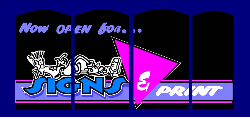
Just a suggestion Dewi
kept the colours subtle though bright to tie in with the rest of the frontageDont want to scare anyone
Didnt know what your messages are so perhaps you can substitute
Terry
Attachments:
-
I think that looks fantastic Terry ! See what Dewi makes of it though 😀
Nigel
-

its got my vote too.. 😉 . not cluttered in the slightest, great impact and ties in with the colours used in the shop. doesnt come across as appearing too corporate/upmarket an image, more freindly & inviting! so joe public wont feel intimadated to stick his head in and ask for a price….
-
THAT’S what I was talking about!
Woo Hoo!
Love…JILL 😉 -
😮 😮 😮 😮 😮 😮 😮 😮 😮 😮 😮 😮
COR BLIMEY!!! 😮
Terry, that is excellent! As Robert said, it ties in with the overall colour scheme of the shop and makes it look so approachable! 😀 Has that been designed for the vinyl or paint approach? Either way, its highly doable, simple and effective lines, cool! Am I okay for using that overall design and layout Terry?
I’m chuffed! 😀
Cheers, Dewi

Log in to reply.