Home › Forums › Sign Making Discussions › Graphic Design Help › what do you think of this design layout?
-
what do you think of this design layout?
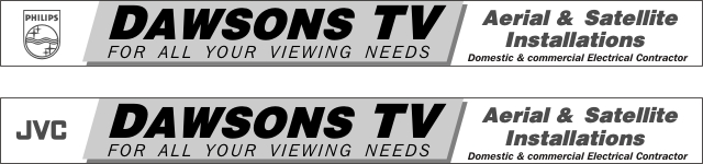
Posted by Steve Broughton on 9 December 2003 at 19:41Right 2 big ol’ fascias to do, both 21′ x 24" not done anything with colours yet just b&w to see if it works? The customer wants on each fascia a suppliers logo JVC and Philips, I think they are trying to get some cash from each supplier in exchange for the advertising so one fascia with JVC and the other with Philips on, make sense ? Whats your opinions ?
Attachments:
 Lee Attewell replied 22 years ago 8 Members · 16 Replies
 -
16 Replies
-

Steve,
When I look at your design because of the white and grey board colours it seems to split up the Dawsons & TV, almost like two different businesses in a shared premises. It does not seem to flow correctly if that is the right phrase. I think if ‘All your viewig needs’ went right to the end of the word TV it would help, as it is with the different font style on the grey it breaks it u too much. (My humble opinion only of course).
Allan
-
Ta mate I did do that originally but changed me mind 🙄 ah well hows this (?)
Attachments:

-

hi steve signs okay!
just a wee point i noticed (for all your viewing needs) the lettering has to be the same slant as dawsons tv! and the white lettering does not stand out too well on the dark grey!! hope you don’t mind my opinion?
Nicola
-
Ta Nik I never noticed that changed it, its not going to be B/W its just that if a sign works in B/W then it will work in any colour, lots of signmakers design this way.
-
Steve,
Much better in my opinion, try maybe moving the grey area over a bit so DAWSONS TV is intirely in the white area.
Allan
PS,
How do you get that little quote to appear from another post.
-
Steve,
There you go we are talking different trades again (ref: Traditional signwriting post). Us who have come into this game from more digital design background would design in colour from scatch.
(I’m only ribbing you honest)
Allan
-
Hello Mr. B
Great idea to break the length of the board with the panel, but I think the tightly spaced heavy fonts tends to exaggerate the length and you’re loosing the benefit gained from the panel.
Alan
Attachments:
-
Thanks for that Alan, yeah thats much better, I’ll nick that idea cheers mate. 😉
-

Steve,
Not too sure about them colours, I take it this company only sell
black & white tv’s then!! 😉 😉Only joking!!
Mark
-

Steve
I actually liked the first one for layout but it does have the uncanny thing about it, as Alan points out, it can be read as two different signs.Alan’s layout is easily readable (Don’t forget to initial the ‘C’ in commercial though if you’re to going to nab it)
John
-
I’m beginning to see you have an eagle eye John 😀
Cheers, Dewi
-
quote Dewi:I’m beginning to see you have an eagle eye John
That’s John all right he gets his kicks from being picky. 😆 😆
We only leave these odd infringements for him to find, you don’t think we leave them by accident do you! We’re far better than that 😉 😆 😆
Alan
-
Ah ha! The cunning double-bluff plan that redirects John’s attention to the lower case ‘c’ whilst at the same time stealing his joke book and concealing it in another forum! 😆
Only joking John 😉
Cheers, Dewi
-
Unfortunately John is continually on the move, he has to spend a lot of time avoiding Des O’connor who wants his joke book back. 😆
-

John’s our “special” friend…He needs to feel important. 😆

Log in to reply.