Home › Forums › Sign Making Discussions › Gallery › vehicle graphics: alvenor aquatics
-
vehicle graphics: alvenor aquatics
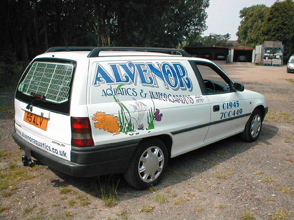
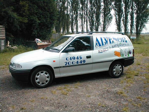
Posted by Sparky on 24 June 2003 at 14:28A regular customer had previously (2 yrs ago) had his van lettered by a well known franchise, then asked them to remove it because it was all directions (they followed all the body lines !!!!).
After 2 years, we finally convinced him we COULD do an astra & make it look right …… we think we managed it, what’s your views ??
Robert Lambie replied 22 years, 5 months ago 10 Members · 10 Replies -
10 Replies
-
I think you made an absolutely fantastic job Sparky.
The use of those curves in the text destroys any chance of the body lines coming into play. (Isn’t that cheating)? 😉
-
Looks Great…
I like how the design is handed…so it looks balanced each side
sometimes it to easy to forget about details like that… -
Excellent job sparky, Nice font, nice angel fish, the telephone number looks a bit lost on it’s own though.
Nice job though well done. 😀
Priced at ??? £235????
Cheers
Johnny S
-
😮 Nice job John!, just goes to show that your’e not as green as you are cabbage looking 😆 😉 😎 , have to agree with johnny the tel number looks a bit iffy, might just be that font though ?
-
Well done, excellent work. Your customer should be well pleased with that.
The Astra is so difficult to get looking right but your solution works really well. 😀
-
Fantastic John!!! 😎 – what a right corker…
Beautiful flowing lines and a very traditional feel to the texts.
sure, the phone numbers a little lonely – but who’s lookin’ at that anyway! 😉
cheers for sharing.
more soon
mikethesign
-
Hey very nice job,
Love the way you’ve done the text and taken into account the two different sides, very eye catching i’m sure it will turn plenty of heads
-
Thanks all,
Yes the customer was really pleased, the “Bossman” didn’t collect it but when his Son & daughter arrived home with it, he made the effort to ring us at home with thanks …. rarity a GOOd customer !!
Agree 100% about the phone number but it had to be prominent & I really wanted to keep it away from the main body of the text /graphics.
points noted for next time 😉
J&D
-
Need I say anything that’s not already been said? 😀
Great work mate! 😉
Ill second the comment on the text direction of flow for each side.. easily forgot.
Works & looks well!
😛
Log in to reply.


