Home Forums Sign Making Discussions Graphic Design Help can anyone help with layout for van please?

  • can anyone help with layout for van please?

    Posted by Mike Grant on 14 June 2003 at 13:05

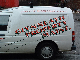
    I have a customer who has a brand new Ford Transit Connect.
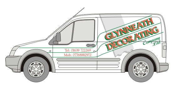
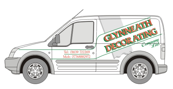
    He wanted it liveried up like his existing vehicle, but after looking at it (and pukeing) I have persuaded him to let me try and improve the design but without loosing the feel of the original.

    This is what I have come up with so far. The customer is happy to a point but would love some imput from you guys.

    The grey stripe is purely to fill a big hole, but it needs something to give the lettering a bit of a lift, It can symbolise a sheet of wall paper, or a painted stripe but without actually being "anything"

    I hope the files work ok as I always have problems in this area. Rob I am sure you will re juggle if I hash up 😳 šŸ˜€


    Attachments:

    Mark Horley replied 22 years, 4 months ago 4 Members · 11 Replies
  • 11 Replies
  • Mike Grant

    Member
    14 June 2003 at 13:11

    šŸ™„

    This should be my effort….

  • Simon Clayton

    Member
    14 June 2003 at 16:00

    Just need the van outline now

    Simon

  • Mike Grant

    Member
    14 June 2003 at 17:54

    One van outline for the use of.

  • Mike Grant

    Member
    16 June 2003 at 17:11

    I don’t want to rush you guys but the van has been booked in for WEDNESDAY šŸ™„

  • Alan

    Member
    16 June 2003 at 20:28

    Could I suggest running the grey stripe right through just leaving a 5mm or so gap around the lettering?
    It looks a bit lost stopping at the outside green lines.
    Not a lot of help I’m afraid Mike but I made the effort. šŸ˜•


    Attachments:

  • Mike Grant

    Member
    16 June 2003 at 21:45

    I do like the way that the absence of the stripe behind the lettering actually lifts the lettering off the side of the van to create a feeling of depth.

  • Alan

    Member
    16 June 2003 at 22:58

    OK fair enough, but would it be possible to loose the centre green line because I think it spoils the illusion of the lettering being on a separate white panel above the grey.

    The three stripes just look like three stripes, where as two look like a boarder to a panel.


    Attachments:

  • Mike Grant

    Member
    17 June 2003 at 10:43

    Thanks guys.

    Mike great layout but as I stressed earlier he wants to retain the sloping lettering as in the picture because “everyone knows his van” I know I am onto a loser design wise but I am trying to keep the customer happy.

    I will try to sway him when he comes in šŸ™„

    Again the green stripes are to echo what has gone before, but I do agree with losing the middle green stripe.

    Will check back later.

  • Mike Grant

    Member
    29 June 2003 at 21:56

    Well one tries your best to make the customer happy with his requests even though you hate what he wants. So just to show him something a bit different, I stuck Mikes layout under his nose.

    Well talk about a change of tune, without even taking a breath he said “I like that one go for it! ” (hot) (:) Aaaaaaaaaaaaaaaaaarrrrggh!

    Don’t that just make you mad šŸ˜•

    So here is the finished article, way over budget artwork wise because of the time trying to make him happy with HIS instructions, but one happy customer in the end which is what it is all about.

    Many thanks Mike for letting me steal your artwork šŸ˜€

  • Mike Grant

    Member
    29 June 2003 at 22:02

    Ooooops sorry Rob for that wide screen pic, it was only little on my puter 😳

    If you can crunch it smaller be my guest.

  • Mark Horley

    Member
    29 June 2003 at 22:42

    I usually find that customers are happy with what they know…(thats there comfy zone)…but show ’em something different ( & more modern) they often go for it…espescially as the design ‘mike’ did was far more eye catching than there original van

Log in to reply.