Home › Forums › Sign Making Discussions › Gallery › vehicle graphics: RW Windows
-
vehicle graphics: RW Windows
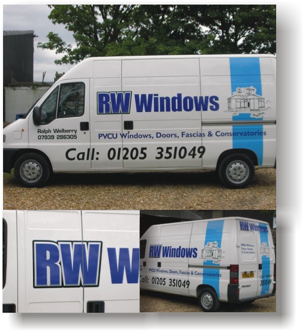
Posted by Steve Broughton on 11 May 2003 at 12:14Did this one today, now 3pm started cutting at 8am, I’m now starving so off for some grub, I hate working on a Saturday.
Attachments:
 Steve Broughton replied 22 years, 7 months ago 8 Members · 9 Replies
 -
9 Replies
-

nice one steve… i second the working on saturdays.. nothing worse 😥
the blue strip finishes it well!
the RW letters, are those chizled?.. they look it in the pic 🙄
If so, is it a chizled font or did you make up yourself? -

Robert Lambie:-
quote :nice one steve… i second the working on saturdays.. nothing worse 😥How bout workin on Sundays? 😥
-

…great piece Steve… 😉
I like the large blue vertical ‘straps’ on the sides and back – bit like large ribbons wrapping up a parcel…sorta’ 😕 …well I like it anyway…
smart effect on the main initials and a pleasant blue theme troughout – smart indeed!
more please…
mikethesign
-

Nice one Steve – these are big vans (I just did an identical model of van on Friday) so I can appreciate that there was a lot of work involved in this job. I particularly like the conservatory 😉 and the chisselled effect on the lettering. Well done
-

Nice job as usual Steve, Like Phil I like the conservatory it fits well with the blue banding as well. Not to keen on the phone number though, I know the customer probably wanted it that big I did one last week where it was at least this size. The customer didn’t want anyone to miss it !!!
-

Nice work Steve, the font looks like a modified version of “Impact”
I am with the other on the phone number.
What vinyl are you using on the light blue stripe, just curious as today we are redoing a Mercedes 614, as a result of problems with Averys’s new 800 series cast, which I am told has the same quality as old 900 series, but I think that’s rubbish, we have vinyl lifting everywhere there is a small undulation in the body work. Maybe just a bad batch….but I’m not impressed.
-
Thanks lads, Gray the effect on the RW is an effect from Mikes CD, its called “Tin Man” tried the reversed out lettering on the stripe but customer didn’t like it, glad you like the pic and I hope the reflection from my slap head don’t dazzle too much 😆 , Henry the blue stripe is Oracal 751 like the rest, of it no flies on you mate, 🙂 yes it was impact. I know what you mean about the phone number but thats what the guy wanted. Yes Phil very nice conservatory 😉 ta!
-

Great work Steve
Where did you get the conservatory?
Clipart? or scanned customer’s artworkOh and nice work too Henry
John
-
John, Phill posted it for someone else a few weeks ago follow this link http://www.uksignboards.com/viewtopic.php?t=2400, thanks Phill.

Log in to reply.