Activity Feed › Forums › Sign Making Discussions › Graphic Design Help › What Colours to use on Merc Champagne coloured truck?!?!?
-
What Colours to use on Merc Champagne coloured truck?!?!?
Posted by JonPinder on November 15, 2011 at 12:23 pmHi Everyone,
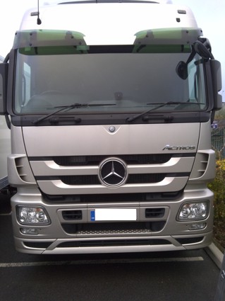
Really struggling to decide what colours to use with this truck. The colour of the truck is called Champagne. The design is going to based around 25 years success in the haulage industry. So silver anniversary.
The text on some of the logo has shadow, so at the moment the customer is wanting black text with a dark grey shadow. If I was to use tho two colours I would use matt.
However I’m not convinced this is the best two colours to use so thought I’d ask for opinions of what you would use as it’s a bit of an awkward colour to work with.
All suggestions welcome.
Thanks in advance to any replies.
Attachments:
 Jill Marie Welsh replied 12 years, 5 months ago 9 Members · 14 Replies
 -
14 Replies
-

Jon
metallic silver & mirror silver, subtle but niceKev
-

why not print on to brushed aluminium and use that. It would look class (or printable chrome)
-

Graphite Grey, metallic – vinyl cut.
I personally, would definitely not go down the printed route especially brushed aluminium or chrome.
John
-
quote John Hughes:Graphite Grey, metallic – vinyl cut.
I personally, would definitely not go down the printed route especially brushed aluminium or chrome.
John
Why not john?
-
Few reasons…
With vinyl cut chrome, printed or not, it’s not easy to clean. When using a cloth etc to clean, it tends to catch the edge of the vinyl / text which can cause it ‘to lift’.
In this situation, due to the nature of the job, printed vinyl would need to be laminated and as far as I aware, there’s not a matching laminate suitable for chrome/brushed ali.
We’ve used chrome on a few jobs recently but see it as more ‘blingy’ rather than ‘classy’ – IMO.
John
-

thanks for the reply fella’s.
I’ve not got the machinery to print unfortunately, just cut.
I like the sound of the metallic silver & mirror silver but would it not look lost on the colour of the truck. Any recommendations on the brand of vinyl to use for this affect. I’ll see what the match is like.
-
Oracal 900 series has a lovely range of metallic silver and gold foils + other metallic colours/shades, you could get some nice effects out of those, pig to apply though I have found.
John
-

iI think a nice navy blue with a light grey shadow.
Martin
-
quote Martin Gray:iI think a nice navy blue with a light grey shadow.
Martin
Champagne is a light shade of pink metallic if i am right then blues & blacks are going to be too bold, but everyone will have their own thoughts
Kev
-

I guess you would really need to see the job in the flesh…
your never going to get a great combination due to the type of finish you have as a base.golds
browns
maybe ivory /creama combination of script and a serif font/s used helps give a feel of age also, but can still feel modern if laid out well.
keep in mind its a celebration of age, 25yrs. these sort of colours lends itself to the tradional era as opposite to hard stark dark and modern colours. they should also sit comfortable on the light golden champagne, background.
(pink champagne, i know, but still) -
Thanks to everyone for taking the time to reply.
Had to ask, as holding swatches against the paintwork just didn’t trigger any inspiration. When working on the standard commercial colours like white, red etc its much easier to make up something.
Think I may lean towards something in brown and cream. The chromes and silvers will blow the budget comparing price per meters.
-

Colours Rob suggested would compliment the base colour, would have suggested brown myself, or you could use a deep red with a gold outline the gold would tie in the red to the champagne.
Steve
-

I was going to suggest burgundy, or maybe cream with a burgundy outline.
Dark brown would also look sharp.
Love…Jill
Log in to reply.
