Activity Feed › Forums › Sign Making Discussions › Graphic Design Help › Vets Logo: Design Help – advice?
-
Vets Logo: Design Help – advice?
Posted by Martin Gray on June 30, 2012 at 9:58 amHiya.
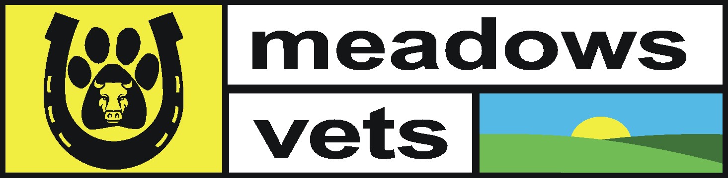
Could i get your opinion on this logo please? The customers logo is of a horse a dog and a cat. But they have asked me if a can change the silhouettes to a horseshoe a bull and a paw. But am not very happy with it. your assistance would be appreciated
Thanks
Martin
Phill Fenton replied 11 years, 9 months ago 8 Members · 11 Replies -
11 Replies
-

oohhh I don’t like that at all. How much freedom do you have?
-

Has to be a bulls face, the horse shoe has to have square holes. everything else has to stay the same.
So in other words not alot!
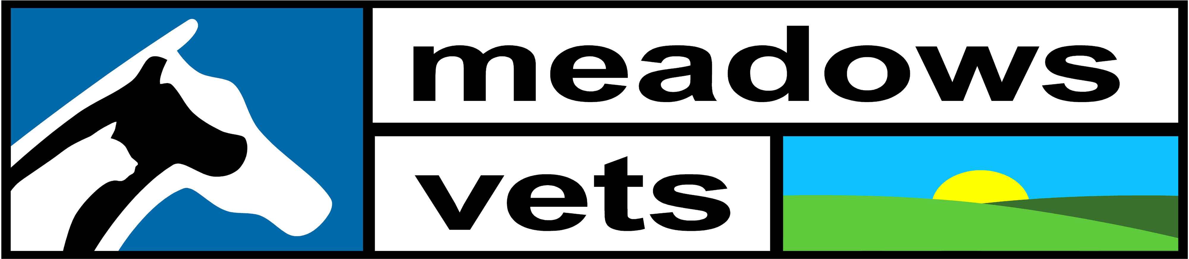
This is there logo i applied onto there van afew weeks back.
Martin
Attachments:
-
 quote Martin Gray:Has to be a bulls face, the horse shoe has to have square holes. everything else has to stay the same.
So in other words not alot!
This is there logo i applied onto there van afew weeks back.
Martin
Whats wrong with this logo? it looks a lot better than the top one.
-
They do alot more then domestic animals. So want a logo for there different stationery.
Martin
-

give them what they want, their image is dated and not good to begin with.
however, if they are a reputable firm and will pay for getting the job done correct. Reinvent their image, compare them both… if they like the new modern brand, they may give the whole place a facelift gaining you much more work.
-

Martin
Turn the horseshoe upside down. (Looks more like a shield that way, nothing to do with luck!)
Maybe the paw can be a shape on the bull’s forehead if you have to keep it in.
My humble opinion.Simon.
-
Thanks guys. I’ve played about with it. And think it looks abit better. Now to see what the customer thinks
Thanks again for your replys.
Martin.
-
Hi Martin
This is sort of what I was trying to say mate…
By all means give them what they want. But re-inventing their image may just tweak their line of thought for something a little more modern.Their original is a mix of two messages, they have a logo that shows meadows/fields and a large word MEADOWS but that’s all secondary, it’s the fact they are VETS that should get priority. Now they are adding another logo to try doing the job that should have been done in the first instance. It all gets a bit too much at a glance…
Anyway, thought ide have a quick go after googling for some clipart to show what I meant.
.
-

But if they don’t want a complete overhaul – what about this?
Attachments:
Log in to reply.
