Activity Feed › Forums › Sign Making Discussions › Graphic Design Help › SA Jewellery
-
SA Jewellery
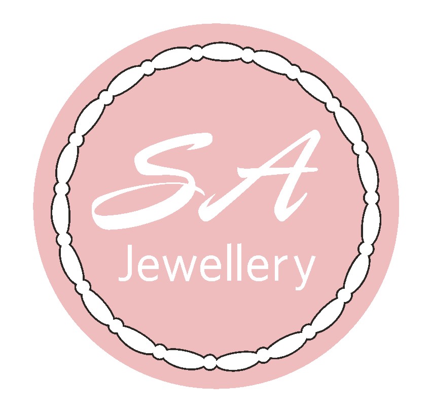
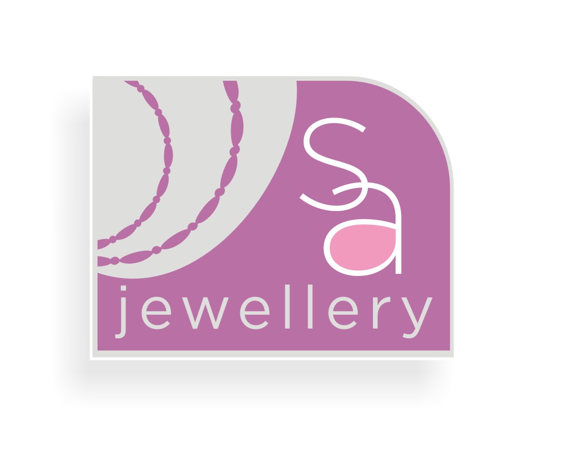
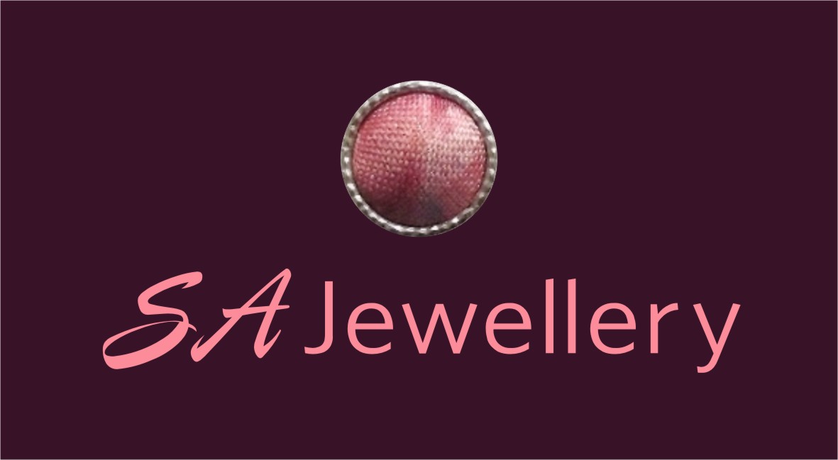
Posted by Phill Fenton on December 6, 2012 at 10:03 amMy Daughter Sally has asked me to draw up a logo for her Jewellery Design business. This is what I have come up with based on her description of what she wanted. It needs more work, any suggestions would be gratefully received?
Phill Fenton replied 11 years, 4 months ago 5 Members · 15 Replies -
15 Replies
-

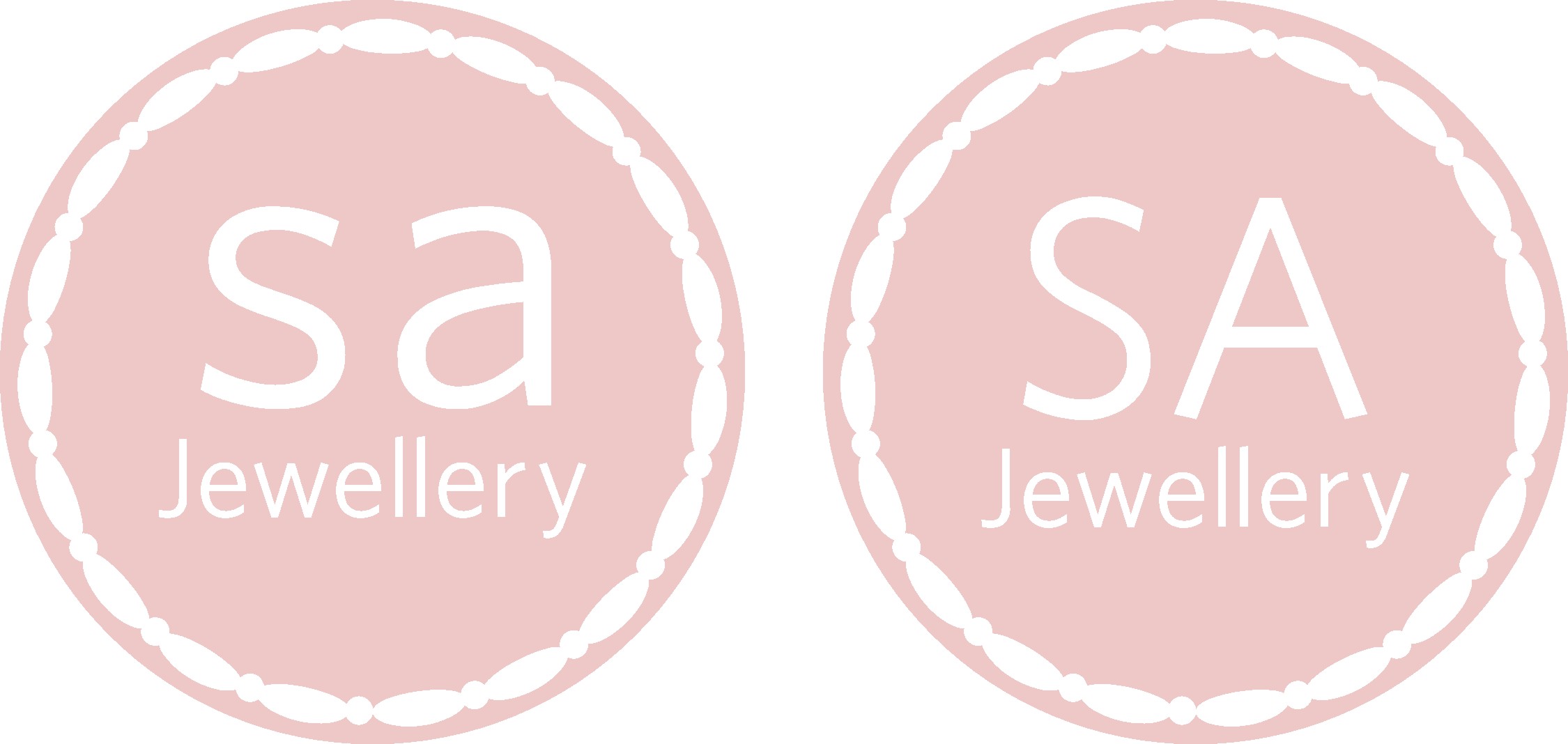
I know her jewellery is quality (you showed pictures of it before) but that logo isn’t saying ‘quality’ to me, because it is too simplified and although the font is a nice one in full use, I am not sure about the way the capitals on their own are working.
Have you any pics of her stuff to post up and more info on what she wants in a logo? Does she use gems or is it just metals etc? -

The capitals together have a lot of conflicting angles.
I’d choose a less casual font and stagger the capitals diagonally
(the first one slightly higher and both welded)
Love….Jilledited to add a suggestion…I had no appropriate "elegant" scripts.
-

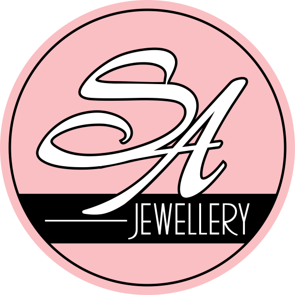
she’s already told me she prefers the font below.
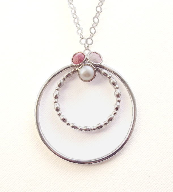
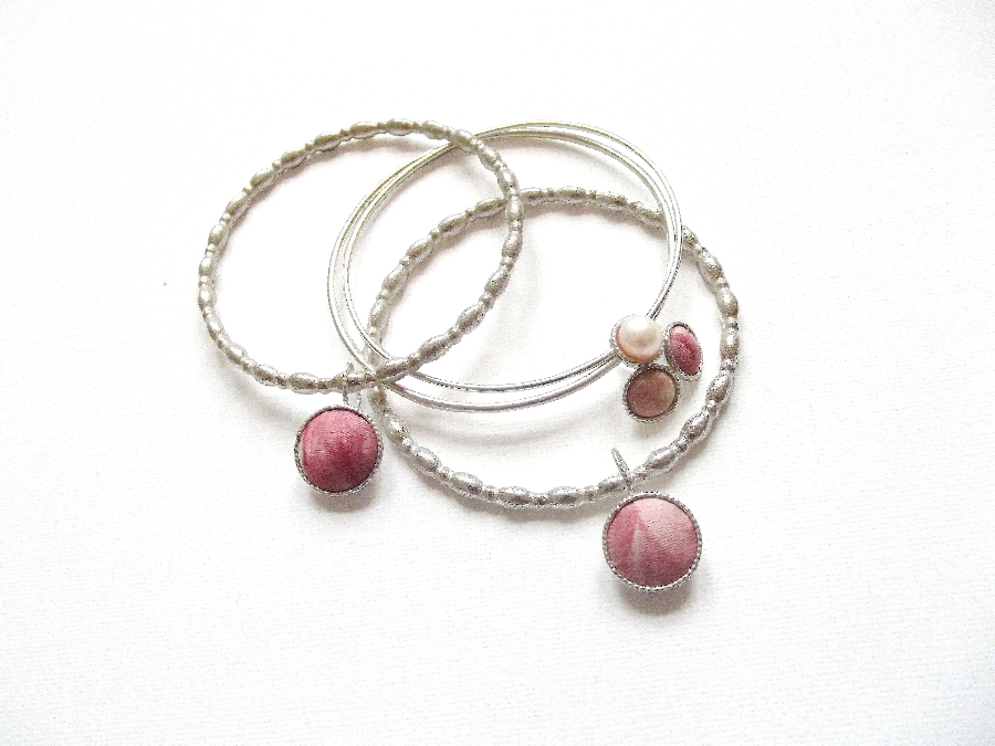
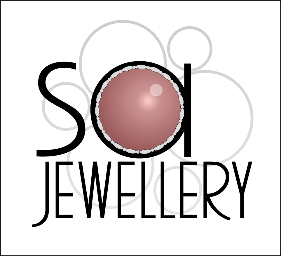
Also – thanks Harry – here are some pictures of her pieces. She works with silver mainly and uses fabrics to personalise the Jewellery. You can see the stylised ring in the "logo" is a common feature in her work
Attachments:
-
I know that font but can’t put a name on it. WHat is it?
-
Ooops….I didn’t realize that the border was a ring.
😳 -
Thanks for your suggestion Jill. I like that font and will see what Sally thinks
-
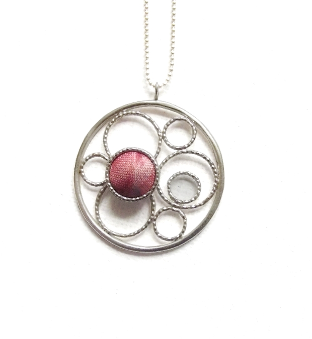
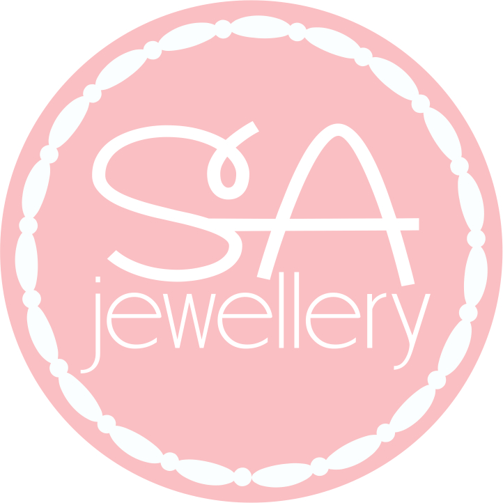
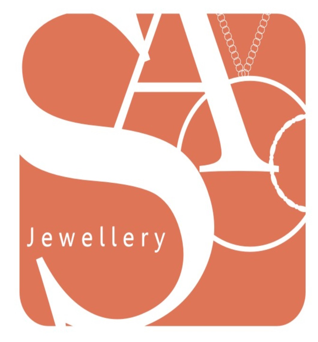
Just a different way of thinking about the elements of her designs.
Attachments:
-
Thank you Harry and Glen – I will show these to Sally, I’m sure she’ll be delighted with your help 😀
-
Like that Martin! Fill the small circle(middle right) with fabric like Glenn has done and you have a very pertinent and standout logo imho. 😀
Log in to reply.
