Activity Feed › Forums › Sign Making Discussions › Graphic Design Help › New Signage for Our Van : Dilemma!
-
New Signage for Our Van : Dilemma!
Posted by Craig Ross on May 29, 2012 at 5:27 pmWell I am transforming the little van I have with a nice new look.
I really wanted to wrap it all in matt black and then signage it. But think I might have to leave it silver and just apply signage.
The wrap was also to cover a few minor scratches here and there, but I may end up just polishing them out with the Rotary or DA.
I really wanted to wrap it to show off my/our skills/services but its the additional cost and the time.
Dilemma! but at same time I don’t want to do it all then think, why didn’t I just wrap it.
Craig Ross replied 11 years, 10 months ago 7 Members · 20 Replies -
20 Replies
-

I understand your dilemma. It depends on the market you are trying to appeal to. If it’s vehicle graphics, wrapping, colour changes for the automotive market then your matt black wrap is probably a good idea. If however, your target market is more the business to business sector producing signage then a more sober look to your van would make more sense. Its a case of "dressing the same way as your customer". This also applies to the vehicle/van you use to project your companies image.
-

Regardless of whether you wrap it or just letter it up, the van itself should not be too rough looking.
Definitely polish out all the bad spots, you don’t want to look shabby to potential clients.
I have had a scratch in my tailgate since I bought my truck, and was going to cover it with a print. But that would look so redneck.
I am going to have my son fix the scratch and the dent then repaint my tailgate.
Then I’ll apply the print.
Love….Jill -

My thoughts exactly Jill.
Bumper is currently off and just been sanded down. For a nice paint job/touch up. 🙂
-
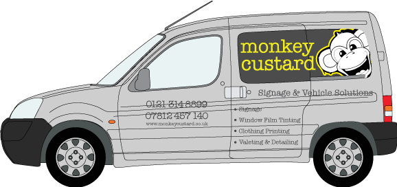
I have real reservations about posting my van design up on here as I hope it doesn’t make me look bad.
Working alone, has advantages and disadvantages. Unfortunately no-one to get opinions from so here I am.
I really want to do our van right the first time. I am going for simple, and admittedly van signage designing is not one of my fortays. Fitting and installation is where I normally come to life. Admitely I am still new to signage (2 years part time) but teaching yourself is not easy as all of you will know.
All opinions welcome, please go easy on me. 🙂
-

Hi Craig
I think the Monkey image needs to layout wise tie in with the name better.
I would do the bullets over 2 lines – with each bullet as a single line of text not over 2 lines as you have it.
I think I would probably keep everything parallel to the sill, but maybe run the side bullets at an angle.
-

Craig, I wouldn’t flood coat the panels as you have shown, and I feel the strapline of what you do could do with more prominence than the name.
Whilst the name is quirky and possibly memorable, it bears no relation to anything you do, so possibly increase the size of the strapline and centre it under the name to make it stand out more.
It looks like you are trying to be jack of all trades, which can make for a cluttered vehicle when trying to cover everything.Lose the Tel & Mob, they are so 1990’s.
Get the web address up higher, what about having the 2 phone numbers with web address below, all on the door?
As Tim mentioned for the bullets, and to make it even add "graphics" under signage (which I would also change to "signs".
Unless the monkey face is placed as on your website it really doesn’t tie in IMHO.On a separate note, I read your application guide and have some concern over the methods given.
I defy anyone to just lightly place a graphic against a vehicle and squeegee it out successfully, especially when using clear application tape.
Have you actually tried it this way?
Personally I would say that clear application tape is very difficult to work with compared to paper based tape, and generally would only be used for layering up colours. -
quote Peter Dee:Craig, I wouldn’t flood coat the panels as you have shown, and I feel the strapline of what you do could do with more prominence than the name.
Whilst the name is quirky and possibly memorable, it bears no relation to anything you do, so possibly increase the size of the strapline and centre it under the name to make it stand out more.
It looks like you are trying to be jack of all trades, which can make for a cluttered vehicle when trying to cover everything.Lose the Tel & Mob, they are so 1990’s.
Get the web address up higher, what about having the 2 phone numbers with web address below, all on the door?
As Tim mentioned for the bullets, and to make it even add “graphics” under signage (which I would also change to “signs”.
Unless the monkey face is placed as on your website it really doesn’t tie in IMHO.On a separate note, I read your application guide and have some concern over the methods given.
I defy anyone to just lightly place a graphic against a vehicle and squeegee it out successfully, especially when using clear application tape.
Have you actually tried it this way?
Personally I would say that clear application tape is very difficult to work with compared to paper based tape, and generally would only be used for layering up colours.Thank you for your comments Peter.
I have not flood coated the panels. It has windows all round therefore they have been tinted therefore the darker area is window film. 🙂
Unfortunately yes I understand I am trying to put lots of different services on the van which I ideally don’t want to do but in the same breath I want to ensure people know my main services. Admittedly the van is being written to make me and my business look professional and the possibility of additional business from it. Therefore someone might see the van, and not know we excited or that we offered clothing printing for example. So I am just trying to highlight this.
The monkey is like our mascot. Adds a little bit of fun in the mix, plus it is on our new website and promo literature.
In relation to the application guide, I am presuming you are referring to eBay. It is an old guide but also is only in relation to Wall Art and yes it is paper application tape I use.
It is a business which started as a hobby and has grown. I have built it up on my own (a little help here and there from the girlfriend) and therefore I have learn’t from trial/error and reading lot’s of literature. I have never been fortunate enough to have specific training or a job in a sign shop.
-
Hi Craig
I still think the Monkey head needs to be with the text on he windows.
Change ‘and’ to ‘&’ allowing you to increase the text size.
Also keeps it consistent with the bullet ‘&’.Size the bullets so they align nicely with each end of the monkeycustard.
I think all the bullets should be centered.
Reduce the monkeycustard on the back so it doesn’t look squashed in to the window size.
Just my 2p’s worth.
-
Craig, I saw the guide on your website store not ebay.
Good luck with the van, I’m sure it will turn out great. -
quote Tim Painter:Hi Craig
I still think the Monkey head needs to be with the text on he windows.
Change ‘and’ to ‘&’ allowing you to increase the text size.
Also keeps it consistent with the bullet ‘&’.Size the bullets so they align nicely with each end of the monkeycustard.
I think all the bullets should be centered.
Reduce the monkeycustard on the back so it doesn’t look squashed in to the window size.
Just my 2p’s worth.
I appreciate all advice / opinions. 🙂 Struggling with my monkey head.
quote Peter Dee:Craig, I saw the guide on your website store not ebay.
Good luck with the van, I’m sure it will turn out great.Thanks Peter. I hope it does. 🙂
-
Right, lets try something new.
Think I hit the nail on head with monkey now, but now the rest has gone to pot!
Don’t you love what you think will be a 15min job. Ha!
-

I’d try a really subtle monkeys head in the top/rear of the tinted window and then drop the text down into the lower half of the window
I doubt it’s possible but can you apply the monkey’s head internally onto the film to make it even more subtle?
-
If I could do that, it would of been too easy. 🙂
The windows are already tinted but even if applied under the window it will still not be any subtler.
You’ve got to love a stress ball whilst thinking… ha!
-
I was typing while you posted that one….I reckon that’s the place for it as Tim pointed out
I would just tweak the monkey custard ( I reckon that’s the first and last time I’ll ever type that ) a bit…either right adjust or stretch ‘custard’ a bit so it’s the same length as ‘monkey’
-
quote Glenn Sharp:I was typing while you posted that one….I think that’s the place for it as Tim pointed out
I would just tweak the monkey custard ( I reckon that’s the first and last time I’ll ever type that ) a bit…either right adjust or stretch ‘custard’ a bit so it’s the same length as ‘monkey’
-
Maybe a yellow outline on the monkey head with black inline.
Increase the line space on the bullets, then line the tel number with it top / web bottom.
-
quote Tim Painter:Maybe a yellow outline on the monkey head with black inline.
Increase the line space on the bullets, then line the tel number with it top / web bottom.
Your suggesting 3 layers of vinyl there! 🙂 Now that’s what I’m talking about.
I’m going to have a play with the design on laptop whilst sitting in front of the tele tonight. See what happens. 🙂
-

Craig
I know this is not exactly a design issue, but could you possibly lose the word "Solutions"? The very sight of that word makes me cringe, and you see it so much these days…check out the dreadful language of the 3M website for further examples…Simon.
-
Well I’m off to do some offsite work today then will return and take a look again to double check I am happy, but with a couple of tweaks I think I’m there..
Attachments:
Log in to reply.
