Activity Feed › Forums › Sign Making Discussions › Graphic Design Help › My ideas for my van
-
My ideas for my van
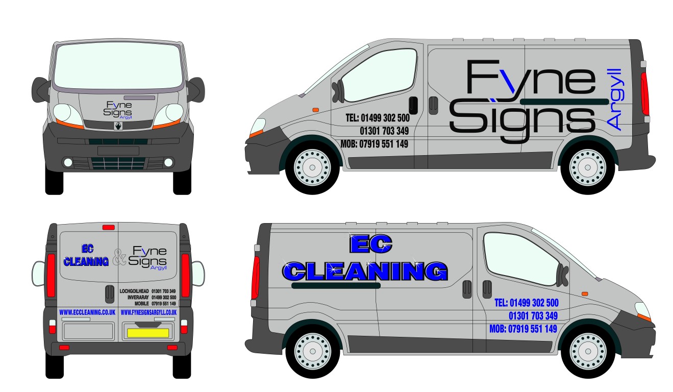
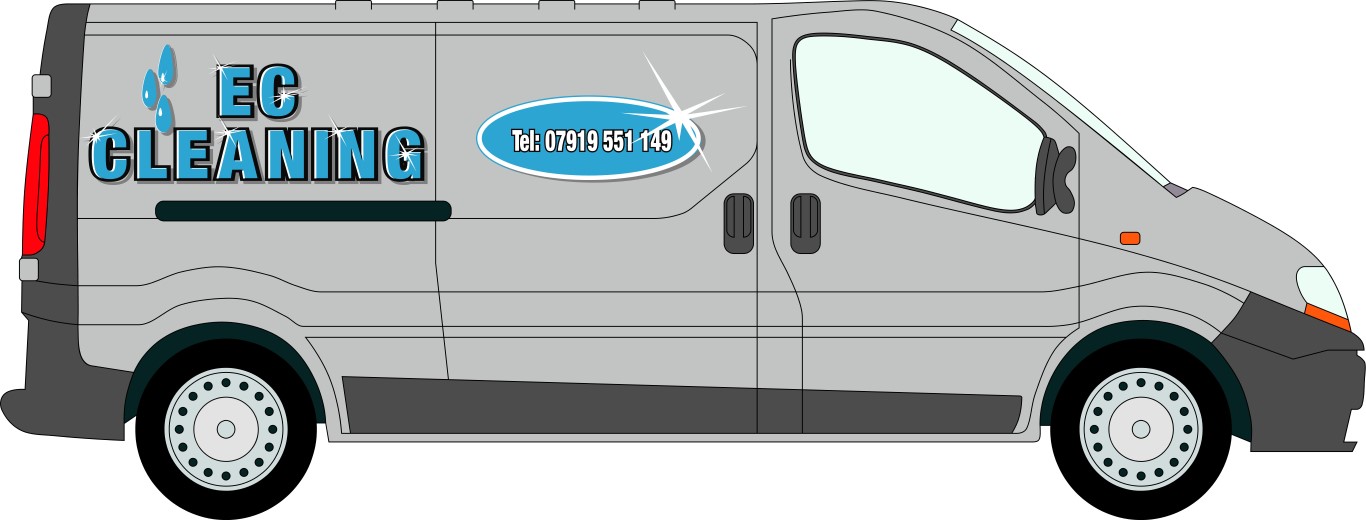
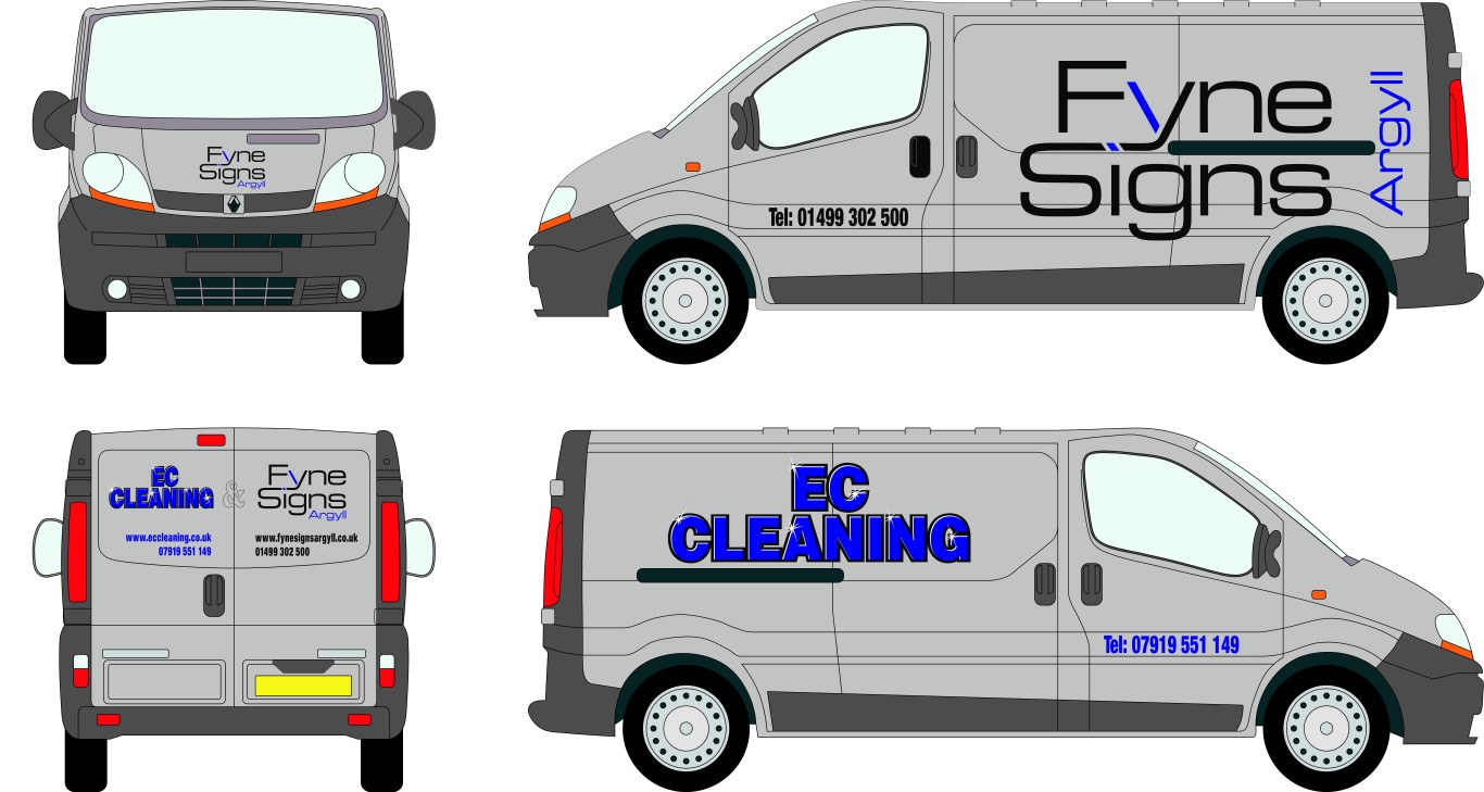
Posted by Ewan Chrystal on April 22, 2013 at 12:33 pmI currently run 2 businesses, The sign making and also a cleaning business. I obviously would like to advertise both on the van. This is what i’ve come up with so far. The Fyne Signs logo is what i use and will stick with but i am constantly changing the EC Cleaning one. The current one i made thanks to Stevo’s tutorial.
What do you all think? Any suggestions are more than welcome.
ThanksEwan
Attachments:
 Ewan Chrystal replied 10 years, 11 months ago 7 Members · 25 Replies
 -
25 Replies
-

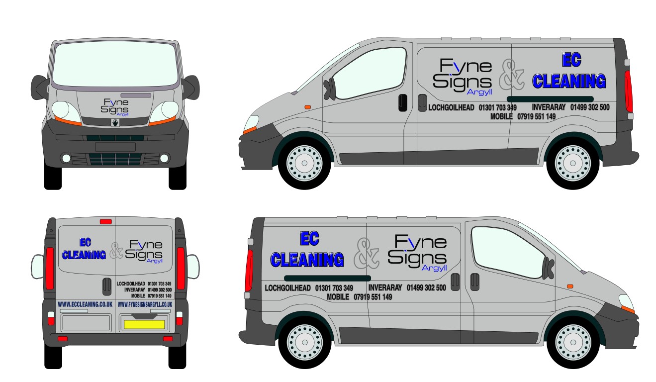
There is too much space between EC and Cleaning, perhaps if you tightened that up.
Must you really have all those phone numbers? Maybe just list them all on the back for a cleaner look on the sides.
The one with the two logos on, looks like you’ve squished the EC CLEANING and there’s too much space between /around all those elements.
The ampersand is a little too big too.
But everything is too close to the edges and would look better if somewhat reduced.
I do like how the tutorial helped you make EC look sparkling clean.
😉
Love….Jill -

Thanks for your input Jill. Its much appreciated. I’ll have a go at making some changes.
Getting quite good at fitting the stuff but designing is whole different ball game -
 quote Ewan Chrystal:Thanks for your input Jill. Its much appreciated. I’ll have a go at making some changes.
Getting quite good at fitting the stuff but designing is whole different ball gameEwan, if you want to learn about design then a good book to buy is " Mike Stevens Mastering Layout".
-
Thanks martin. I’ll look into that as i think at least a basic understanding can only be a good thing
-

Hi Ewan,
For me the kerning is too tight on EC Cleaning side, really hurts the legibility from a distance when it is that tight. I think it needs a bit of life as well.
The Fyne signs may be a tad too big too imo.Can you post an ai?
-
With pleasure Harry. I agree it does need a bit of life although in my mind that would probably end up being cluttered 🙂
-
Sorry Ewan, can’t get that to open, can you save as an earlier version AI 9 or 10 maybe?
-
It gives you the options in the last box, the one where you choose between a mac and pc. The top drop down box has a list of Adobe versions.
EPS may work too. -
Got it, sorry about that. Saved as AI 10
-
Looks a lot better…and I agree, as usual, with Mr. Cleary.
😳
Thanks for taking advice….so many people don’t listen.
I think I’d also make a grey drop shadow off to the bottom right on EC, and I still think the elements could be tighter on the back of the van.
Maybe if the blue was not so dark it would be more legible, a suggestion would be from my Oracal color chart 951 series 052 azure blue.
I was going to say Fjord blue but that sounded too monty-pythonish.
😉 -

Ms W and Mr C are spot on.
I agree, go for a lighter blue as black and dark blue doesn’t have enough contrast.
What about a lighter text for the tel no’s etc.
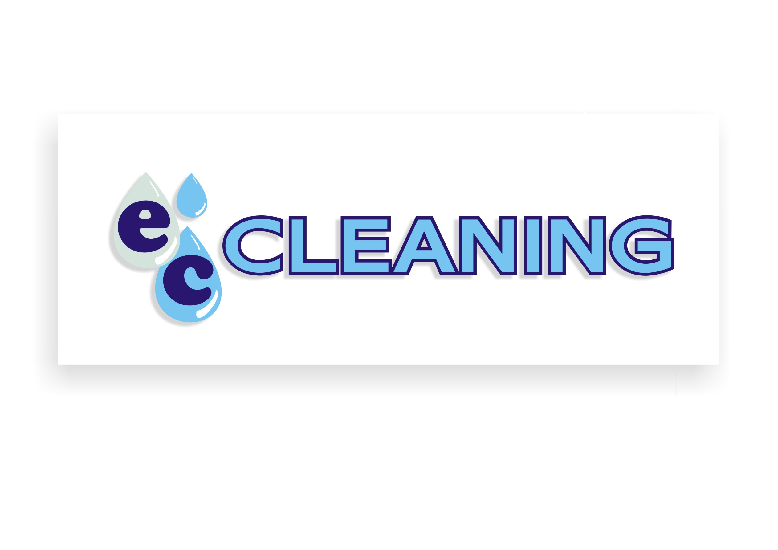
The EC side lacks something too. Maybe liven up the Cleaning into a script with a nice bold EC. -
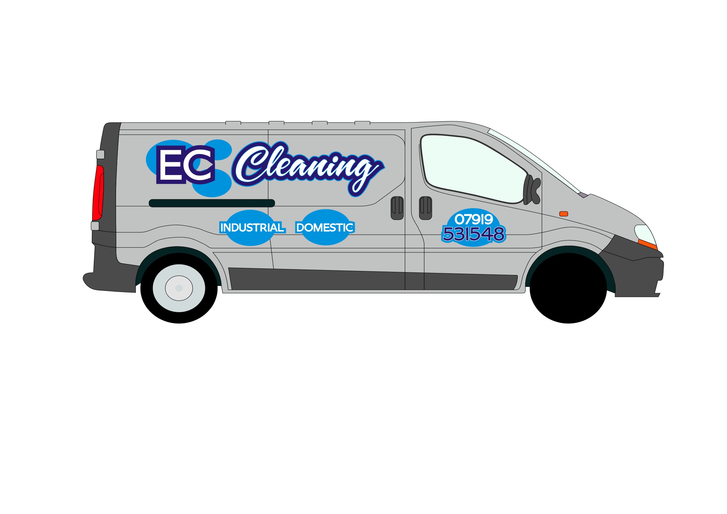
Just a quick go to put some visual life into it.
Attachments:
-
Thanks Harry and Neil. I’ve had a wee play taking on board all your advice. I had it as script a few years back but it never really grew on me.
What do you think now?
Attachments:
-
I liked it better without the balls.
I prefer the lighter blue lettering.
😀 -
quote :I liked it better without the balls.
The original idea was to make them look like water spots but i think that is a bit beyond my talents at the moment 🙂
-

Personally I would pick which business you wish to advertise/promote on your van.
Which business do you wish to grow most? And which business are you slowly dwindling out, or are you hoping to run them both alongside each other for ever?
-
Hi Craig, the sign making is definitely the direction i’m going in. I have had the cleaning business for 10 years and it is successful. The plan is within 1-2 years to have built the sign business up enough and then sell the cleaning business
-
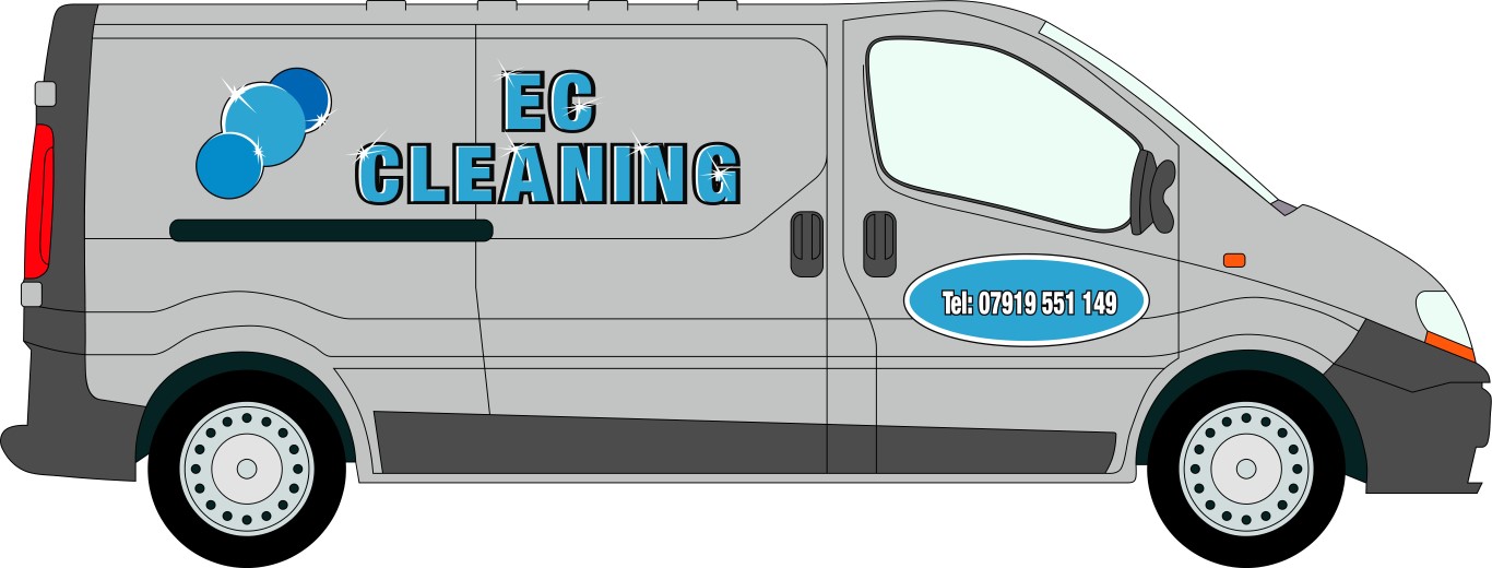
Latest effort. The reason why i am putting both businesses on the van is not so much to advertise the cleaning but more to show what can be done with vinyl lettering. This will hopefully lead to more sign business.
Attachments:
-
If it was me Ewan, I’d be making those droplets work for their money and make it more of a logo. Just a thought.
Attachments:
-
No to that last one. Way too much emphasis on the phone number.
-

I like the ec in the bubble, ties it all in…
Personally, it’s about perception as well as skill and on that note I think advertising the 2 business together may make people think you’re a jack of all trades and master of none (which i’m sure you’re not)
Potential customers may be concerned you’ll sacrifice on one service to deliver on the other.
If I wanted a kitchen fitted and one van advertised kitchens and mobile valeting and another kitchens only, I would probably not go for the first one….I would think there could be possible delays and problems if they have too much work on in different industries.
Just a thought. I would think about which one you prefer to do and get most enjoyment from and advertise just that one. Focus all your energy on it, if you really want to keep both going, advertise them separately.
-
quote :Personally, it’s about perception as well as skill and on that note I think advertising the 2 business together may make people think you’re a jack of all trades and master of none (which i’m sure you’re not)
Potential customers may be concerned you’ll sacrifice on one service to deliver on the other.
If I wanted a kitchen fitted and one van advertised kitchens and mobile valeting and another kitchens only, I would probably not go for the first one….I would think there could be possible delays and problems if they have too much work on in different industries.
Hmmm, interesting perspective Jonathan. I admit i hadn’t looked at it that way
-
Sorry for the lack of response. I’ve decided to stick with the Fyne Signs on both sides. I don’t really need to advertise EC Cleaning and will be selling that business within the next year or two anyway.
Thanks for everyone’s input
Log in to reply.
