Activity Feed › Forums › Sign Making Discussions › Graphic Design Help › Grays – Help with my van graphics please?
-
Grays – Help with my van graphics please?
Posted by Martin Gray on October 18, 2012 at 10:10 pmHello
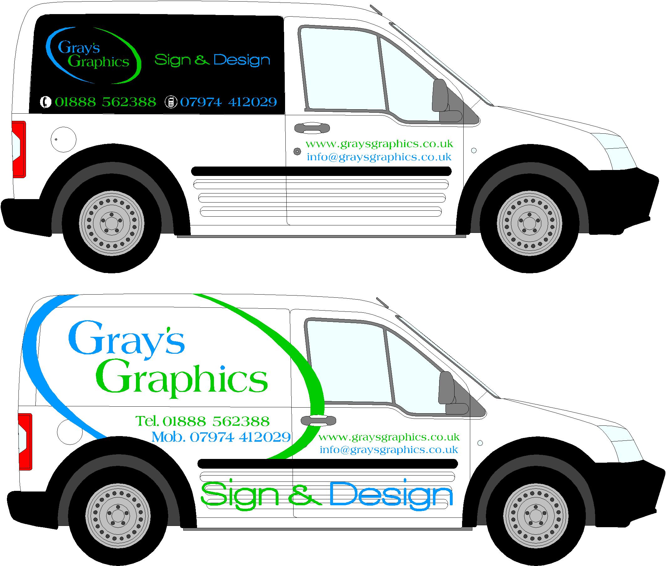
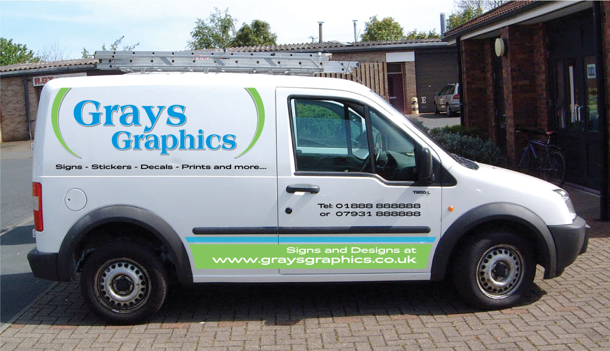
Ive just became the proud owner of a ford connect. I know its little, but it will do what i need it to do. Now the fun part starts! I want it to stand out, but be simple and clean. my logo colours are matt black and green and blue. i thought about going fluorescent. and maybe even reflective black. ive got a friend that is a graphic designer and mite wrap the rear of the van in a fancy design. ive loaded a photo. The first one is how my logo is laid out on my bussiness cards. and the bottom one is how i think i would like it to be, but with matt black in there some where.
All ideas welcome
Martin
Nicola McIntosh replied 11 years, 6 months ago 11 Members · 18 Replies -
18 Replies
-

Bottom design looks good to me, unsure about the "Sign & Design" part though.
Only my 2 pence worth. 😀
-

Do the bottom piece in the matte black with the signs and designs part cut out so the white van shows through?
Love….Jill -

Conflicted 🙁
How about the top one but without the black background.
-

Bottom one (with Jill’s modification) all day, everyday for me.
-

I like the way you’ve done the lower example.
With some graduated tints ?
Attachments:
-
No…no tints (makes it harder to read and is already almost out of style here)
Sorry Phill 😳
In my opinion, if you put a pic of yourself on it wearing only a kilt you would have more female clients calling than you could imagine.
😀 -
Darn it Jill..You’ve ruined my diabolical plan.. :doh:
Y’see Martin doesn’t have a printer and probably would’ve used me to print the graphics 😳
-

Thanks for all the reply’s.
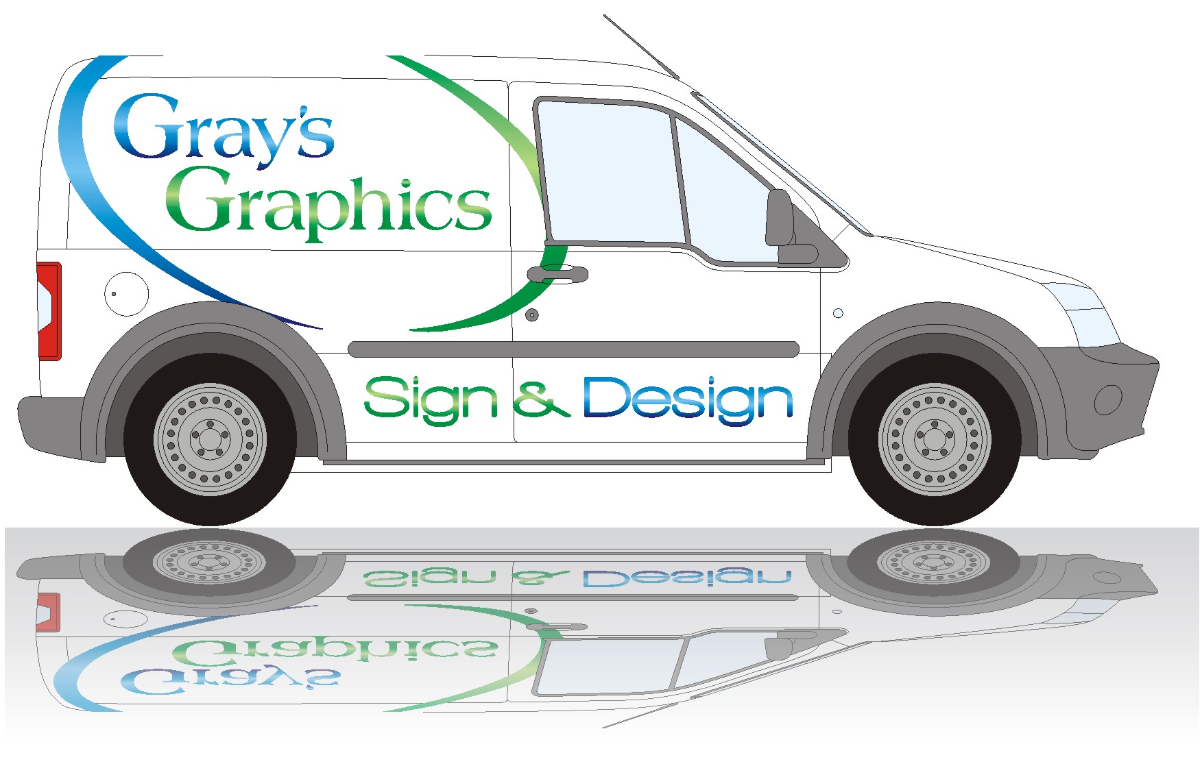
Am away from my computer today but will have a play with it tonight. I will try your idea Jill and maybe use white reflective on the bottom. Am thinking of removing the side moldings and painting the arches from grey to matt black so should blend in ok. On the kilt front the only problem i see is maybe the customers will want me to fit it in a kilt! And its not exactly tropical weather up here atm.
haha. I knew that was your plan Phill. But not to worry am thinking of wrapping the rear so al have a wee job for your printer! 🙂
Martin
-
Fair enough.
I’d use Chris’s suggestion, his doesn’t have as much clutter as yours. -

I think the blue sweep take my eyes to the centre of the van, and then the green sweep takes my eyes out of the top of the van again.
I think the whole design looks a bit "lazy’. If you saw this van done by another sign company what would you think. Think the font you have used is Americana. Never a strong font, try an heavier version maybe.
maybe try letering in the blue and just keep the green for the decorative sweeps, and try and use the sweeps to draw your eyes to the lettering and not away from it.
just my opinion.
Harv
-

I would redesign your logo, looks so 90’s…
Chose an nice modern looking font type, is a good step in creativity!I will have a look at it and post something soon.
-
Gray, take advantage of your company’s name : Gray’s Graphics 2times ‘G’
I do prefer graphic elements in a logo, that should be after a while recognized as your company without even seeing the whole thing.
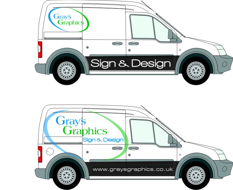
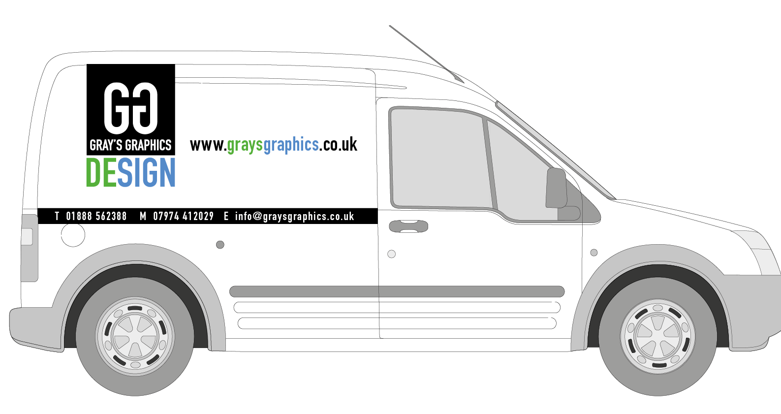
This is what I just made…
Attachments:
-

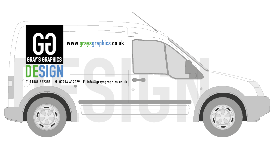
like tims concept, would try the black box as black lines to break the boldness will have a go tmw 😀
Log in to reply.
