• coach design help

    Posted by George Elsmore on February 18, 2013 at 1:47 pm

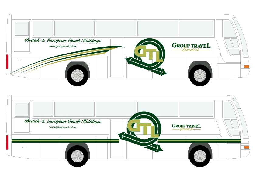
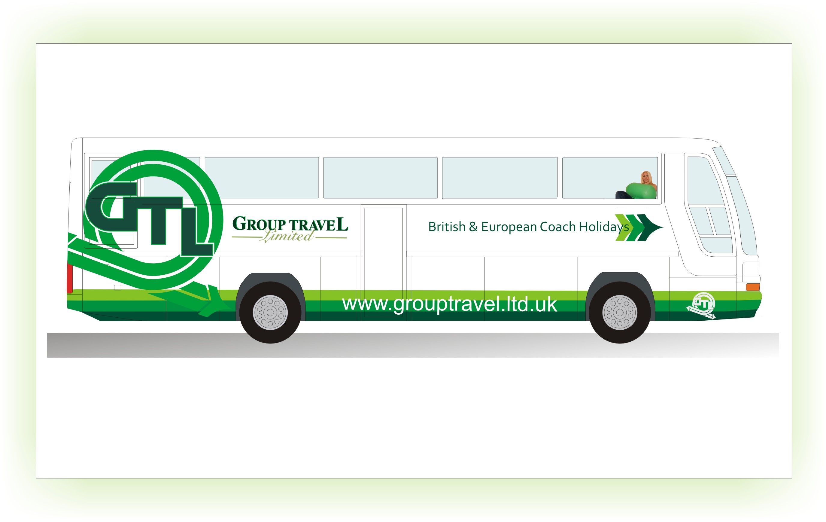
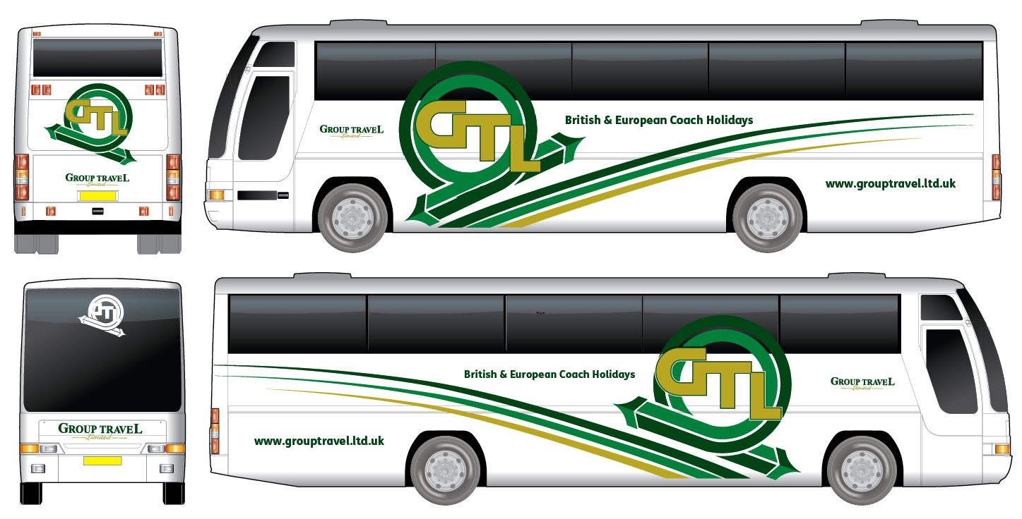
    Hi All, I have a client who has a coach in white he wants vinyl graphics for, his words were can we make the logo etc less flat looking can me make the coach less white 😕 I have attached the jpeg and ai. I asked him if the logo he has is set in stone to which he replied no but keeping it similar it would be good, I fired this across but \i am not to impressed anyone with any input whatsoever would be good….tweak away peeps 😀

    cheers

    G


    Attachments:

    Steve Hooper replied 11 years, 2 months ago 7 Members · 10 Replies
  • 10 Replies
  • David Hammond

    Member
    February 18, 2013 at 2:03 pm

    Personally the ‘swish’ doesn’t appear to flow.

    The logo running over the windows too. Will passengers like having their view obscured?

    I’ve had a quick play around with it, still not 100% with the ‘swish’ at the back.


    Attachments:

  • Jill Marie Welsh

    Member
    February 18, 2013 at 2:31 pm

    Here’s my take, agree with the swooshy thing not flowing…I like the plain stripe idea better but saw it after I did this.
    😀
    Thought a more updated script might look better too.


    Attachments:

  • George Elsmore

    Member
    February 18, 2013 at 2:57 pm

    thanks for input I forgot to say 😳 needs to bee greens and gold solid vinyls, I do have a large format printer and suggested blends etc but he wants solid vinyls also i did a design with a straight band all the way arond but it was not liked the swoosh thing is something I thought of but i am up to getting rid if need be

    ta

    G

    keep em coming 😀

  • Martin Cole

    Member
    February 18, 2013 at 3:20 pm

    I don’t like the swoosh’s George… bin em

    here’s mine with logo in contravision where on windows

    I hope hes got deep pockets


    Attachments:

  • Jill Marie Welsh

    Member
    February 18, 2013 at 3:40 pm

    Now that’s more like it.
    Martinis for everyone!

  • David Hammond

    Member
    February 18, 2013 at 4:32 pm

    I like the logo at the rear Martin.

    Maybe move the Group Travel Ltd to the front in place of British & European coach holidays?

    Or maybe bring the web address up above the green bands? Just to fill in the empty space between the wheel arches?

  • John O'Sullivan

    Member
    February 19, 2013 at 12:28 am
    quote Martin Cole:

    I hope hes got deep pockets

    on the costs did you mean the design or the tour guide you included!! 😀 😀

  • HarveyShaw

    Member
    February 19, 2013 at 6:38 am

    My take on things……


    Attachments:

  • George Elsmore

    Member
    February 19, 2013 at 8:13 am

    Cheers people some food for thought keep em coming for another 24 hours 😀

  • Steve Hooper

    Member
    February 20, 2013 at 12:13 am

    I quite enjoy seeing something ‘clever’ on the back of coaches etc. rather than just the logo. Something that is memorable for the message or humour.

    Probably not a lot of help but my 2p worth. 🙂

Log in to reply.