Activity Feed › Forums › Sign Making Discussions › Graphic Design Help › A designer offered to redesign my logo?
-
A designer offered to redesign my logo?
Posted by Iain George on November 14, 2016 at 5:00 pmHi
A designer who sometimes sends me work from time to time offered to have a look at my logo and come up with something more eye catching.
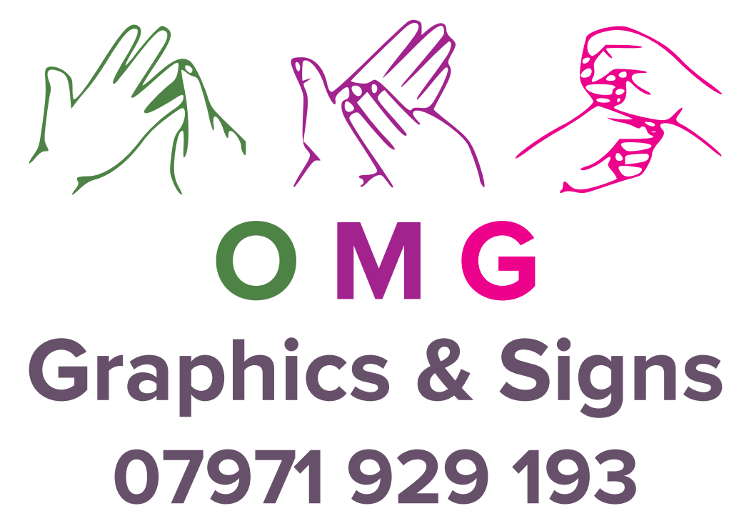
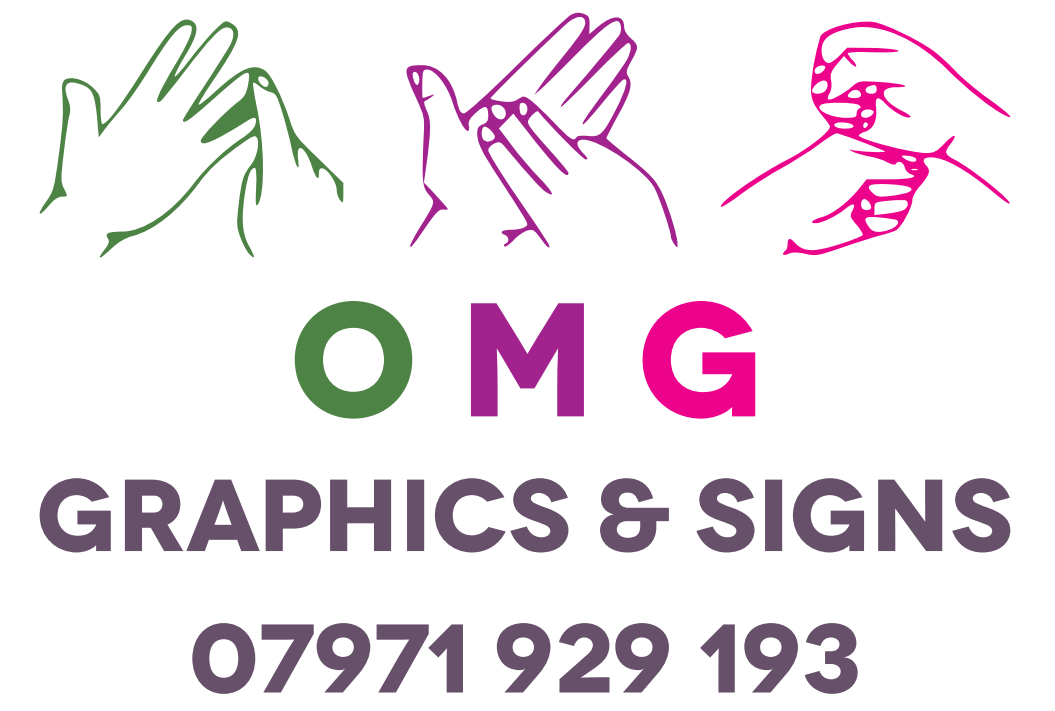
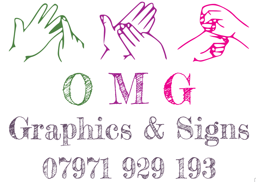
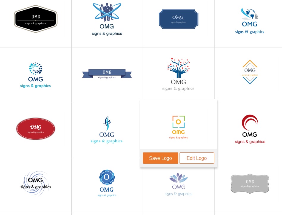
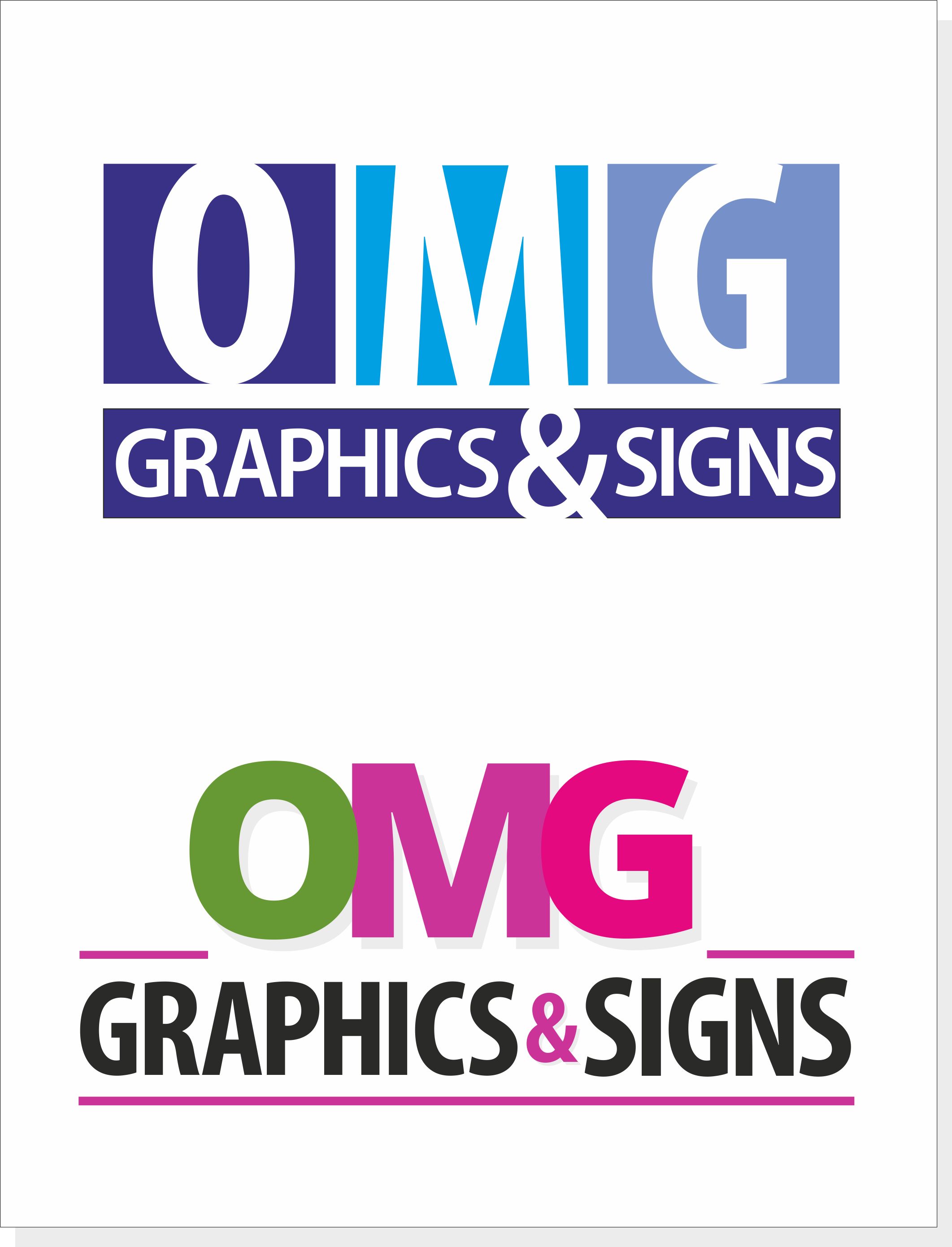
I have attached the PDf and would like your feedback. I know which one I like but would like to hear from other people and the pros and cons.Many thanks
Iain
Attachments:
 Simon Worrall replied 7 years, 5 months ago 10 Members · 13 Replies
 -
13 Replies
-

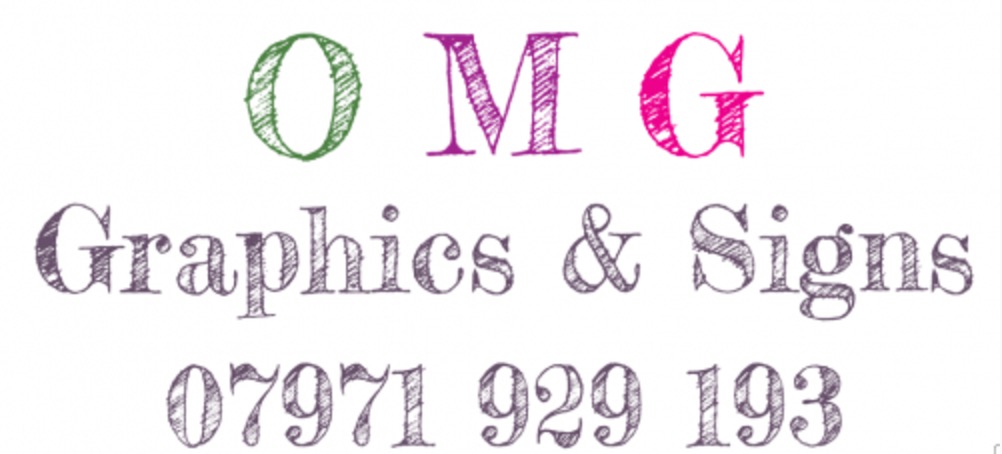
hi iain
Honest opinion
none of them i went through each one couple of seconds each and nothing stood out .
pretty much the same with no impact.
ime not a designer and my logo is probably not good
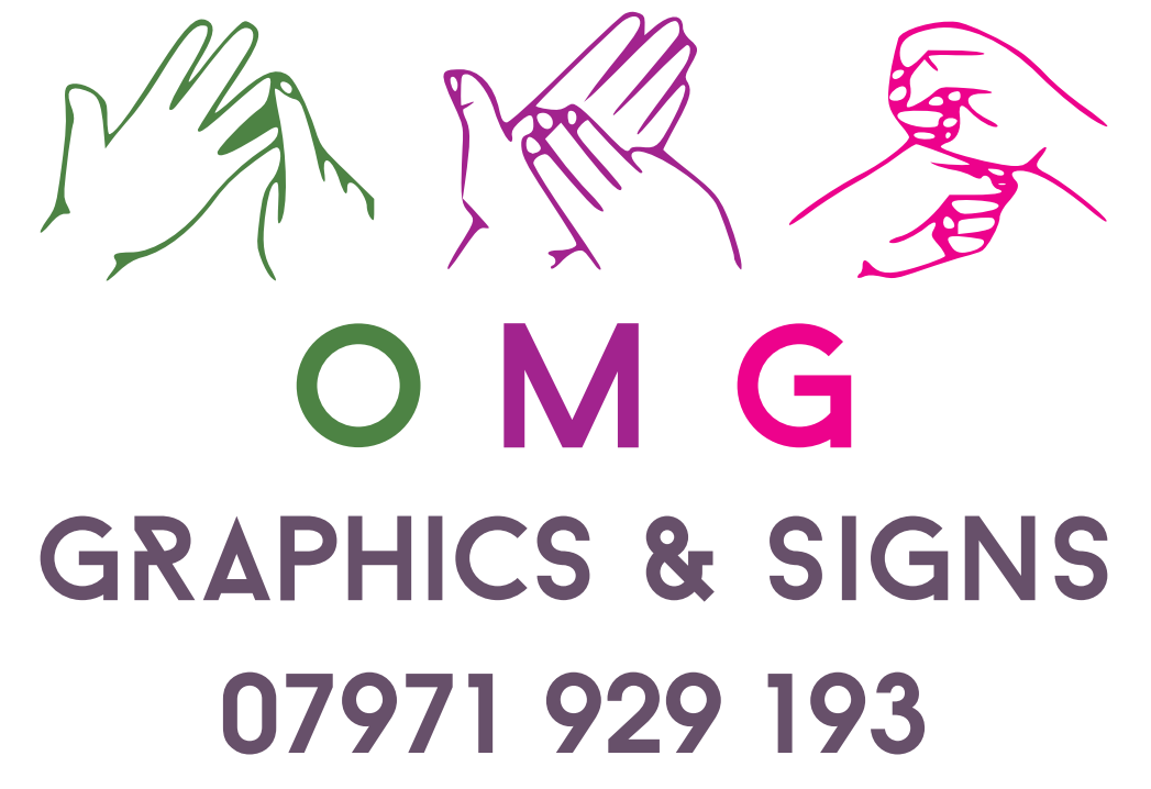
not sure the relevence of the sign language
if you try one of the free sites you can get some good ideas you might find one you like straight off .derek
Attachments:
-

Nothing there says ‘signs’ or ‘designer’ or has any impact and are just really ‘meh…’ possibly a new or inexperienced person just getting into design.
They look very vistaprint-esque to me – just generic logos to slap your text on top of with little or no thought about the end user….you.
Give them a brief and see what they come up with.
Dave
Just typed OMG LOGO into google image search – loads of inspiration with impact!
-

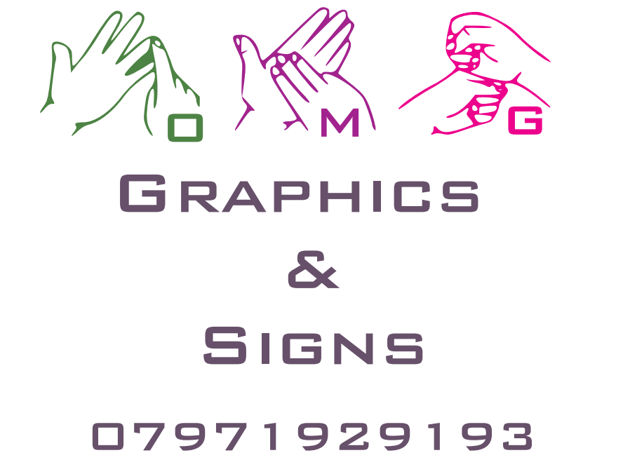
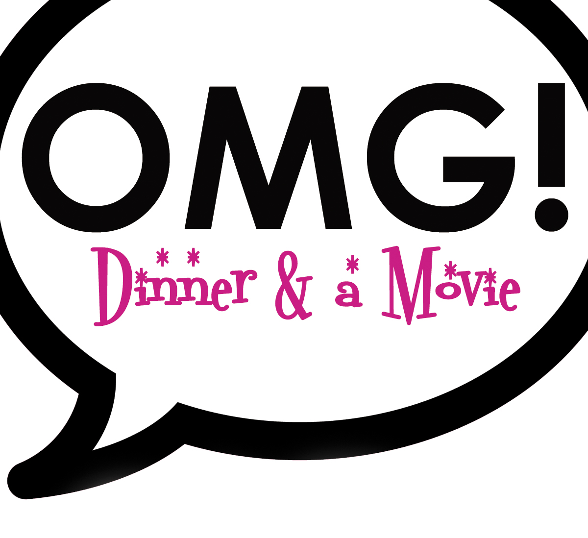
I will say the last one is what I have at the moment. I drew it up myself about 3 years ago I wanted to use the sign language so people may think signs. If that makes sense. The OMG are actually my daughters initials but so happens to be a modern thing as well. I never gave them a brief they just said they could improve my original design. Maybe because my original isn’t much cop there is not much you can do but I did expect a bit more then what they have done.
-

Third one is the best of the three, to be honest they don’t really stand out to me.
-

designing for yourself can be very difficult and something associated / sign related type theme to it, even harder!
So don’t go knocking yourself for drawing a blank on your own. however, the revised versions of your logo are not better, i would say your own, "minus the hands" is the better of the bunch.As Derek and Dave has suggested, google or stock image logos should provide plenty inspiration.
one thing though, your OMG is primary and should be made most prominent, a logo even… the rest is just text, but how it is laid out and fonts, colours used etc is all equally important.personally. i would ditch the hands completely as it relates to something completely irrelevant.
-

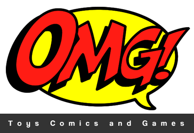
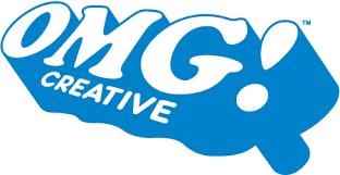
Out of curiosity I had a quick google for ‘OMG Logo’
There’s a few that stood out for me attached. With ‘OMG!’ being a common text abbreviation, usually relating to something unbelievable, they’re not ‘sign’ related, but make good use of the OMG.
The top one, not that keen on, but shows what a bit of colour can do.
Second one is clear and to the point and looks quite ‘retro’ to me.
Bottom one is rather fun, bright an vibrant
One thing we didn’t contemplate with out first logo, was how it would work across all our advertising, everything was branded with the logo, except the van as it just didn’t work. Only recently we ended up -ditching the original logo and using the one we had on the van.
Attachments:
-
David
Thanks for those but the reason I went with the hands was to try and get away from the Oh My God side of things as I said the reason for OMG is my daughters initials. -
To be honest Iain, i think the association with your daughter is a nice touch, but because of it being "OMG"… it does make it "current" and there is a relevance of "impact, amazement, fantastic, gob-smacked" appeal of the graphics… signs etc.
just personal opinion, but i would play on that fact, but not so much cartoon type pop-art graphics. -

Those efforts by the so called designer are very poor…no visual stimulation at all :puppyeyes:
knocked up a couple of ideas that may help you
Attachments:
-
To be fair I think they were trying to improve on my poor starting point. I will drop the hands and take on all of your advice. Up until now I have been doing my work as private jobs whilst working else where. I am now looking to make a proper effort in the new year and hence the logo upgrade.
-
 quote Martin Cole:Those efforts by the so called designer are very poor…no visual stimulation at all :puppyeyes:
knocked up a couple of ideas that may help you
I’ve got to say these ones that Martin has done pack way more punch. Also Dave’s suggestions are good
Log in to reply.
