Home › Forums › Sign Making Discussions › Gallery › Recent work
-
Recent work
Posted by Stephen Ingham on 27 November 2008 at 16:14Hi all, i havent posted anything on here for a while so here are some recent jobs completed.
cheers
stephen
Attachments:


 Jon Marshall replied 16 years, 11 months ago 9 Members · 9 Replies
 -
9 Replies
-

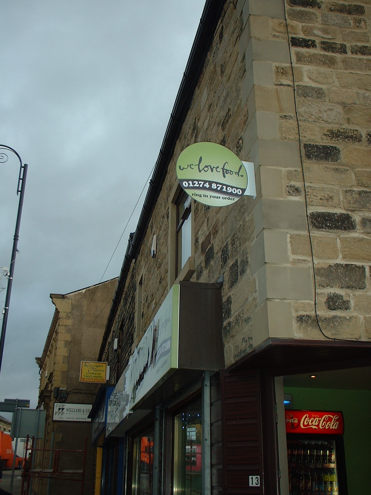
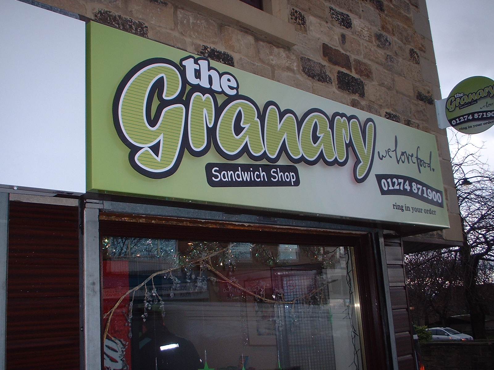
I like the ‘Granary’ signs. Your designs?
Only crit would be that they could have been reduced in size a little. Bit close to the edges.
Well done 😀
-

have to agree with Neil on the granary bit more space around would have been good but over all impression looks good, the rest nice tidy work thanks for sharing.
Lynn
-

Some nice stuff there.
I really like the look of the granary ones, your own design?
I DO think the main sign works really well with the extra large text, but (as said) maybe the pavement sign could have done with a tiny, little bit of space – even half an inch.
I know it’s not your fault as nearly every retailer does it, but it bugs the hell out of me!
panino = singular Italian sandwich
panini = plural Italian sandwiches
paninis…Italian sandwicheses? 😉
-

Really like the look of Granary
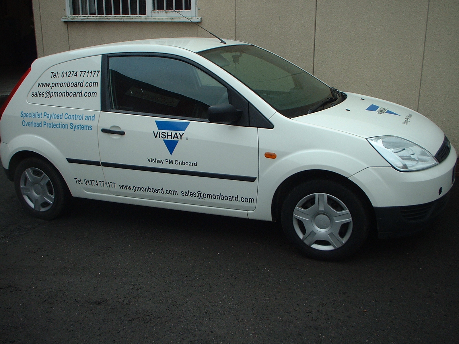
Not sure on the ford van/car with the phone number and email twice??
Nice work mate -

Ditto on most of the comments above. The Ford has some tricky lines and makes it a little confusing as to where to line text up. Probably best if the rear window/panel was left blank esp as the info is repeated.
Granary, bit more breathing space as the "the" makes it look like its off set to the top i.e. not aligned to the centre line.
Good clean simple work, thanks for sharing.
-

interesting use of two colours on granary.. like a half-tone line effect or one way vision idea…. nice
-

Hi all, thanks for your comments, all appreciated.
The Granary signs were our design, although part of a branding exercise, so the logo was supplied by a designer with the half tone colours.
The customer loved it, and thats why i enjoy doing this job so much, sad some might say…if i didnt i would change careers..
I do agree with your comments about how close the granary is placed to the edge, it was a compromise, the customer wanted it to protrude off the edges.
The ford fiesta van was a nightmare, because as you say its difficult to know where and what lines to follow, so we just stuck everything horizontal, its a similar story with the vito van.
cheers
stephen -

You definitely need to work on your text layout on the vans but the Granary one looks really nice.

Log in to reply.